Showing posts with label responsive. Show all posts
I thought I'd look into existing colour schemes within The Body Shop and their design aesthetics..
Colour Schemes Within Their Website


I noticed that on their website they use various shades of green and pink, similar to a few colour schemes below:


I think that the colour schemes should be sourced from the products that we are trying to sell! For example, using all the shades of the Colour Crush Lipsticks, or the Body Butter..
Body Butter Colour Schemes:


For Body Butter colour schemes, I thought about looking at warm, healthy colours associated with fruit and nuts (as the scents of the body butters are essentially fruit and nut scents, apart from the Aloe Vera Body Butter). Frequent colours that popped up were blues, browns and yellows.
Chosen Quilling Paper (based on colour schemes):


Colour Crush Lipstick Colour Schemes:


For the Colour Crush Lipsticks, I decided to look at warm shades of pinks and reds, to reflect the shades of the lipsticks themselves. Frequent colours that popped up were reds, pinks and purples.
Chosen Quilling Paper (based on colour schemes):

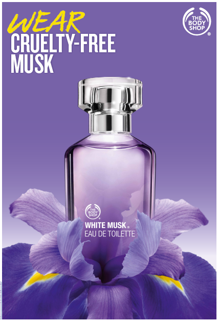


When looking at White Musk in store, I noticed that the packaging for the products followed a lavender colour scheme, so I looked at different shades of purple. Frequent colours that popped up were lilacs, lavenders and light pinks.
Chosen Quilling Paper (based on colour schemes):

Nutriganics Drops Of Youth Colour Schemes:


The nutriganics products are for healthy skin and made me think of nature and organic colours. Frequent colours that popped up were greens, browns and yellows.
Chosen Quilling Paper (based on colour schemes):

- Leave your comment • Category: collaborative brief, OUGD503, responsive, studio brief 2
- Share on Twitter, Facebook, Delicious, Digg, Reddit


Visiting the Body Shop in Leeds was really useful for primary research, as we were able to talk with existing employees about their work ethos and the products that they sell. It also enabled us to think about colour schemes that were relevant to the products - looking at different lipstick shades or packaging colours for the white musk perfume.
Even though they didn't really have anything free for us to take away from the store, it was a useful insight to how everything is displayed and who goes into the shop (we only saw women in there).
Looking at the outside of the store enabled us to see exactly how big window displays could be! (with some being absolutely HUGE)
- Leave your comment • Category: collaborative brief, OUGD503, primary research, responsive, studio brief 2
- Share on Twitter, Facebook, Delicious, Digg, Reddit