Showing posts with label studio brief 1. Show all posts

Brief
To create a hand-rendered typographic design piece using serif, sans serif and script lettering.
The final design must include a photograph as the background and submitted on instagram..
When it came to researching for this brief, I had a look at submissions for the contest last year, as well as submissions that were from this year's competition (you could view what other people had created on instagram during the time period)


I noticed that a lot of the photography used in the background wasn't always relevant to the quote or typography.

I quite liked it when designs were using photos to incorporate their typography - so using this photo as a dividing line..


A lot of the time the submitted designs reminded me of something you'd find on tumblr and seemed to be made to look pretty, rather than with a purpose or idea behind them..


I really loved this submission, because of how detailed the typography was within the word "wanda". Although, I'm not really that sure as to whether the background is considered a photograph or not..


I thought that this University of Wisconsin design seemed a bit cheesy and not that well thought out. I didn't really like the furniture used, as it didn't serve much purpose, and the layout of the typography seems like the designer just thought "oh, I'll put everything in the centre of the page".. There doesn't seem to be much consideration..


I think that the above design just got a bit too carried away! They didn't really stick to one idea and tried to shove as much typography into the page as possible.. It really annoyed me that they didn't even try to make the "almost always" work, and it just ended up a scruffy mess!

I like the idea behind this submission, as I didn't think about using a quote from a film, and using one from Finding Nemo was quite nostalgic. Although the swirly furniture and quality of the lettering was pretty poor, I really liked the concept and image of Dory.

Even though this design was really complex, it worked well as they had considered layout and you can tell that time was spent perfecting the lettering, unlike previously complex designs!

What I found interesting about this submission was the fact that they chose to use imagery within their lettering to add to the design, rather than just using an image in the background.
- Leave your comment • Category: OUGD503, responsive, studio brief 1
- Share on Twitter, Facebook, Delicious, Digg, Reddit
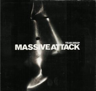
Research into existing album artwork for Massive Attack


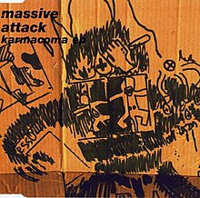
Karmacoma
I found the song really relaxing and quite hypnotising. It was quite a strange song, a bit creepy in a way.. Especially with all the samples from films used within the song. The music video was particularly strange and made me feel slightly uncomfortable - it felt like being stuck in a mad house or something out of The Shining.

About The Song...
(Taken from Wikipedia)
"Karmacoma" is a single by British trip-hop collective Massive Attack, released as a single from their second albumProtection in March 20 1995. It is a rap featuring vocals from band member 3D and guest artist Tricky. Tricky also recorded his own version of "Karmacoma," renamed "Overcome" for his debut studio album, Maxinquaye.
The melodic refrain (e.g. 0:54) is taken from the opera Prince Igor by Russian composer Alexander Borodin, and also includes a sample of Tuvan throat singing used by The KLF in "Dream Time in Lake Jackson". The bass line sample featured is the same bass line used by Serge Gainsbourg in the song "Melody" from his 1971 album Histoire de Melody Nelson. The "Napoli Trip Mix" of the song contains samples from Roberto Paci Dalò's record "Napoli", released in 1993. The Startled Insects wrote the music for this track (Tim Norfolk and Bob Locke).
Description[edit]
- A man is in the corridor, holding a gun in one hand and a plastic bag with something in it on the other. He's walking backwards and pointing the gun at everything he sees, in a clear state of paranoia and distress. He's sweating and mumbling under his breath, desperately attempting to memorise the room numbers for reasons unknown. At several points he is menaced by two mysterious, identical twin girls (in homage to the 1980 film The Shining), who, at one point, hold up the missing letter 'k' from another tenant's typewriter. And at one point he glimpses a double of himself, pointing a gun at him.
- A man with long, unkempt hair and beard is sitting in his room (actor Olegar Fedoro resembling Charles Manson), staring directly into the camera and speaking in a dazed manner. "I am a... dangerous person," he announces at one point. Later: "All those guys I killed... nothing personal." (He bears a strong resemblance to the man with the gun from the corridor, although it is unclear if they are actually intended to be the same person.) At the video's end he tells the camera, "I want to be free... and I am free." (These three lines are all Charles Manson quotes.)
- A man in one of the rooms is covered with oil among cameras and mirrors, apparently performing some sort of bizarre artwork. The oil comes from his navel, apparently, and his finger goes impossibly deep into it to extract the oil.
- A middle-aged man with a moustache is in a room with two women dressed in red satin robes. He asks "Who's gonna be a bad girl, then?". One of the women answers apathetically, "I am".
- A man (who resembles the protagonist of Eraserhead) is seen with a typewriter, writing "Karmacoma" over and over again on a sheet of paper, though the letter 'k' does not appear. When the man in the corridor realises the two girls have the 'k', it immediately cuts back to the man with the typewriter, who does not look at another man who appears in his room, burning sheets of paper.
- A boy watches TV news in which the journalist covers his half face with his hand. The boy repeats what he sees. As this is happening, a woman dressed in campy, old-fashioned clothing is talking on the phone about the boy.
- A man plays golf in the corridor.
- A man attempts to drown a miniature copy of himself in a bathtub.
Censorship[edit]
- The man with the moustache stands on top of a mattress and sticks his tongue out. He has a big pointed piercing in his tongue.
- The actress that accompanies the band is resting her head on 3D's shoulder. She then lifts her head, looks straight into the camera and blood spills from one of her nostrils.
- The man with the gun passes along another version of himself, the second man points the gun at the first. Cut to a different angle, where the first man is alone and pointing the gun where the second man was a second before.
- The man covered in oil is shown with his index finger stuck inside his stomach. He slowly removes it until it's all out, without leaving a wound or a hole of any kind.
Lyrics
You sure you want to be with me
I've nothing to give
Won’t lie and say this lovin's best
Well leave us in emotional pace
Take a walk, taste the rest
No, take a rest
[3D]
I see you digging a hole in your neighborhood
You’re crazy but you’re lazy
I need to live and I need to
Your troubles must be seen to see through
Money like it's paper with faces i remember
I drink on a daily basis
Though it subtle cools my temper
It never cools my temper
[Tricky]
Walking through the suburbs though not exactly lovers
You’re a couple, 'specially when your body’s doubled
Duplicate, then you wait for the next kuwait
[Tricky & 3D]
Karmacoma, jamaica' aroma [x4]
[3D]
You sure you want to be with me i’ve nothing to give
Take a walk take a rest taste the rest
Take a walk take a rest taste the rest
Take a walk take a rest a taste of rest
[Tricky]
Don't want to be on top of your list
Monopoly and properly kissed
We overcome in sixty seconds
With the strength we have to together
But for now, emotional ties they stay severed
When there’s trust there’ll be treats
And when we funk we'll hear beats
[Tricky & 3D]
Karmacoma, jamaica' aroma [x4]
[3D]
Deflowering my baby, aiyee my baby me
I must be crazy, see i'm swazy
Digging a hole in your neighborhood
You're crazy but you're lazy, must be lazy
[Tricky]
Don't wanna on top of your list
Monopoly and properly kissed
[3D]
Deflowering my baby, aiyee my baby me
My baby
Deflowering my baby, aiyee my baby me
I must be crazy, you must be lazy
[Tricky & 3D]
Karmacoma, what?, jamaica aroma [x4]
kar·ma
[kahr-muh] Show IPA


- Leave your comment • Category: OUGD503, responsive, studio brief 1
- Share on Twitter, Facebook, Delicious, Digg, Reddit
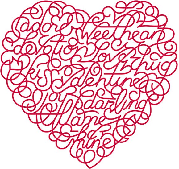
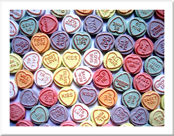
OUGD503: Design Responsive - Secondary Research on Valentine's Day Card Live Brief
by Roxxie Blackham on Saturday, 11 January 2014


- Leave your comment • Category: OUGD503, responsive, studio brief 1
- Share on Twitter, Facebook, Delicious, Digg, Reddit
The Brief:
The Stowawayz are a contemporary acoustic band, situated in Oxfordshire. The band consists of two teenage girls, playing guitar, ukulele and singing. The band currently perform covers of existing songs, but are planning on writing their own music in the next few years.
The brief is to create a logo that represents The Stowawayz' music that can be applied to business cards and social networking sites.
Considerations:
- The logo needs to follow a nautical theme
- Use of one or two colours in the scheme
- Use of an image that represents the music they play
- Consider the fact that the logo will be printed as well as used online
Research into existing business cards:


- Leave your comment • Category: OUGD503, responsive, studio brief 1
- Share on Twitter, Facebook, Delicious, Digg, Reddit