Showing posts with label task1. Show all posts
Using Shannon & Weaver's model of the communication process, analyse one piece of visual communication.


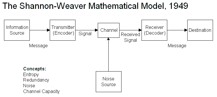
Using the Shannon & Weaver's model, we can say that the information source would be the client / brief that the designer has worked from. This information source could also be research that they have committed themselves to work upon over the publication, or research that they have been given by their client.
To transmit or encode this information that has been gathered, a designer would have been hired to produce something relevant to the information given in the brief that meets the criteria. In this case, the designer has transmitted the information into a publication/magazine. The designer will need to produce a design aesthetic that is highly redundant, so that the information can be clear and easily understood. However, because of the format of the information, the designer is allowed to play around with the rules of redundancy, and create something that could be entropic.
This transmitted information will then need to be channeled into something accessible. In this case, the channel would be the physical thing that has been produced - the publication/magazine. There aren't any cases of noise visible within this publication, however during production the designer could have experienced a variety of noises, for example the printer wasn't working or the bounding of the book stopped it from closing etc.
Then the receiver or decoder of this particular piece of design would be the printer/publisher. They would receive the channeled publication files from the designer and then decode the information so that they have something produced that can be sell to the target audience, or in other words, the destination.
The layout of the content inside the magazine is highly entropic, as the typography has been positioned sideways. This works in the designers favour to separate it from others in the market. However, it still holds redundancy, due to functionality - you can still understand and read the magazine as the designer needs to keep the functionality within the publication, else it won't be successful in the target market.
Something I love:

Typography by Doyald Young.
I really love design work by Doyald Young. I think all of his designs are really intricate, precise and beautiful. I love how he makes all his letters look as though they're flowing across the page and entwining with one another. I particularly like this piece of work by Young as he's left construction lines on the paper and all the letters have been created with pencil, which makes it more personal and authentic. The leftover pencil lines also add texture to the page, and I think the use of pencil makes the letters look softer and more subtle, rather than hard hitting and in your face.
Something I hate:

The London 2012 Olympics Logo.
I really cannot stand the Olympics Logo. I think it is really vulgar and far too sharp and in your face. I'm not sure why the numbers have been made to look so abstract and jaggerdy, but I really don't think it works at all and doesn't represent London at it's best. The colours used clash and hurt my eyes, and have nothing to do with the Olympics or London. I think the whole image is completely unappealing and horrible to look at. I can't see how the image conveys Britain or the 2012 Olympics at all, apart from the fact the Olympics 5 rings logo has been added in and the words London and 2012 are in there somewhere as well, otherwise it really doesn't relate and doesn't work at all. However, it is a very memorable image.