We had to choose four different fonts, one of each of the following categories:
Roman - Georgia Regular
Gothic
Block - Haettenschweiler Regular
Script - Chopin Script Regular
We printed out an Upper and Lower-case for each, of just A and B. We then cut them up into their different anatomical features, for example we split the lower case a into the bowl and the stem (which you can clearly see in the following mixture of Haettenschweiler's bowl and Chopin Script's stem...
The next step was to mix and match the different features of each letter, these are shown below:
LOWER CASE A's...
UPPER CASE A's...
LOWER CASE B's...
UPPER CASE B's...
✿✿✿✿✿✿✿✿✿✿✿✿✿✿✿✿✿✿✿✿✿✿✿✿✿✿✿✿✿✿✿✿✿
I came to the conclusion that my original letters were not suitable to work with:
Script: The script font that I chose was far too elaborate and different to the other fonts that I had chosen to go with. This made it difficult to work with, and resulted in really peculiar looking letterforms.
Script: The script font that I chose was far too elaborate and different to the other fonts that I had chosen to go with. This made it difficult to work with, and resulted in really peculiar looking letterforms.
Roman: I kept the same roman font, as I really like this font and I think that it is simple, elegant and easy to work with.
Gothic: For the gothic font, I decided to use something that I preferred generally, and what I thought would work well will the Roman and Script fonts.
Block: I decided to use a bolder and more block looking font, as I considered how well it could work with the other letterforms of the other typefaces.
NEW SELECTION:
Roman - Georgia Regular
Gothic
Block - Poplar Standard Black
Script - Apple Chancery Regular
✿✿✿✿✿✿✿✿✿✿✿✿✿✿✿✿✿✿✿✿✿✿✿✿✿✿✿✿✿✿✿✿✿
After some more experimentation, I came up with my 5 final Typefaces:
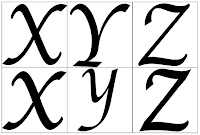
Georgia Chancery
I was quite worried about combining a serif font with a script font, however I am really pleased with the outcome and feel that this crossbreed font could work really well for Headings or larger bodycopy. It might be quite hard to read when used at a smaller size...
Hand Rendered Version
Digitally Rendered Version
✿✿✿✿✿✿✿✿✿✿✿✿✿✿✿✿✿✿✿✿✿✿✿✿✿✿✿✿✿✿✿✿✿
Georgill
I knew that combining these two fonts would be quite easy, due to the simplicity of them both. One thing I did find, which I didn't expect, was how bold the final crossbreed seems. It is also pretty quirky and not as simplistic as I first hoped.
Hand Rendered Version
Digitally Rendered Version
✿✿✿✿✿✿✿✿✿✿✿✿✿✿✿✿✿✿✿✿✿✿✿✿✿✿✿✿✿✿✿✿✿
Gill Sansdard Black
I wasn't quite sure what to expect when I started combining these two fonts together, however I found the end result quite interesting. I think that the final crossbreed font is playful and innovative. I like the almost child friendly illustrative feel that it has about it.
Hand Rendered Version
Digitally Rendered Version
✿✿✿✿✿✿✿✿✿✿✿✿✿✿✿✿✿✿✿✿✿✿✿✿✿✿✿✿✿✿✿✿✿
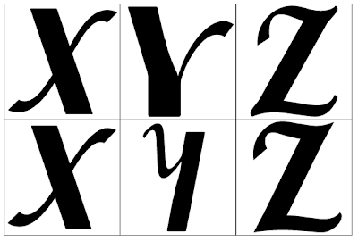
Poplar Chancery
I was really uncertain when it came to combining these two typefaces due to the sheer fact of how different they are to one another. Also, when I tried combining a block and script font with my previous typefaces, it really didn't work out well at all. I think that this final crossbreed font is a whole lot more improved to previous attempts, however I feel as though it would still need a lot of work if it were to become an actual typeface for people to use. The uppercase letters definitely work better than the lowercase....
Hand Rendered Version
Digitally Rendered Version
✿✿✿✿✿✿✿✿✿✿✿✿✿✿✿✿✿✿✿✿✿✿✿✿✿✿✿✿✿✿✿✿✿
Poplar Georgiard Black
Once again I found it quite tricky working with a block font, mainly because it was hard to make the serifs look good next to the bold block typeface that I had chosen. However, I feel that the final crossbreed outcome is both interesting, yet oddly elegant. I like how misshapen it seems and feel that certain letterforms, for example the C and the Y work really well when combined. I think that the other letters probably need a bit more consideration, however I like the outcome.
Hand Rendered Version
Digitally Rendered Version
✿✿✿✿✿✿✿✿✿✿✿✿✿✿✿✿✿✿✿✿✿✿✿✿✿✿✿✿✿✿✿✿✿
In conclusion, I found that block and script fonts were the hardest to work with, especially when it came to using them together as they are such striking fonts on their own. I think that Georgia worked really well whenever it was crossbred with another font, just because the serifs added the elegance to the typeface that it needed, and I feel that without those serifs, most of the typefaces would look a bit jaunty and unbalanced. I think that Gill Sans was harder to work with than originally expected, mainly because the typeface itself is quite irregular and not as structured as I first thought.
However, I am pleased with the final outcomes, especially Georgia Chancery!


