Why is critical analysis an important part of education?
- You can learn to understand your own individual strengths and weaknesses, as well as helping your piers to acknowledge theirs.
- It's a chance to ask other people what they think of your work and where they think you could improve - once again identifying your strengths and weaknesses but within particular designs themselves, rather than as a whole.
- When looking at work created by your piers, you can be influenced to change your work slightly, as you may be 'inspired' by what they have produced or the ideas that they have come up with.
- Gaining feedback from others in your class, as well as working amongst other students helps to keep you motivated and can often lead to stronger design concepts as you are feeling motivated and that you want to succeed.
- From analysing the work of other students, you develop a stronger understanding of what good design is and how you can make your work suit the briefs better.
Five criteria that effect the way I judge if I like/dislike a piece of work:
- Composition & Layout: If the composition of the design is messy, cluttered, over crowded or just obviously not thought about, I can't stand it. I seem to favour clean structure over messy design, possibly due to the course I was on last year and how much that tutor influenced me, so I find it difficult to like messier design, for example in postmodernist work. However, I can appreciate it.
- Colours: I prefer minimal use of colour over bright and overused colour, however sometimes, if it is used well, a lot of colour can look nice. I am quite picky however, and usually favour design that has used 1 or 2 colours plus stock.
- Quality: The quality of the images, skills or executed work itself is extremely important to me, as I don't want to be looking at a pixelated image, poor drawing or terrible alignment.
- Typography: I particularly favour hand-rendered typography that has been executed to a very high standard, over computer generated typefaces. Typographers like Jessica Hische and Teagan White are large influences for me when I'm drawing type, as I love the vintage style of both of the typographers, and how elegant their type is.
- Method of Production & Choice of Media: I love to see Graphic Design that has been screen printed or hand made as I find it really creative and interesting, and I feel that a lot more skill has been put into the work than someone just choosing a pretty typeface on Illustrator.
- Leave your comment • Category: OUGD401, studiotask1
- Share on Twitter, Facebook, Delicious, Digg, Reddit
Find an article in a newspaper from Tuesday 23rd October, and research into related subjects and visual concepts..

Chosen Article: Women of War: A Different Side of Afghan Mission
"A new photographic exhibition provides a rare insight into the lives of women soldiers serving on the front line in Afghanistan. A photojournalist, Alison Baskerville, was embedded with British Forces and granted unparalleled access to the Female Engagement Officers. The engagement officers work to build relationships with Afghan women in some of the most dangerous parts of Helmand. Ms Baskerville said her photographs highlight how women respond to the often austere conditions in which they find themselves and how they maintain their morale and individuality in the face of demanding circumstances. Capt Alice Homer, below, is an officer with the Royal Electrical and Mechanical Engineers. The exhibition runs from Thursday until Nov 11 at Oxo Gallery, Oxo Tower Wharf, on London's South Bank." - The Daily Telegraph, Tues 23rd October 2012.


The role of women in the war has changed quite dramatically since WWI, as women were nurses rather than actually in the front line. I think it's really interesting to see how women take part nowadays, and how their roles are still quite feminine, for example gaining the trust of the Afghan women.

Researching into the roles of the women in the war, I came across this website which informed me a lot about what women used to do in WWI and it made me realise how much society has barely changed today and the fact that women's roles have improved, however they still don't take part as much as the men do.

I think that propaganda posters are really effective designs to encourage women to do something during the war. The poster has been made to make the woman look like a strong figure of importance, showing off her muscles and preparing herself for work. The slogan "we can do it" immediately brings the sense of positivity to the poster and the colours are bold and vibrant which also suggests positivity and strength.

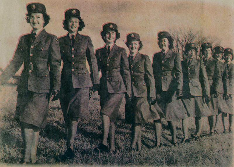
I found that women had a set uniform during the war that was pretty similar to that of the military, but had great femininity about it, what with the tight fitting blazers and knee length skirts. I think the fact every single woman in the photograph is walking the same, has the same hair and are wearing the same clothes shows that there wasn't really any thought of individuality when working for the service.

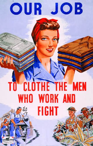
I think that this poster is very sexist and portrays a stereotypical housewife. Rather than encouraging women to take part in the war first hand, they're being told that clothing the men who work and fight in the war is their job and that they should abide by this idea. The poster makes women seem fragile and weak in comparison to the illustrations of the working and fighting men.

I really like this photograph, because even though none of the women are looking down the camera, you still feel like you can relate to the photo and it seems really personal and easy to engage with. The women look content with their officering job and their role in the war.

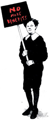
I think that this example of info-graphics is interesting, because it relates more to how women are perceived and how they don't have as much choice as men do. The poster relates more to women's rights than it does to women taking part in the war, but I really like the general aesthetics of the design and the simplicity and clarity.

This example of info-graphics is similar to the example shown above, just set out in a different manner. I think it's a lot more cluttered than the other one and wouldn't really say that the colour choices work for the design.

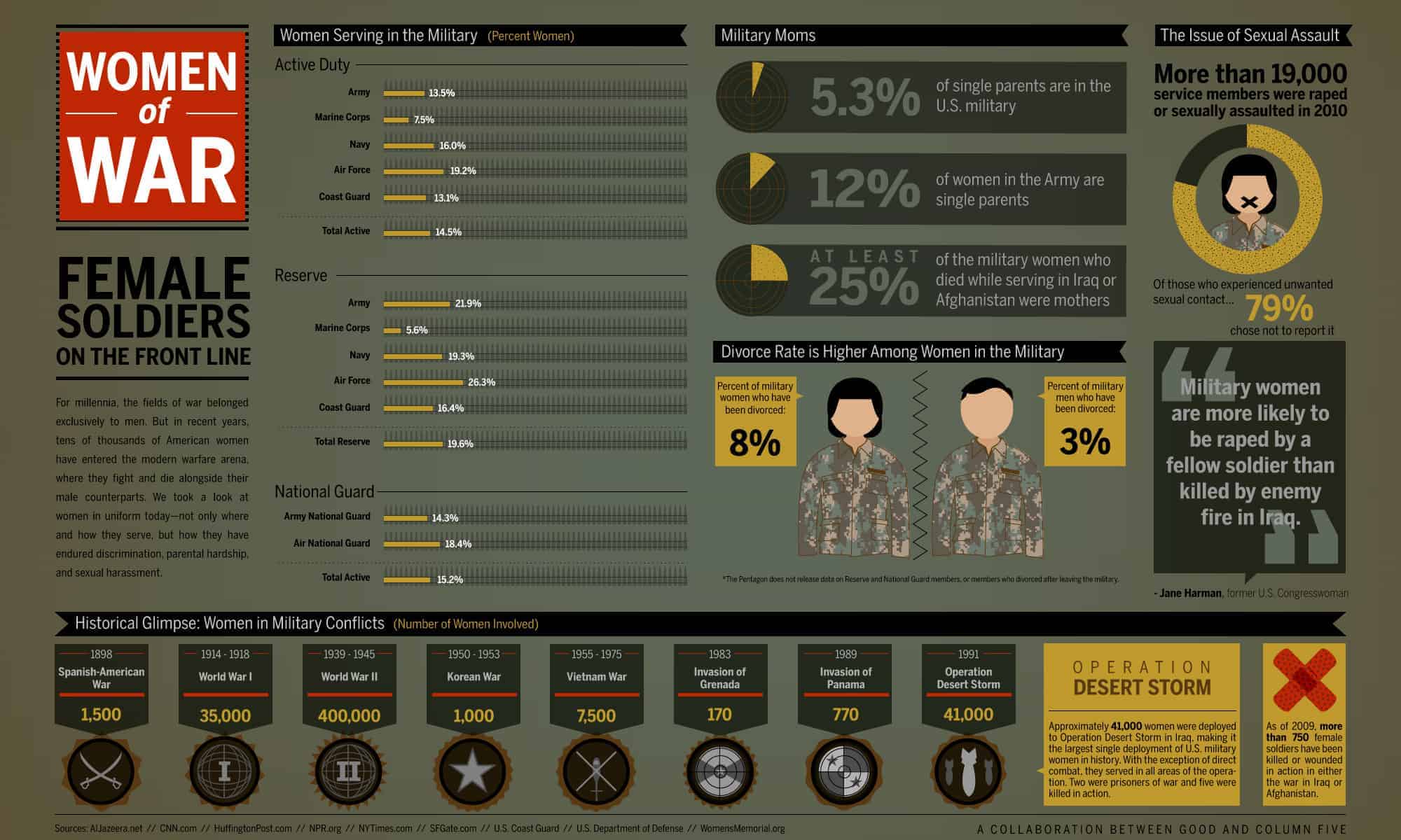
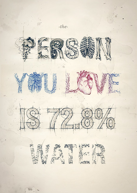
I really love this info-graphic about women of the war, because it is factual and informative, yet simple and to the point. The poster has lots of information spread across a small amount of space, yet it is extremely legible and easy to engage with as the designer hasn't just slapped a big block of type across some paper. I think the colours work really well as they're colours that you would usually associate with warfare and the army.

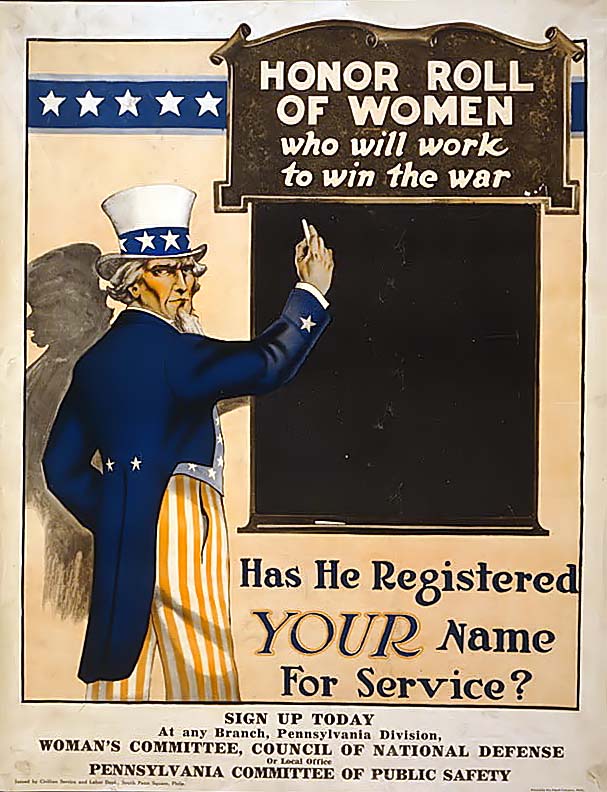
I think this propaganda poster design is really clever, because it directs the message straight at the reader by asking "has he registered YOUR name for service?". This makes the design more personal to the audience as they read the poster, and will make them question themselves and feel guilty for now registering their name.

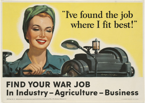
I think that this poster concept aimed at women works well, because it has been created to make the industry, agriculture and business job sides of the war seem really appealing and positive. The designer has done this by using positive and bright colours alongside an illustration of a happy woman working with the slogan "i've found the job where I fit best". This combination of generally happy outcomes makes the whole design undeniably cheerful.

I love this idea that's being illustrated, and the way it has been executed. At first it is a bit confusing to understand, but once you read the key the diagrams become extremely clear. I like the way the entire image looks hand-rendered and the colours chosen really compliment each other nicely. I also think it's good how concise and seemingly accurate the diagrams are.
2 examples of design work I love:

Source For Image
I absolutely adore work produced by Teagan White. Every single thing she designs is well thought out and cleverly executed. I love how illustrative her work is and the amazing attention to detail, especially in this poster.

Illustrative Typography Design by Alberto Seveso
Source For Image
I really love looking at the typography work that Alberto Seveso produces. I especially love the set of designs that this image came in, because of the bright colours and watercolor effect.

'11 Ways To Ruin A Great Design' Article by PiDesign
Source For Image
I think work that has been produced like this is absolutely horrendous. You can tell that the designer used a combination of Microsoft software, such as paint and power-point to create the end product. The entire image is that bad it verges on the edge of greatness.

Terrible Fonts on dafont.com
Source For Image
I absolutely hate flicking through the fonts on dafont.com and coming across extremely amateur typefaces such as this one. I also really don't like it when fonts have been created with little curly girly hearts and flicks as the dots on the I's etc, as I think it looks really tacky.
OUGD401: Compare and Relate ‘The Uncle Sam Range’ and ‘Daddy, what did YOU do in the Great War?’ Propaganda Poster Adverts.
by Roxxie Blackham on Friday 19 October 2012
OUGD401
Compare
and Relate ‘The Uncle Sam Range’ and ‘Daddy, what did YOU do in the Great War?’
Propaganda Poster Adverts.
From first
impressions, ‘The Uncle Sam Range’ advertisement for a cooker by Schumacher
and Ettinger (1876) and ‘Daddy, what did YOU do in the Great War?’ propaganda
poster by Saville Lumley show absolutely no similarities and seem to be
extremely different, however these two poster designs are, in fact, awfully
alike.
‘The Uncle
Sam Range’ advertisement is tremendously patriotic in theme. This idea of
patriotism can be read through the constant homage of patriotic colours and
designs in the clothing, curtains and carpets, as well as the obvious ‘All-American’
typeface strewn across the bottom of the advert. ‘Daddy…’ isn’t as visibly
patriotic, however there is still a very distinct British theme apparent in the
design. Once studied, you notice the pattern on the curtains representing the
Red Rose of England, the floral Fleur-de-Lis pattern of royalty on the armchair
and the figurines representing the Queen’s Guards that are being played with by
the child on the floor.
Whilst both
images display great deals of patriotism, they are also comparable through the
idea of being designed around the concepts of two very great scenes in history.
‘The Uncle…’ commemorates the American Declaration of Independence after the
Civil War, through the visible dates on the clock and the framed treaty on the
wall and celebrates their independence through pride and satisfaction, whilst
‘Daddy…’ celebrates the passing of the first world war, set in the future when
the war has finished, and hopes to use the potential feeling of guilt to get
men to sign up for the British Army. This is conveyed through the father who
didn’t volunteer during the war being questioned by his daughter about how he
took part.
The sense
of pride and superiority is found in the idea of Uncle Sam sitting at the
dinner table next to his cooker inviting the character portraying The World to
enjoy food from around the globe for dinner. This gives the viewer faith in the
cooker as well as America itself, as it conveys America as the provider of the
rest of the world. The automatic feeling of faith aspires the viewer to
purchase the cooker. The idea of a provider figure is also presented in
‘Daddy…’ through the desire to be thought of as a hero and the fear of shame
and disappointing their family. This will make the viewer consider how they can
take part in the war and make their family proud through the use of direct
acknowledgement with the viewer, which is shown by the father looking straight
at the viewer and the emphasis on the word ‘YOU’.
In
conclusion, it can be said that both poster designs celebrate a passing of the
war, but through very different sentiments and concepts. They have both been
aimed at the upper/middle classes through the affluent clothes and environments
and hope to motivate the viewers to take action and either sign up to the army
or purchase a cooker through aspiration and desire for greatness.


- Leave your comment • Category: OUGD401, seminarnotes
- Share on Twitter, Facebook, Delicious, Digg, Reddit
I think the uni prospectus, as a whole could take a lot of slating. However, the main focus points would be:
The Cover
The use of shiny red foiling on a blue stock really does not work. Considering Leeds College of Art & Design is a university filled with art students, they really should want to show this off in their prospectus, especially with the front cover as this is the very first impression that the prospect student would receive from our university, and really this should make a huge impact on their choice of whether they even want to go for an interview here! As the prospectus last year really did influence me to come and have a look at what else LCA had to offer.
The First Page
The opening page has no definite focal point, and is hard to focus on. The main body of text is bigger than the title more like a sub-heading and seems to only have been made bigger because there isn't enough content. It also makes little sense as to why they have bordered off each sentence - it looks like it's been design on Microsoft Powerpoint!
The Introduction To The Principal
Although the photo of the principal is both professional and friendly, it portrays the university in a business-like manner. It feels too clinical and not very creative, and we look more like a school for accountants. Also, the title is too understated and isn't very creatively designed or thought out.
The Images...
Throughout the entire prospectus, there are poorly cropped images scattered here there and everywhere. Not one of them lines up with text or another image, which makes it seem like they didn't even bother to use grids or margins! Also, the images themselves never really seem to relate to the text that corresponds next to them! I think the worst page would be when they're "showing off" what Graphic Design is all about, and they haven't even bothered to try and make those pages aligned, or even use an interesting layout choice! Poor design all round.
OUGD401: Seminar Notes - Comparitive Critical Analysis Notes
by Roxxie Blackham on Tuesday 9 October 2012

- Leave your comment • Category: OUGD401, seminarnotes
- Share on Twitter, Facebook, Delicious, Digg, Reddit

- Leave your comment • Category: OUGD401, seminarnotes
- Share on Twitter, Facebook, Delicious, Digg, Reddit


Words That Best Describe Yourself:
Neat Freak, Sometimes Loud, 'A Thinker', Observant, I complain a lot!
Which living designer do you most admire, and why?
David Foldvari - Really like the freedom in his brushstroke of his work, along with him being able to illustrate controversial issues in a non-bias manner

Source For Image
Looking at Foldvari's work, I really like the way he illustrates and the style he works in. It reminds me quite a bit of work by Banksy, especially the full illustrations of the people in solid black and white. I think this kind of technique of lots of little black strokes, whether painted or drawn, could look really good in a typeface.


Source For Image
Source For Image
Who is your favourite musician?
Florence & The Machine

I think that the style of the typeface for the name of the band could work quite well representing Anisha, because it's quite girly and you straight away think of Florence when you see it.

I also think that the typeface that has been created to write the album name 'CEREMONIALS' is really interesting and something similar to this could work quite well, as it relates to the fine lined brushstrokes of Foldvari's work.
Favourite Colour: Maroon
Which piece of graphic design do you wish you had created?
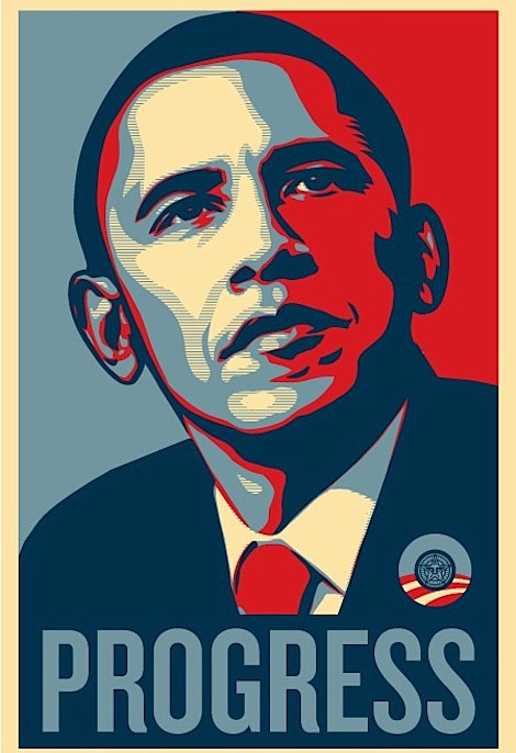
Shepard Fairey - Obama Posters

I think that the colours used in Fairey's posters are interesting to work with, however we have been limited to black and white.. Could the typeface consist of this style of design? Could try creating some type using black white and grey, rather than blue red and cream, and make something of similar aesthetics?
Favourite Typeface:
Arial

I think that Arial could be a good typeface to work from, because Anisha describes herself as a 'neat freak' and Arial is an extremely tidy typeface. It's a bit plain, but that adds to the neatness. If I can find an interesting way of using Arial, but changing it to incorporate Anisha's personality and likes&dislikes etc, it could look really nice!
 Source For Image
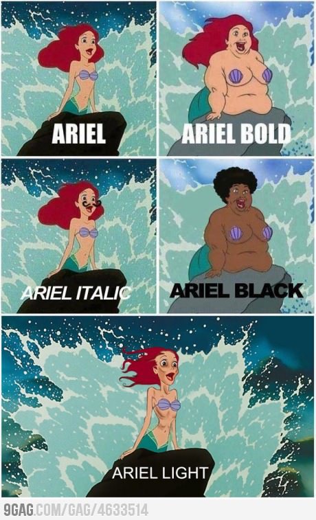
I thought about maybe manipulating the Arial typeface, to incorporate the character Ariel from the Disney film 'The Little Mermaid'. I found this take on changing the actual character to suit the description of the different typefaces, which I found extremely amusing.

I really like the typeface used for the title of The Little Mermaid, and there have been many takes on it
Source For Image
I really like the M used on this version of the title, because it looks like a wave going over the rest of the letters.

I really like the idea of using a well known font and incorporating the pattern into it to give it a zebra feel. I also like the use of lines to create the pattern.
Ideas For Typeface
 I thought about tracing over parts of the Arial typeface and then filling in the rest with lines. I really like this idea, because it is aesthetically pleasing. It's an effective idea as it conveys the 'neat freak', Arial loving side of Anisha. I have also created it in the style of Foldvari, as he uses a lot of fine lined strokes in his work, and also when he incorporates type into his illustrations, the letters are quite bold and blocky. I think if this idea was hand rendered, then I can make it look even more like Foldvari's work, by using different materials and processes, other than just straight, neat lines on illustrator.
I really like filling in the previously white parts of the typeface, as it emphasizes the letters more and helps to make them stand out. This also makes the areas which are made up of fine lines less in your face and they look like they're actually part of the letter.

Andrei Robu

I found a typeface quite similar to what I'm trying to create, which I really like. I think it's really smart and nice to look at, and quite inspiring for my own work.

I decided to go back to the Foldvari research from before, and chose this illustration. I really like it, because he has used typography to help create the image. I like all the fonts that Foldvari creates in his images, as they're very stencil-like and bold, which once again reminds me of street art.
Matthew Gray Gubler
One of the people Anisha said she'd like to have at her dinner party was Matthew Gray Gubler. I did a little bit of research into him and found that not only is he a famous actor, he also loves to draw and paint.

Favourite Food: Fish

Source For Image
I think this idea for a font is really cleverly thought out and well executed. I really like the idea of using silhouettes of sea animals to create the different letterforms. I think the letters used on their own wouldn't work so well, but when used in a sequence or in a word, it would be legible and could look really cool.

I think this is a really fun and witty way of creating a typeface to do with fish. I like the idea of using actual photographs of fish to create the letterforms with, and think it works quite surprisingly well, as the fish aren't exactly that easy to work with (especially when creating the glyphs).

I think fish scales are really interesting to look at close up and form a nice shape. Letters made out of scales could look quite interesting.. Or maybe find a way of incorporating just a few scales into the letters.

Close-up Photograph of the skeleton of a fish.
I really love this photo, it's really interesting to see the skeleton of a fish, especially when it looks so translucent. I think it's really intriguing how straight all the bones are and how it just looks like a big pattern of straight lines. I think the idea of the fish bones could work quite well with the previous idea of using lines in my typeface (see above).

Source For Image
Looking through some more of Foldvari's work, I noticed that he likes to make it look like the ink has dripped off of the characters that he's illustrated. It makes the images look more eary and weird.
- Leave your comment • Category: alphabetsoup, OUGD403
- Share on Twitter, Facebook, Delicious, Digg, Reddit