Saving seeds worldwide and safeguarding plant life to help solve some of the world’s most pressing problems.
The Millennium Seed Bank Partnership (MSBP) is a network that, in December 2012, comprised 170 partners in 80 countries. In 2009, the MSBP hit its first target of collecting and banking seed from 24,200 plant species in just 10 years. That success is testament to the power of the partnership and makes us confident we can achieve still more over the period up to 2020 by when we will have seed from 75,000 species in safe storage. This represents about a quarter of all the world’s bankable species.
Our priorities are useful species and plants most threatened by changing climate - those from drylands and islands, mountains and coastal regions - and from parts of the world where there are large gaps in our collections. The MSBP isn't only about safeguarding seed for the future but about helping solve some of the world's most pressing problems through the use of plants.


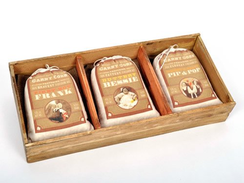
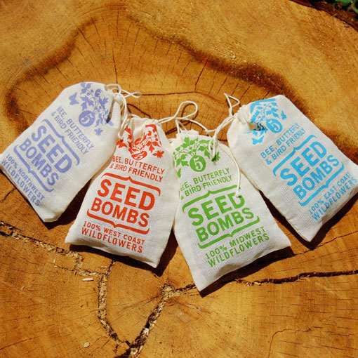
I thought that the current welcome pack and certificate that you receive isn't really that appealing! No wonder the younger generation don't find plant-life that appealing or 'cool'!

Paper-making:
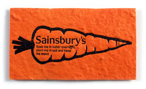
Paper-making is the process of making paper, a substance that is used universally today for writing and packaging. In paper-making a dilute suspension of fivers in water is drained through a screen, so that a mat of randomly interwoven fibbers is laid down. Water is removed from this mat of fivers by pressing and drying to make paper. Since the invention of the Fourdrinier machine, 19C, most paper has been made from wood pulp because of cost. But other fibre sources such as cotton and textiles used for high quality papers. Previously, paper was made up of rags and hemp as well as other materials.


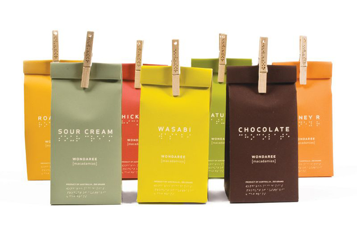
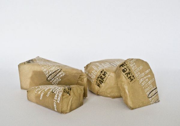
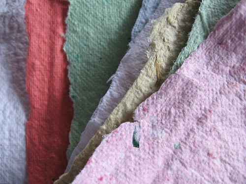
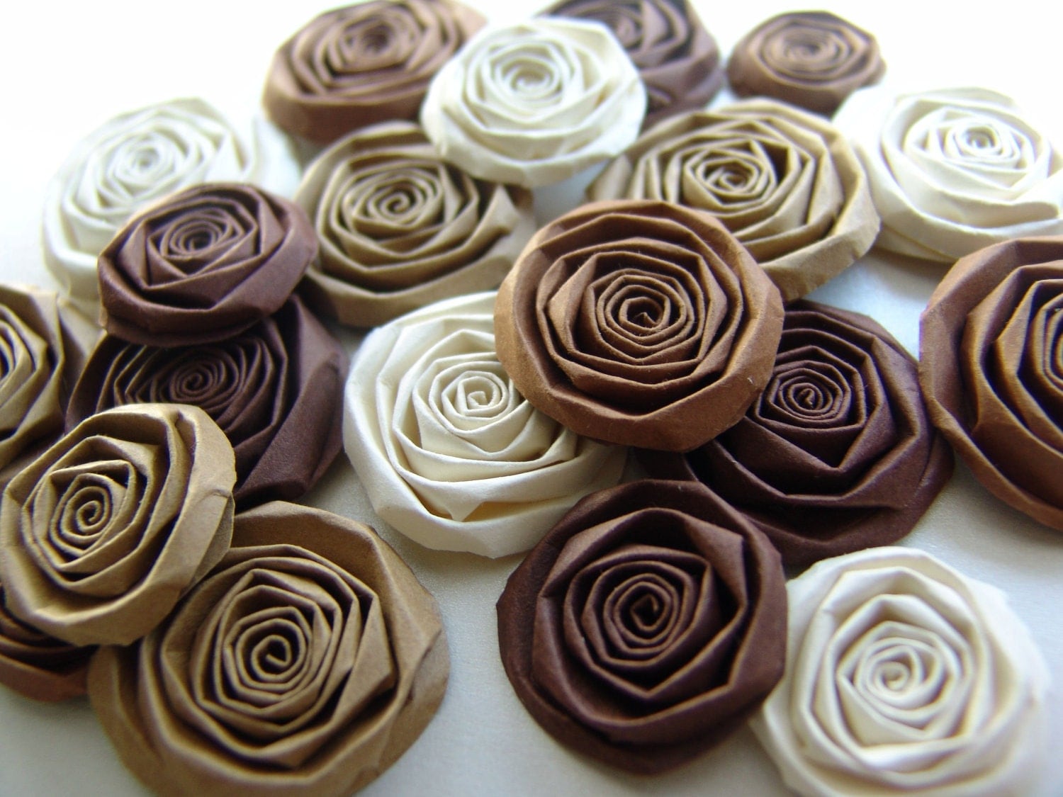
Examples of hand-made paper:


OUGD504: Secondary Research For Design For Print & Web
by Roxxie Blackham on Friday 13 December 2013
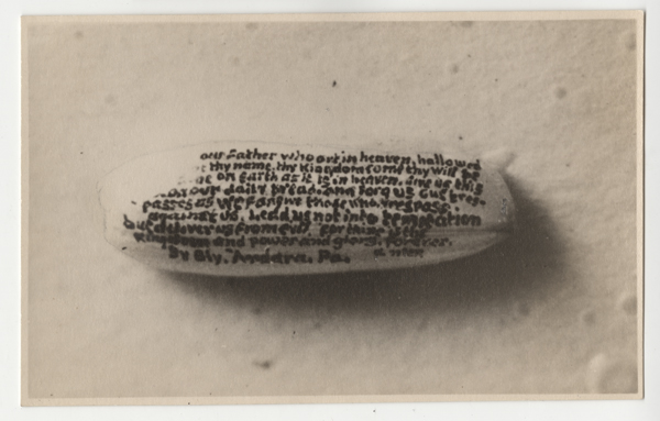
Micrographia
The description, study, drawing or photography of microscopic objects. The art or practice of writing in minute characters.
For example: writing on rice


Designing For Screen
Matt Tweddle & Dave Eccles
matthew@numikop.com
@numiko
numiko.com
Based in Leeds by the river
- Produce digital designs for product and entertainment sectors. Things that are useful and meaningful, not a waste of time.
- Work with Channel 4, BBC, Disney, Design Council, NHS, NSPCC, Water Aid, Cancer Research UK.
Common perceptions of digital design:
- Too many limitations
Limitations are disappearing, there is a lot more that you can do now than before (e.g. typography, responsive grids, scaling vector graphics (SVG), HTML5, canvas and open GL, connection speeds)
- Designers need to be able to code
Designers don't have to be able to code! Some understanding is undoubtedly useful, but you don't need tech understanding to get a job as a web designer! You will pick stuff up along the way.
- Designing websites all the time must get boring
Constantly evolving technologies, so that means there are more and more exciting things to do all the time. Hose of new exciting challenges.
- Web designers lack all understanding of design principles
We take design seriously.
- You need to move to London to work on high profile projects
Leeds, Leeds, Leeds...
Nesta...
A charity partnered by various tech companies like Mozilla. Campaign is to get kids aged 6-18 into digital making.
Came up with the name, logo and overall brand - "Make Things Do Stuff"
Created a typeface based on the gestural movements you do when using touch-screens.
Animated characters used on the website to bring it to life and target the audience.
http://makethingsdostuff.co.uk
Considered the mobile experience and how it works on a small screen.
Water Aid...
A vision of everyone in the world having access to clean water.
Created a gifting platform for them. You would gift a digital story for £15.
'Wahoo' - Give water, save lives.
Use of illustration to tell the story and make the site compelling.
Lewis Hamilton...
Wanted the best website on the entire internet.
Use of interesting grids and layout.
Timeline of Lewis Hamilton's life.
Use of social networking sites to update the content of the information automatically.
Bespoke design.
Use of iconography.
The National Lottery...
The National Lottery - Good Causes Website - original website needed redesigning.
Custom typeface - hand drawn, then converted to a typeface to be used on the web.
Iconography and visual language.
Office for National Statistics...
Infographic aimed at college students deciding on whether to go to university or not.
Simple, geometric and straight out of illustrator
Channel 4...
The Spirit of 45 documentary
Different layout to typical website - full screen experience
Engaging and emotive
IPTV...
Example of how we don't just design websites when designing for screen. This was designed for Samsung TV.
Takes place over the top of live footage
Film 4...
30th year celebration - talent search for people to recreate the best moments of Film 4
BBC...
Primary School website
GEL - challenge to bring it to life as they limit your grids and area to work within
Design Council...
Discover-Define-Design-Develop-Deploy
Discover
What the clients want, who they are, what we want them to do, what do they need, research
Define
Take all the insight and make sense of it - exactly what you're going to design
Develop
Making and coding it
Deploy
Making it live
Understanding Audiences
- Who they are
- What they need
- To understand their digital lives
- To understand YOUR organisational needs from a digital platform
- To ensure we're answering the right questions throughout the project
"There's nothing more dangerous than the right answer to the wrong question" - Peter Drucker
Conducted various surveys, workshops and spent 2 weeks talking to various people to answer all the questions. 49 audience types, 8 groups.
Developed personas for each group - fictional but pretty understandable person that you can image that you are designing for.
This resulted in 180 user stories.
After that process, a creative brief is produced.
Clear-Flexible-Simple-Creative
User-centred
Avoid extraneous detour and interface debris
Mobile First
Adopt a Mobile First philosophy to prioritise what is important for the business and audience
Device Agnostic
Optimised for any screen size
Guiding Principles
Focus on content
Reduce interface debris and focus on the delivery of content
Make it simple
Functionality should be designed to be entirely intuitive and obvious
Embrace less is more
Strive to achieve the same functionality through as few visual elements as possible without sacrificing clarity
Be consistent
Use consistent design patterns to reduce user thinking time
Consider context
Design patters as fluid elements that can adapt for all screen size
Be bold & confident
Use big imagery and typography to convey messages
Iterate based on feedback
User test wireframes, designs and front-end development
Wireframing
Refine the wireframes. Collaborative process.
Establish what's important, what needs to be on the page.
Not designed to lock designers down.
Created new iconography for consistency in colours - make it more functional, less bright.
Currently at the point where they're designing for in the browser and testing - launching site in January.
Why we want Graphic Designers:
- Typography is king online, just as it is offline
- A knowledge and understanding of brand design
- Unique layouts and concepts
- Iconography
- Illustration
- Infographics and visualisations