First of all, I thought I'd look into the plot for the film, as I've never heard of it and wanted a bit of insight into what happens.
I had a look online for the plot, which was as follows:
David Locke (Jack Nicholson) is a television journalist making a documentary film on post-colonial Africa. To finish the film, he is in theSahara desert seeking to meet with and interview rebel fighters involved in Chad's civil war. Struggling to find rebels to interview, he is frustrated when his Land Rover gets hopelessly stuck on a sand dune. After a long walk through the desert back to his hotel, a thoroughly glum Locke learns that an Englishman, Robertson (Charles Mulvehill), who has also been staying there and with whom he had struck up a friendship, has died overnight at the hotel.
Locke decides to switch identities with Robertson; he is tired of his work, his marriage and his life, and sees an opportunity for a fresh start. Posing as Robertson, Locke reports his own death (Locke) at the front desk, where the hotel manager mistakes Locke for Robertson, and the plan goes off without a hitch.
In London, Locke's wife Rachel (Jenny Runacre) has been having an affair. She feels guilt-ridden and torn when she is informed of her husband's death. She approaches Locke's friend, Martin (Ian Hendry), a producer at the BBC, in an attempt to get in touch with Robertson so that she may learn more about her husband's last days. Meanwhile "Robertson" (Locke) has flown off to Europe with the dead man's belongings, including his appointment book.
Locke soon learns that Robertson was gunrunning for the rebels whom, as a reporter, Locke been trying to contact in the desert. When he goes to check out an airport locker listed in Robertson's diary, Locke is tracked down by the rebels' point man in Europe. He is there to complete the weapons sale. Since neither man has ever seen the other before, Locke escapes the meeting without being discovered He takes the cash left in the locker as the first down-payment for the arms deal Robertson had set up before his death.
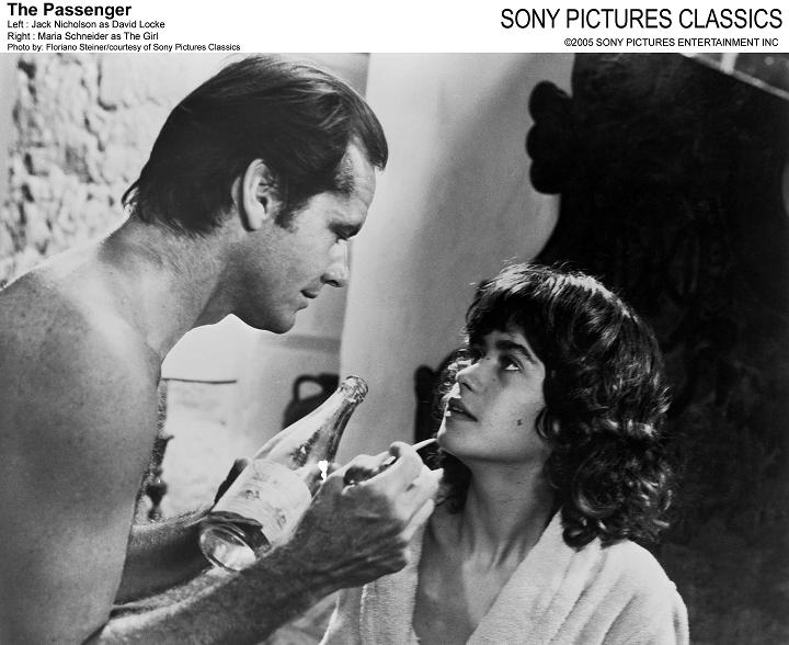
Later Locke accidentally spots Martin on a street in Barcelona, as the latter tries to track Robertson down on behalf of Rachel. Locke backtracks and at this point bumps into an architecture student (Maria Schneider) while trying to hide nearby. He asks The Girl to fetch his belongings so he won't be seen at his hotel, where Martin has apparently camped out in order to catch up with "Robertson". She sneaks past Martin, and leaves with Locke as he drives off from Barcelona. They become lovers. While trying to explain his recent behavior, Locke confesses that he has stolen a dead man's identity.
Locke is flush with cash from the down payment on the arms he cannot deliver, but is drawn to keep the meetings listed in Robertson's book. In the meantime, Rachel has received Locke's belongings, which were returned from Africa. Having heard from Martin of his unsuccessful chase of the elusive "Robertson", Rachel receives a shock when she opens Locke's passport, only to discover the photo of Robertson pasted inside. She now realizes why "Robertson" was so elusive, and heads off to Spain to track down Locke.
Locke begins fleeing from the Spanish police, whom Rachel has brought in on the search for Robertson. The Girl is loyal and helps him evade them, providing rational advice. Locke sends the Girl away on a bus, with a grim story of a blind man who regains his sight only to commit suicide, saying he'll meet her later in Tangiers later.
The thugs catch up with him at the Hotel de la Gloria [2] in the Spanish town of Osuna, province of Seville. The assassination takes place off screen in a seven-minute long take-tracking shot which begins in a hotel room, travels out into a dusty parking area and tracks back into the hotel room.[3] The police and both women find Locke motionless in bed. His wife Rachel says she "never knew" the dead man, while the Girl identifies him as Robertson.
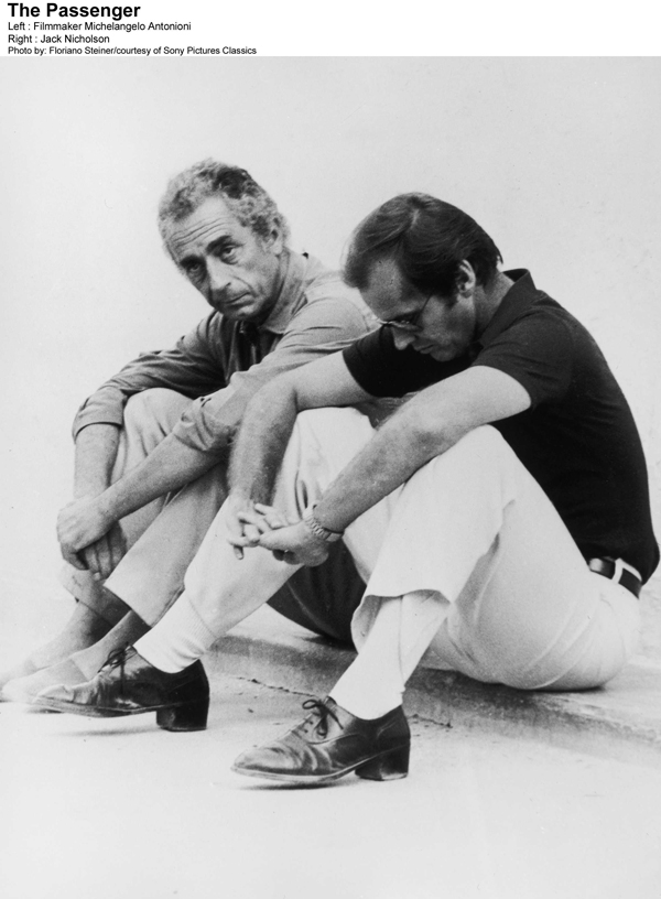
Jack Nicholson as David Locke

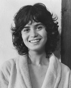
Maria Schneider as The Girl
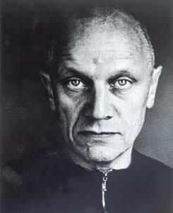
Steven Berkoff as Stephen
Ian Hendry as Martin Knight

Jenny Runacre as Rachel Locke

Ambroise Bia as Achebe

Charles Mulvehill as David Robertson

✿✿✿✿✿✿✿✿✿✿✿✿✿✿✿✿✿✿✿✿✿✿✿✿✿✿✿✿
Thinking about the fact that we're designing a film poster, I thought about looking into existing posters for The Passenger...
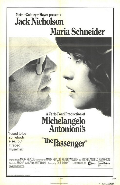
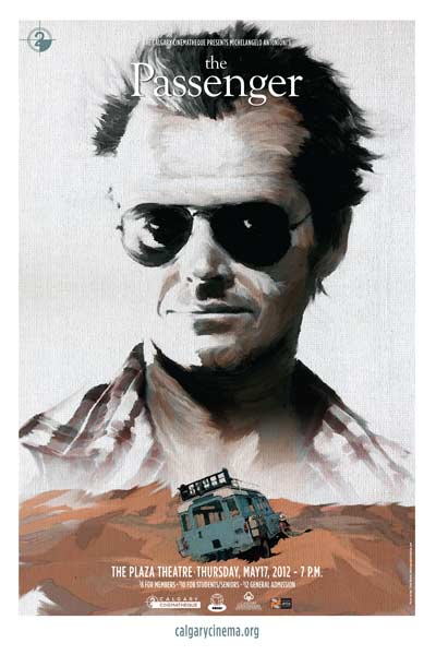
I couldn't really find that many posters for the film - there were only a few alternative posters, as they seemed to have a strong image used for their advertisement at the time, and it seems to remain barely touched or changed.
The original poster for the movie was featured in landscape format, however they also created portrait versions for flexibility and a slight change in layout.
I really like the original posters, due to the simplicity of the composition and featured images. It's quite an interesting poster to look at, as you don't quite know what the film is going to be like from the poster - it's down to the viewers perception, which is similar to the film.
More recently, the poster was remade to advertise the film being screened again as a 'return'. The poster used for the return of the film was pretty much the same as the original, however it featured slight changes, for example the quotes by critics and the main image used looks slightly modified.

I found a few other posters for The Passenger, designed in different styles to the original..
I thought that this poster was quite weird, as it made it look like a bit of a horror movie, through the choice of typography, composition and colours.

The poster was quite different when designed for other languages. Even the title of the movie changed to "The Reporter" or "Profession: Reporter"..


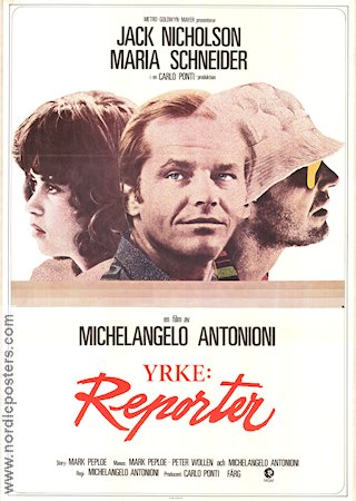
I noticed that most of the posters that were created for the film were highly photographic. They often looked like film stills or photos taken during the filming, and they focussed on the main characters within the posters.

I thought that this poster was a bit too much, and made it seem as though the whole film was about a man journeying across the dessert. I think that using a giant portrait of Jack Nicholson's head makes it look a bit like a book cover, especially with the sketchy style to the image.
I didn't really like the following poster either, as it made the film seem a lot cheaper and less serious that it was! However, the photos that they used were quite iconic and helped to make Jack Nicholson look insane and like he was falling apart.

I really like the simplicity of a lot of the posters - I especially like the posters that feature huge imagery from the films (the sony classics posters) and a small amount of text at the top of the page. I think that when I come to designing my poster for the film, imagery is going to have to play a huge part in it to make it visual.. I don't think you could portray insanity through typography alone..
✿✿✿✿✿✿✿✿✿✿✿✿✿✿✿✿✿✿✿✿✿✿✿✿✿✿✿✿
Seeing as we're going to submit our posters to this website, I decided to have a look at existing posters on there for classic films..
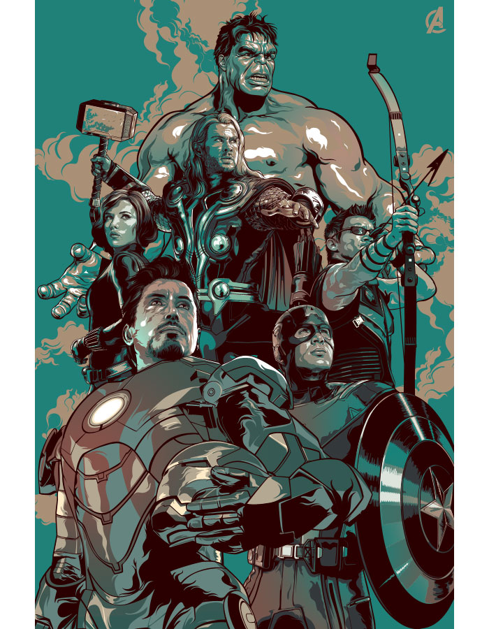
The Avengers
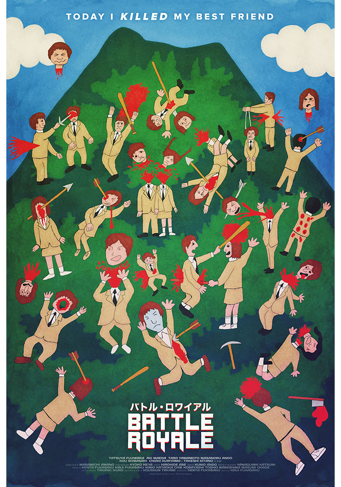
Battle Royale
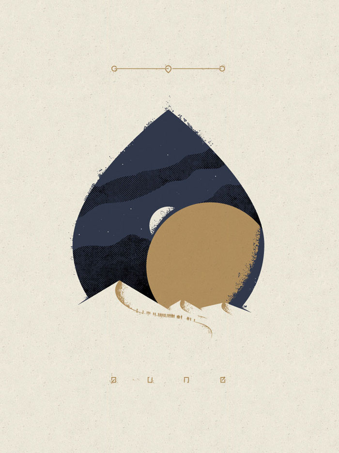
Dune
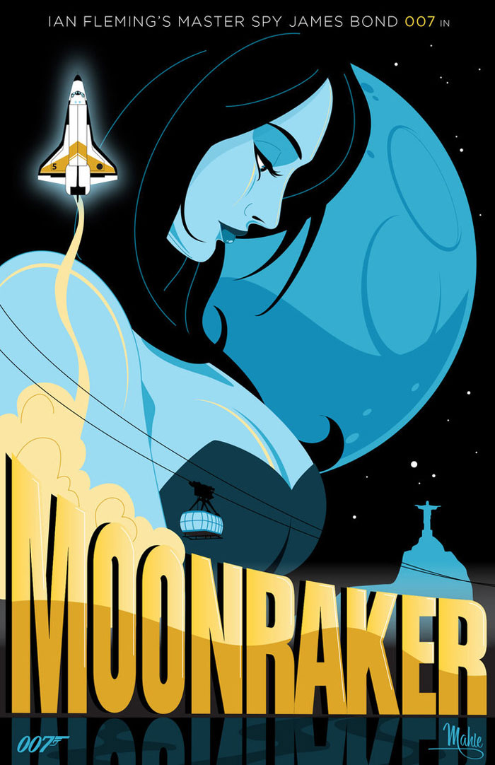
Moonraker
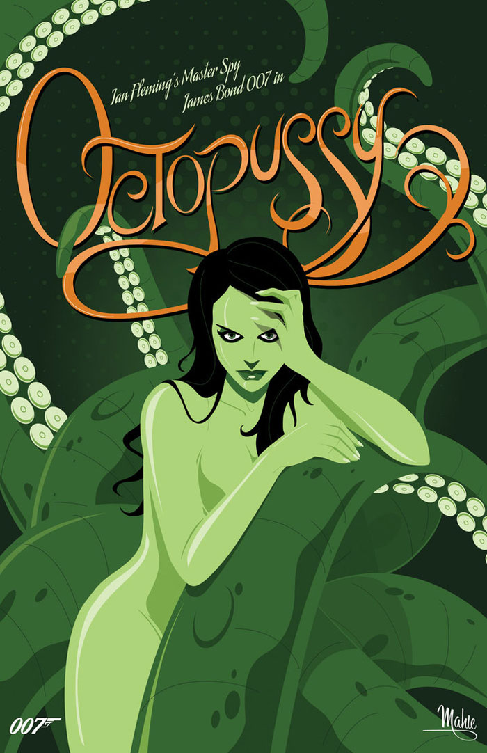
Octopussy
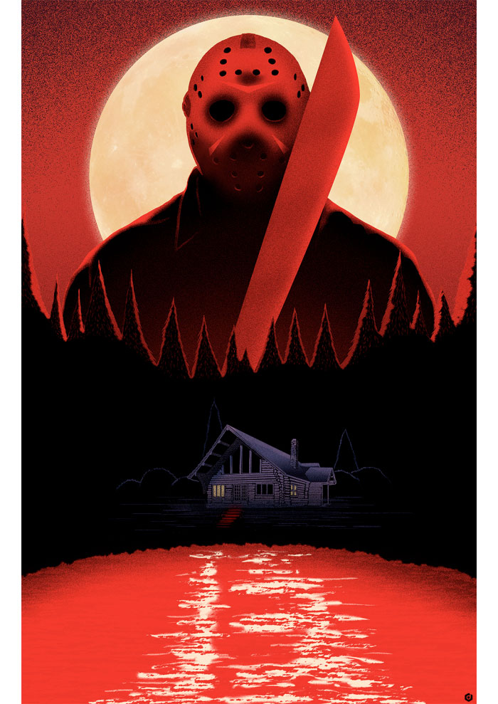
Friday 13th
I noticed that a lot of the posters featured on alternativemovieposters.com are highly illustrated and vector image based.
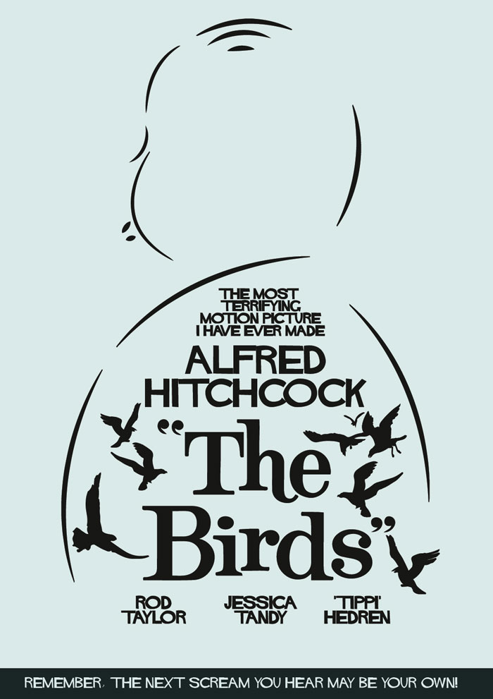
The only poster I found that was more typographic was the following:
The Birds
Trailer For The Film:
- Leave your comment • Category: brief 3 (505), OUGD505
- Share on Twitter, Facebook, Delicious, Digg, Reddit
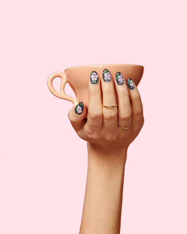
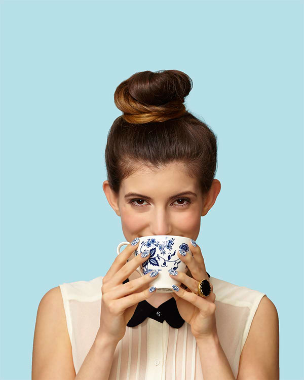
Yardstick Coffee
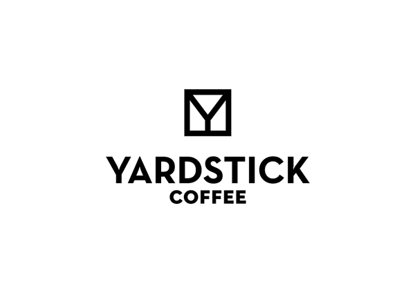
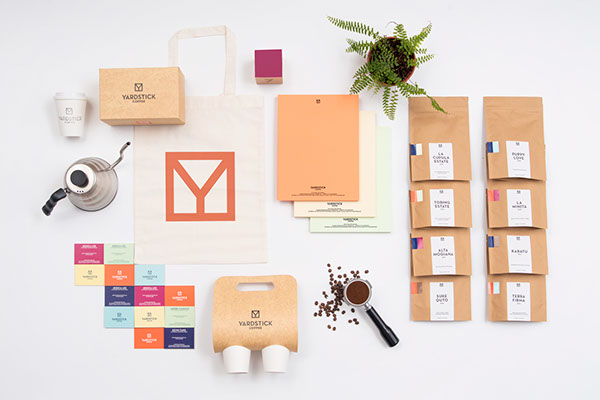
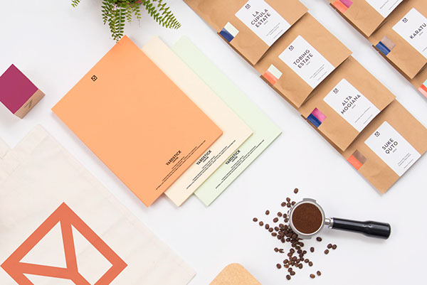
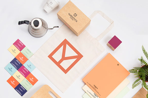
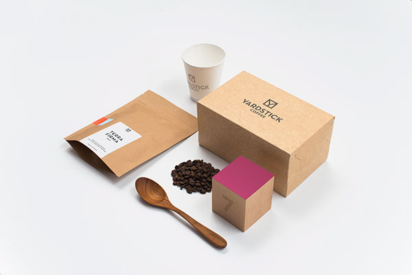
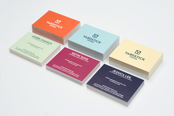
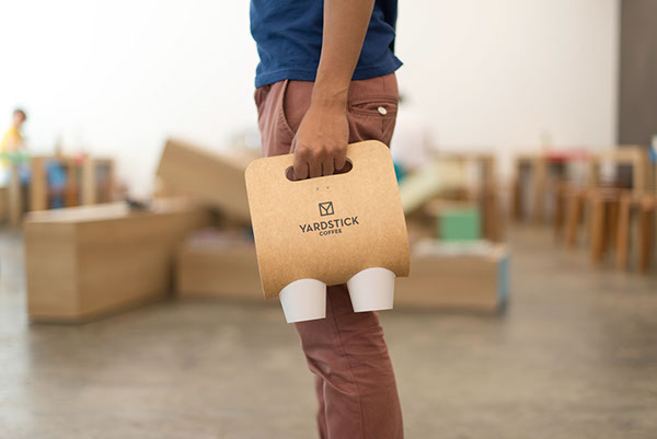
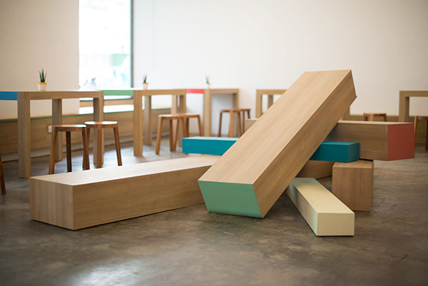
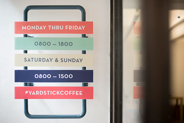
I think that the branding for Yardstick Coffee is extremely well thought out, across all areas of the coffee shop. The brand's identity is consistent - the use of pastel colours and a simplistic feel is seen across the board, which creates continuity. I really love how the designer has even thought about the interior of the coffee shop and considered how the tables and chairs will fit into the brand. I think that the products are photographed in a way that shows off the designs, and shows how all the products are interlinked.
Smutje - Fisch am Eck
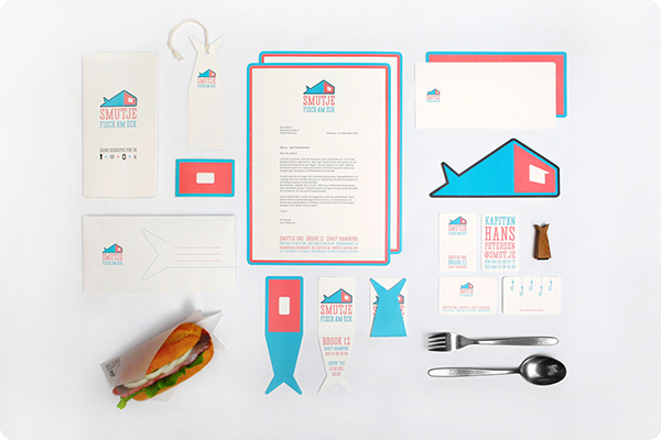
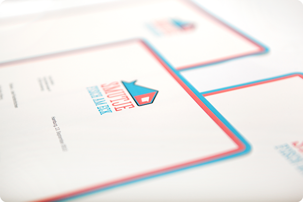
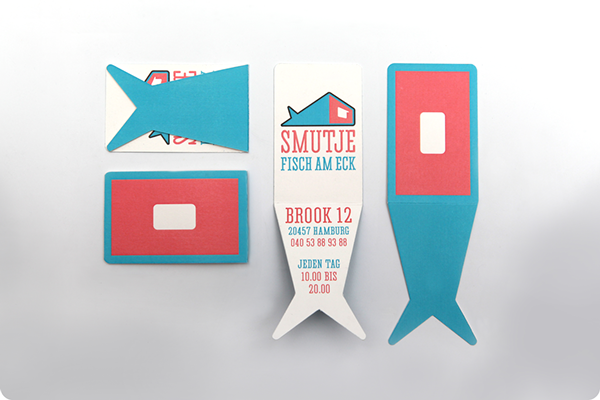
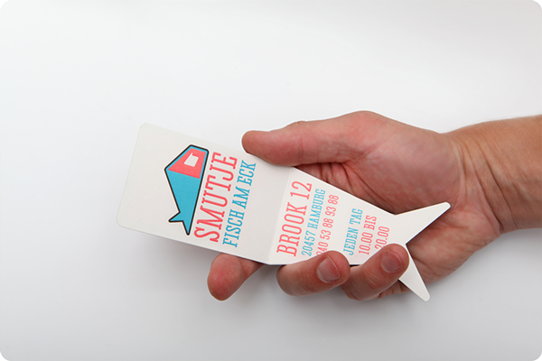
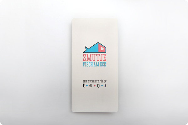
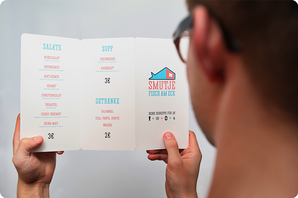
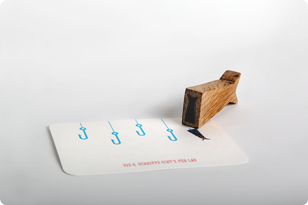
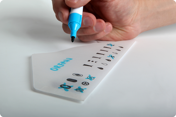
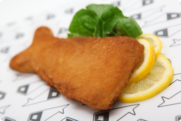
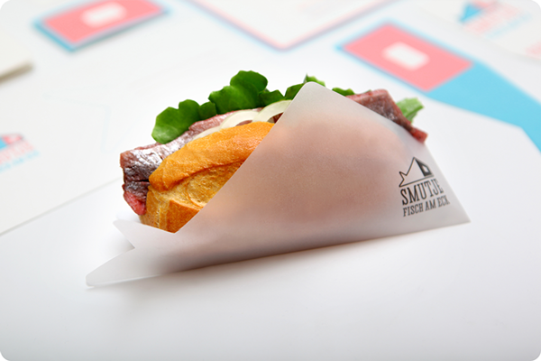
What I really liked about Smutje's brand was the way that they incorporated the fish shape across all sorts of products - from stamps to the food itself. They really considered how they could drill their brand into your head so that you remembered their logo and what they were about. The colour choices are a little bit strange for a fish sandwich shop, but the colour compliment one another so it works well across the range of products. The fish shaped business cards are interesting, as they've decided to break the normal shape of a business card and make it a bit quirky and memorable.
Hosh Mariam
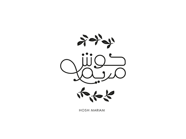


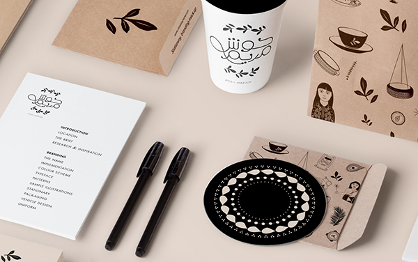


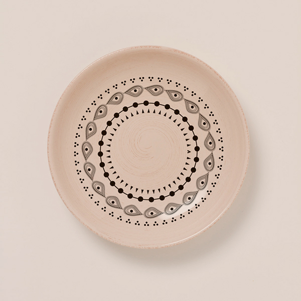

When viewing the Hosh Miriam branding, I noticed that the designer had thought about everything when it comes to a restaurant, even down to the patterns on the dishes, and the signage outside of the restaurant itself. I quite liked how the brand used limited colours, and concentrated on stock or surfaces that were a brown colour to add colour to their products and prints. The interior of the restaurant works really well with the organic-esque branding qualities.
Yakuza
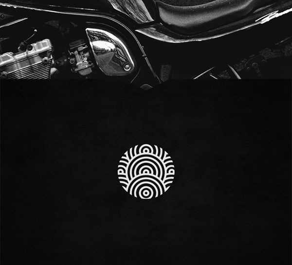
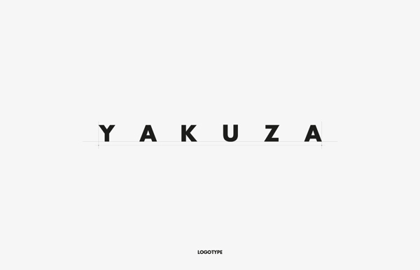
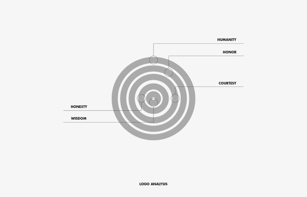

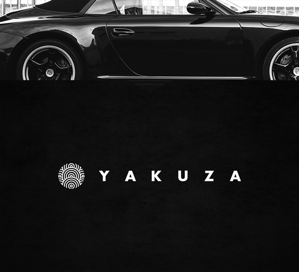
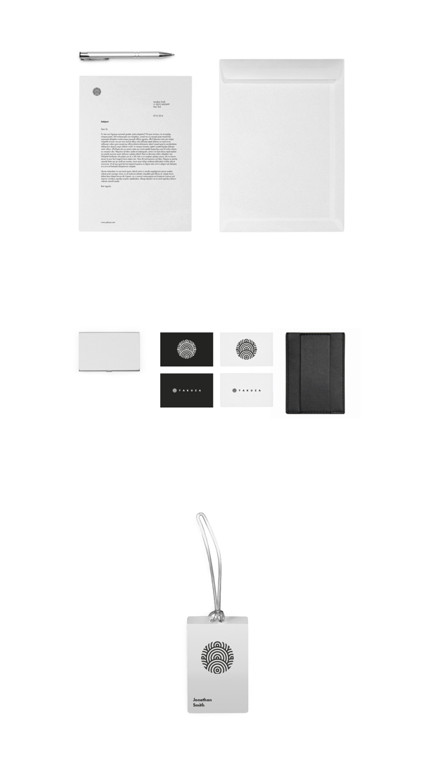
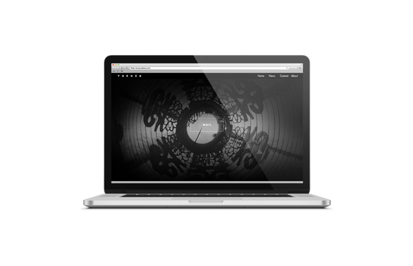
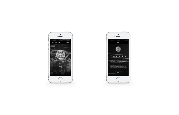
I thought that Yakuza was branded well, as they showcased various ways that they developed through their ideas to create their logo, and how it represents the company and their honour as a private security firm. It was also interesting to see how the brand worked online, through the use of macbook and iPhone mock-ups, showcasing their website and how it responds across different technology.
Vesuvio
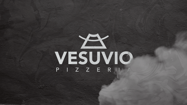
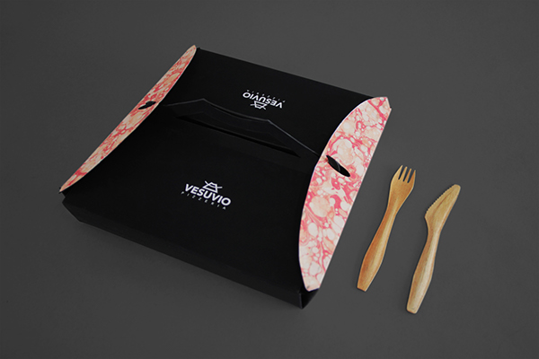
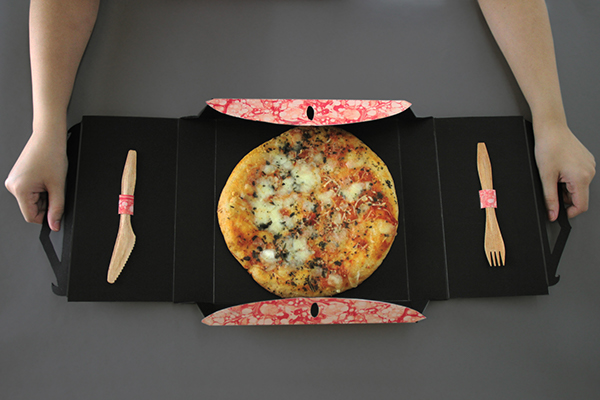
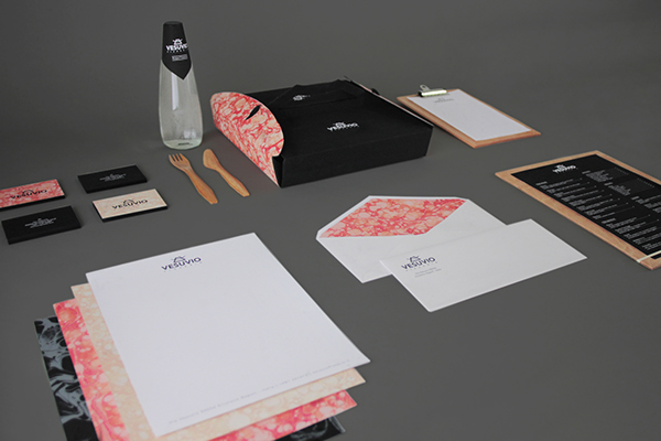
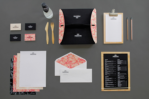
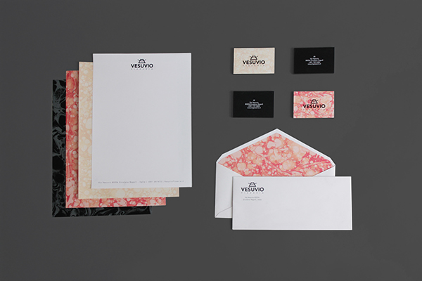
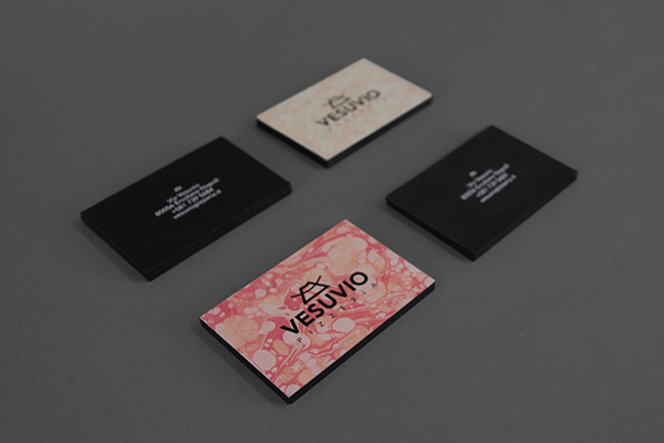
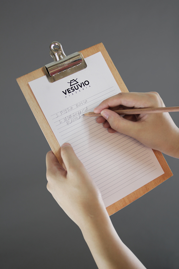
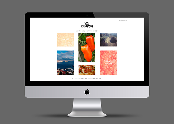
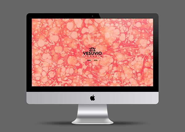
The brief was set as part of a university module, where they were asked to create packaging for a takeaway of their choice, but this student decided to take theirs further and create an entire brand, rather than just producing packaging. I really loved the marble effect that they created, as it looks like lava as well as pizza toppings, which relates to their concept behind the brand (great tasting tomatoes come from the soil of Mount Vesuvius, hence the name Vesuvio, hence the lava). I also love the idea of creating a GIF to showcase their logo with smoke moving in front of it, as if it was near the volcano. I think that they've really thought about products that this takeaway would need, even down to using a chalkboard menu, rather than your ordinary paper one.
Massproductions
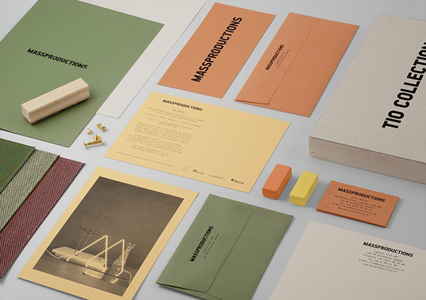
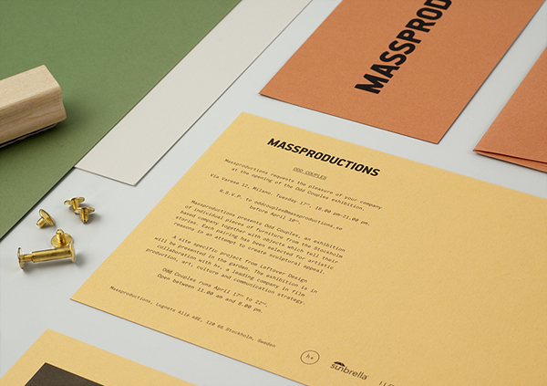
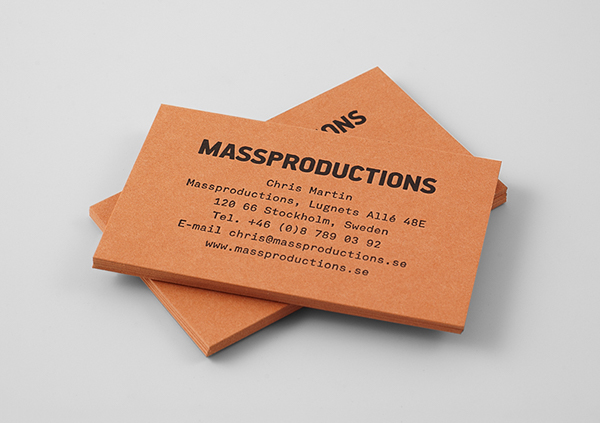
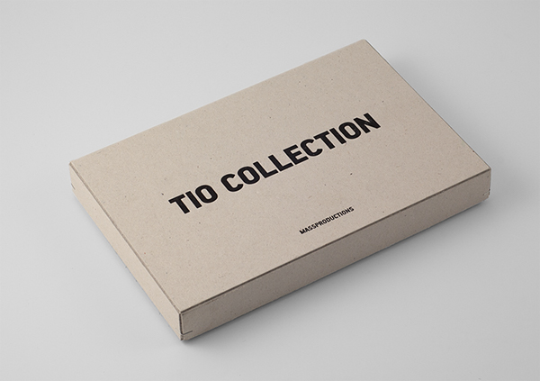
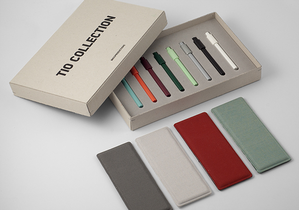

I quite like the overall simplicity of this brand, and how the colours used have derived from stocks and materials used for the products. I quite like the use of various dull colours, as it looks quite different to usual, and bring the designs together to create continuity. I think that the finish of the products has been well considered, and the use of embossing really adds to the tags.
Golden Leaf


Even though all of the designs are consistent, the designer has only really considered the stationery range, and how the brand will be reflected across these. However, I think that the use of double sided letterheads and business cards adds elegance, and the pattern choice creates a memorable design. I think that it could look nicer using gold foiling, to make the colours stand out on the page a bit more and add a sense of sophistication and expense.
Kocostar Nail & Foot Therapy
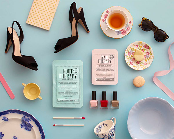
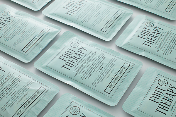
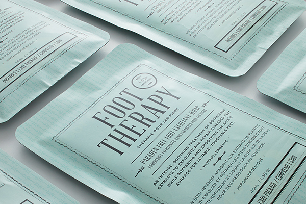
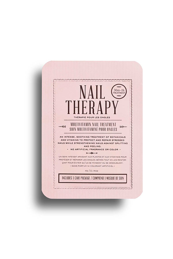
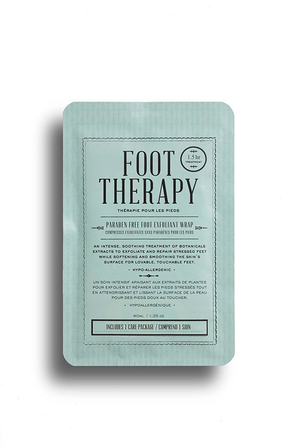

I really like the colour choice for this nail therapy brand. Although it doesn't really look like they've got much of a brand going on, I think that the use of photography works really well and adds some extra personality to the brand.
Avril


I think that this brand is very girly, but I think that the logo is really clever, as at first glance you wouldn't notice the A inside of the flower - a bit like the Fedex logo, with a hidden image within the logo. I quite like the colour scheme, and how everything incorporates their flowery pattern, bringing all the products together to create a whole feel of the brand. However, I feel that more products could have been explored.
Mylene Poisson Sommeliere
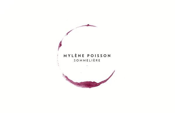
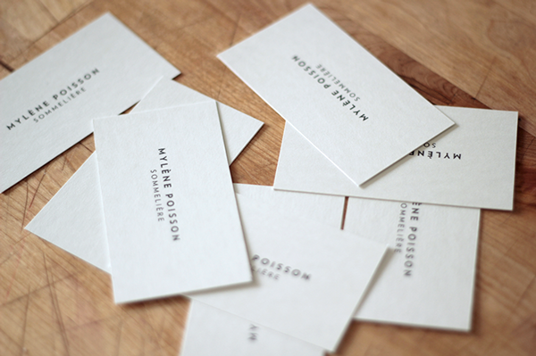
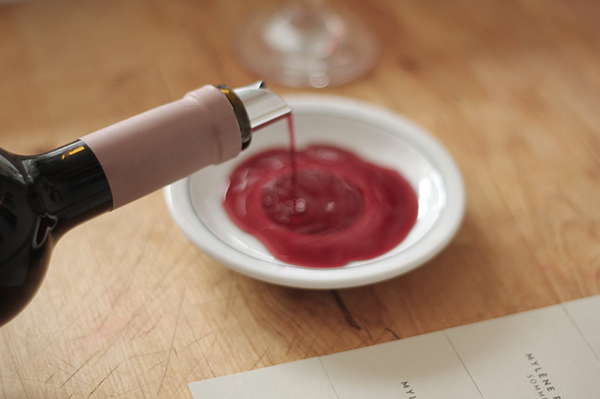
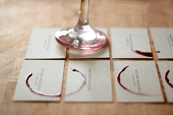
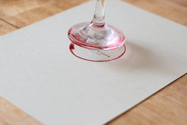
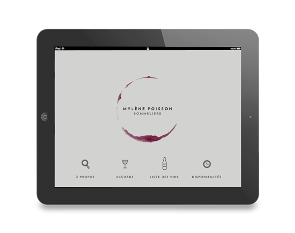
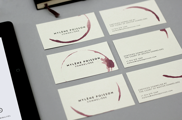
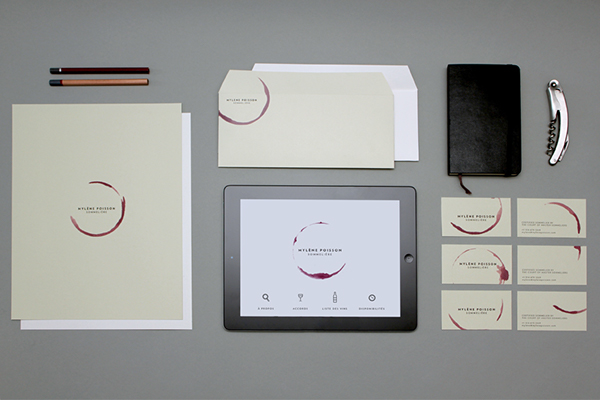
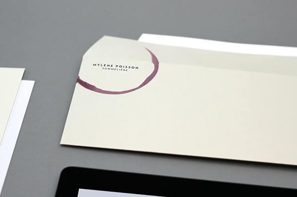
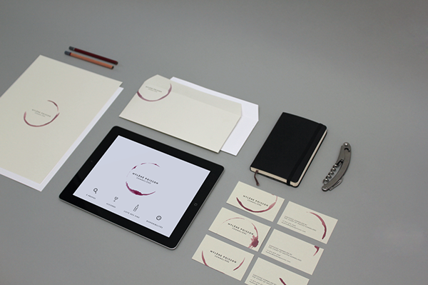
I really liked how the logo was created by hand using the bottom of a wine glass, so that it was authentic. This also meant that every time the logo was applied, it was different which added personality and individuality to the designs.
- Leave your comment • Category: brief 2 (505), OUGD505
- Share on Twitter, Facebook, Delicious, Digg, Reddit