GROUP 4
➟ COMMUNICATION SKILLS
↳symbolism
↳social networking
↳struggling with social situations (disabilities, autism, etc)
↳mute, deaf, blind
↪will affect communication skills
↳languages
↳expressions and gestures
↳body language
↳signage
↪universal language
↳info-graphics
↳branding
∴∴∴∴∴∴∴∴∴∴∴∴∴∴∴∴∴∴∴∴∴∴∴∴∴∴∴∴∴∴∴∴∴∴∴∴∴∴∴∴∴∴∴∴∴∴∴∴∴∴∴∴∴∴∴∴∴∴∴∴∴∴∴∴∴∴∴∴∴∴∴∴∴∴∴∴∴∴∴∴∴∴∴∴∴∴∴∴
My Theme Within Communication:
Expressions, Gestures & Body Language

Dictionary Definition of Expression:
1. The process of making known one's thoughts or feelings.
2. The conveying of opinions publicly without interference by the government: "freedom of expression".
Dictionary Definition of Gesture:
noun: A movement of part of the body, especially a hand or the head, to express an idea or meaning: "so much is conveyed by gesture".
verb: make a gesture: "she gestured meaningfully with the pistol".
Dictionary Definition of Body Language:
noun: The process of communicating non-verbally through conscious or unconscious gestures and movements.
∴∴∴∴∴∴∴∴∴∴∴∴∴∴∴∴∴∴∴∴∴∴∴∴∴∴∴∴∴∴∴∴∴∴∴∴∴∴∴∴∴∴∴∴∴∴∴∴∴∴∴∴∴∴∴∴∴∴∴∴∴∴∴∴∴∴∴∴∴∴∴∴∴∴∴∴∴∴∴∴∴∴∴∴∴∴∴∴
Different Body Language Can Be Perceived As:
- confidence
- awkwardness
- shyness
- comfortability
- relationships
- confrontational
- joyfulness
- embarrassed
- knackered/tired
- stressed
- superiority
- intoxication
- boredom
- attentiveness
- pleasure
- relaxed state
- guilt
- relief
Body Language Consists Of:
- body posture
- gestures
- facial expressions
- eye movements

∴∴∴∴∴∴∴∴∴∴∴∴∴∴∴∴∴∴∴∴∴∴∴∴∴∴∴∴∴∴∴∴∴∴∴∴∴∴∴∴∴∴∴∴∴∴∴∴∴∴∴∴∴∴∴∴∴∴∴∴∴∴∴∴∴∴∴∴∴∴∴∴∴∴∴∴∴∴∴∴∴∴∴∴∴∴∴∴
What Defines An Expression:
- mouth
- eyes
- forehead
- voice
- nose
- creases/wrinkles
- eyebrows
- cheeks
- eye contact
Forms Of (Facial) Expressions:
- happy
- sad
- angry
- confused
- worried
- shy
- gormless
- scared
- overjoyed
- embarrassed
- tired
- arrogance
- confidence
- relaxed

∴∴∴∴∴∴∴∴∴∴∴∴∴∴∴∴∴∴∴∴∴∴∴∴∴∴∴∴∴∴∴∴∴∴∴∴∴∴∴∴∴∴∴∴∴∴∴∴∴∴∴∴∴∴∴∴∴∴∴∴∴∴∴∴∴∴∴∴∴∴∴∴∴∴∴∴∴∴∴∴∴∴∴∴∴∴∴∴
Forms Of Gestures:
- friendly (handshakes, greetings, smiling, etc)
- loving (hugs, kisses, embracing, etc)
- caring (hugs, gifts, holding, mothering, etc)
- mean/uncaring (shoving, hurting, ignoring, etc)
- angry (shouting, grabbing, biting, etc)
- hand/body gestures
- movement
- eye contact

James Borg states that human communication consists of 93% body language and paralinguistic cues, while only 7% of communication consists of the words themselves.
Ray Birdwhistell (anthropologist) pioneered the original study of non-verbal communication - what he called kinesics. He estimated that we can make and recognise around 250,000 facial expressions.
Paralanguage
Paralanguage refers to the non-verbal elements of communication used to modify meaning and convey emotion. Paralanguage may be expressed consciously or unconsciously, and it includes the pitch, volume, and, in some cases, intonation (the variation of pitch while speaking which is not used to distinguish words) of speech. Sometimes the definition is restricted to vocally-produced sounds. The study is known as paralinguistics.
Kinesics
Kinesics is the interpretation of body language, such as facial expressions and gestures - or more formally, non-verbal behaviour related to movement, either of any part of the body or the body as a whole.
Non-verbal communication strengthens a first impression in common situations, like attracting a partner or in a business interview. "You have less than 10 seconds and realistically close to 4 seconds to make a good first impression on those whom you come in contact" - Hogan, K & Stubbs, R (2003) 'Can't Get Through 8 Barriers to Communication'.
The first scientific study of non-verbal communication was Charles Darwin's book 'The Expression of the Emotions in Man and Animals'. He argued that all mammals reliably show emotion in their faces.
∴∴∴∴∴∴∴∴∴∴∴∴∴∴∴∴∴∴∴∴∴∴∴∴∴∴∴∴∴∴∴∴∴∴∴∴∴∴∴∴∴∴∴∴∴∴∴∴∴∴∴∴∴∴∴∴∴∴∴∴∴∴∴∴∴∴∴∴∴∴∴∴∴∴∴∴∴∴∴∴∴∴∴∴∴∴∴∴
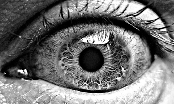
I created a questionnaire and gave it out amongst fellow students to gain some results on how easily people distinguish the difference between various emotions, through the use of the whole face, and then I concentrated just on the eyes to see if people found this more difficult or not.
My results are as follows:
Sadness 12/12
Happiness 10/12
Confusion 2/12
Anger 12/12
Confidence 3/12
Shyness 4/12
Happiness 6/12
Worried 2/12
Anger 12/12
Sadness 11/12
Confusion 4/12
Awkwardness 0/12
Scared 2/12
The easiest emotions to distinguish were:
- sadness (average score of: 11.5/12)
- happiness (average score of: 8/12)
- anger (average score of: 12/12)
I think that these are the most recognisable emotions, because the way the faces are used to form each emotion is extremely expressive and you tend to look at the way the eyebrows change, the nose creases, and the mouth moves.
The most difficult emotions to distinguish were:
- awkwardness (average score of: 0/12)
- confusion (average score of: 3/12)
- worried (average score of: 1/12)
- scared (average score of: 1/12)
- confidence (average score of: 1.5/12)
- shyness (average score of: 2/12)
I think that it's harder to distinguish the other emotions, because faces and expressions that aren't as frequently used as happiness, sadness and anger are less recognisable to read into as everyone would have had different personal experiences with each expression.
It is quite hard to determine someone's feelings just by how they use the muscles in their face, especially if they don't tend to show a stereotypical form of the emotion.
I think to make the results fairer and more reliable, I would need to gather more results from males rather than only gathering 3/10 males to take part (in comparison the the 9/10 females that engaged in the questionnaire), as males and females tend to judge expressions and body language differently.
With the information that I gathered, I produced a bar chart to help convey it easily for in my crit...

∴∴∴∴∴∴∴∴∴∴∴∴∴∴∴∴∴∴∴∴∴∴∴∴∴∴∴∴∴∴∴∴∴∴∴∴∴∴∴∴∴∴∴∴∴∴∴∴∴∴∴∴∴∴∴∴∴∴∴∴∴∴∴∴∴∴∴∴∴∴∴∴∴∴∴∴∴∴∴∴∴∴∴∴∴∴∴∴
After the group crit on Friday, we were given a new brief to work on in a group or on our own. Our topic was: How to get people to communicate via talking.
PRIMARY RESEARCH:


HOW I'M GOING TO CARRY MY RESEARCH FORWARD:

- When considering readability, distance comes into consideration.
- Block fonts are design for headlines.
- Script fonts are designed to work at a certain font size. If they are used too small, they merge together and when too large, they merge apart.
- Too decorative.
- Counters are not easily defined.
- Italicising gothic fonts can often control the dynamics of how things move and makes it easier and quicker to read.
- The most unreadable way of working with type is using only uppercase letters.
- Known fact that lowercase is much more readable.
- Comes back to the fact that what we're reading are the negative spaces and shapes around the letters.
- Gothic fonts work best at small scales as that is what they were designed for. As soon as you want to make the point size bigger, you will turn it into a block font as it will need to be bolder.
Readability & Legibility Task Can Be Found Here:
http://r-blackham1215-dp.blogspot.co.uk/2012/11/ougd404-what-is-visual-literacy-task.html
My 3 Rules of Aesthetics are:
- The resolution of the image must be high quality, ie not pixelated/executed badly.
- The colour choice should complement the design choice.
- Typography must be appropriate to it's use.


- Leave your comment • Category: OUGD401, studiotask2
- Share on Twitter, Facebook, Delicious, Digg, Reddit
Both legibility and readability hinge on the idea of the anatomy and spacial elements of Typography.
Leading: The amount of lead they put between each letterform to create space.
- The spaces around the letterforms is the one thing that will affect the ability of what we're trying to read (the counter).
- Strong way of allowing us to identify certain letterforms.
- Idea of fonts themselves being used for certain functions: some being more legible than others.
- Be aware that some people find Roman body copy easier to read
- Where as others find Gothic body copy easier to read.
- Dyslexics often find Roman easier to read.
- When you increase the size of Block, Gothic and Script fonts, it becomes easier to read. However, when you increase the size of Roman body copy, it becomes harder to read.
- Block/bold type needs spacing to increase the legibility.
- Never play with body copy spacing as it has been set to a certain scale for ultimate legibility.
Legibility
Legibility is the degree to which glyphs (individual characters) in text are understandable or recognisable based on appearance. This is based very much on the anatomical elements.
Readability
Readability is the ease in which text can be read and understood. It is influenced by line length, primary and secondary leading, justification, typestyle, kerning, tracking, point size, etc.
Tracking
Tracking starts to pull the letters along their base line and create more space, for example:

You can use a lot of fonts within one typeface and keep some cohesion and legibility. However, DON'T USE MORE THAN 3 FONTS.
- Each typeface on a root level is based on character and drawing.
"Type is speech made visible"
- Through the process of the Industrial Revolution, there became a need for people to read.
- Less story tellers and town criers.
- Oral tradition had accents and emphasis. Lots of different oral dynamics.
- There was still a need for these verbal dynamics to be brought through into Typography.
- Different characteristics of typefaces helped to do this.
- Everyone can read into different fonts int he same context, but find their characteristics either more/less suitable.
- Certain dynamic to italic fonts that lean you forwards and you start to assign movement to it even though the text is still static.
- The images used can often help you to understand the typeface and what they're communicating as it gives more context and reinforces what you're thinking.
VOCABULARY:
- font
- typeface
- font family
- weight
- stroke
- uppercase
- lower case
- tracking
- kerning
- serif
- sans serif
- script
- blackletter
- display
- monotype
- symbol
Typeface
A collection of characters, letters, numbers, symbols, punctuation, etc which have the same distinct design.
Font
The physical means used to create a typeface, be it computer code, lithographic form, metal or woodcut.
A full font allows you to work with the entire glyphs, accents, punctuation etc of the western language.
A font isn't just about letterforms, it's about all the alphanumerics and glyphs.
BLOCK Garamond Block
GOTHIC Garamond Gothic PUT THESE ALL TOGETHER AND YOU
ROMAN Garamond Roman HAVE A TYPEFACE.
SCRIPT Garamond Script
Some type families have the full range of these categories within it, where as some type families just fit within one visual category.
- Multipe weight of fonts together make a TYPEFACE.
- Starts to become important in a financial way (buying one font will cost less than an entire typeface).
- Bold fonts start to condense.
- The type family is the broader collection of type elements.
- Font family isn't as broad, much smaller collection.
ROMAN: Serif Fonts
GOTHIC: Stripped down, sans serif
BLOCK: Bold, used for headlines. Heavy, black stroke.
SCRIPT: Fluid, handwritten style. Curlesk terminals.
Arial has a round full stop, Helvetica has a square full stop : easiest way of distinguishing between the two.
- Type written into stone gave certain features in letterforms, e.g. serifs.
Sable
Oriental way of working with type.
Completely new characters and line.
Bone
Working with quills and ink.
Middle East script creating new characters because of the materials.
Wood
Significant move forward.
Fairly soft but rigid, so could create new weights and curves.
1450 The Guttenburg Bible.
Metal & Lead
Pourable, mouldable and castable.
Can play with scale and fine lines.
Silicone
First computers had silicone chips.
Digital age created new possibilities for typefaces.
Created a drive to create new fonts that look handmade but are digital (to create fonts that aren't just Helvetica etc)
Definitions of Typography:
- the art and technique of printing with movable type.
- the composition of printed material from movable type.
- the arrangement and appearance of printed matter.
- Claude Garamond creates Garamond 1500-1520.
1700-1800: Transitional period of type development.
- sudden development, because of industrial revolution
- creates the sudden ability to mass produce and for mass industry.
- enlightenment: people were wanting to communicate their knowledge on a mass scale.
- sudden publications of newspapers and books etc.
- people learnt to read on a mass scale so books etc were produced for people to access.
- Gill Sans designed in 1928 (Bauhaus period).
- Type driven by digital age (2000-now).
- Edward Fella: letters in America
- photographer and typographer.
CATEGORIES OF TYPE:
- serif
- sans serif
- black letter
- script
- italic
- multiple weights
- calligraphy
- handwritten
- bold
- thin
- thick
- decorative
- hand rendered
-------------------------------------------------------------------------------------------------------------------------
Method of Production Character of Letterform Anatomy of the Glyph
-------------------------------------------------------------------------------------------------------------------------
CLASSIC PRE INDUSTRIAL
STONE established, sophisticated, traditional, BOLD
commercial
SABEL rough, fast, fluid, gothic SERIF
BONE elegant, feminine, posh LIGHT
-------------------------------------------------------------------------------------------------------------------------
MODERN POST INDUSTRIAL
WOOD simple, formal, curved, modern REGULAR
LEAD fragile, rounded, bold, minimal WEIGHT
SILICONE geometric, dense, textured, simplistic STROKE
-------------------------------------------------------------------------------------------------------------------------
- All type has a special context.
- The x-height defines the form of the lower case.
- Anything that descends below the baseline defines the lower case.
- Very rare to find upper case letters descending below the base line.
POINT SIZE
1 point = 1/72 inches = 25.4/72mm = 0.3527mm
12 points = 1pica
TYPE ANATOMY

Stem
The sygnificant vertical or oblique stroke.
Serif
The right angled/oblique stroke at the end of any stroke.
Sans Serif
Without a serif (French).
Bowl
The rounded form that describes a counter. The bowl may be open or closed.
Counter
Negative space between the letterforms.
Terminal
Point where the letter/serif ends.
Descender
Anything below the base line.
Ascender
Anything above the x-height.

Find 5x examples of modernist work and 5x examples of postmodernist work - why does it fall under that category? is it successful/unsuccessful and why? what's your opinion on the examples, and justify.
Modernist Graphic Design Work

Source For Image
This piece of design work falls under the Modernist category, because of the obvious structure that follows rules created by the Bauhaus and Modernism Movement. "Modernism was a commitment against greed, commercialization, exploitation, vulgarization, cheapness" - Massimo Vingelli. You can see that the entire image has been designed to line up to invisible guides, giving it a clean and easily legible structure. I think it's a really successful example of Modernist Graphic Design work, especially for the period, as you can easily follow and understand the image created by the designer and it has been created with function in mind before form. I really like the poster design, because of how well it has stuck to the design rules set in the period of time, and in my opinion the aesthetics of the piece compliment the function.

Source For Image
This poster design is quite obviously an example of Modernist Design work. Firstly, it quite obviously follows the principle proclaimed by Adolf Loos "Form Follows Function', because of the lines that have been added into the design to prove the use of guides and rulers - the weight of the lines are the same as the typeface weight, so they line up really nicely with the letter U in FUTURA, which makes it legible. I think that this poster is extremely successful as it is really easy to read and understand. I'm not quite sure what the random geometric shapes are used for, however they compliment the design and make it more aesthetically pleasing to the eye. I like this poster, however I don't really like how the A seems to have fallen onto it's side, as I think this might have been a bit too experimental for the design era.

Source For Image
I would say that this poster design suits the modernist period, mainly because of the simple and legible type used for the information in the poster. The large decorative design itself isn't very legible, and I wouldn't associate this with Modernism straight off, however after looking at the poster for quite some time, you can see particular similarities between this and the work of the Bauhaus. For instance, the constantly joined typeface looks like it has derived from the curved Bauhaus font and the colours are all quite recognisable and similar to that of the poster at the top of my research. I think that it's a really successful poster design and attracts the audience's attention with the decorative, bold colours on the cream background.

Source For Image
This design by Josef Muller-Brockmann is quite obviously a modernist example of design work. due to the simplicity of the layout and colours within the design, as well as the use of sans serif typeface. I like how the poster has been stripped down so much that it is literally just a small bit of important information to read and the title of the exhibition, yet Muller-Brockmann has decided to play with legibility of the the title Der Film so that you can still fully understand the poster, yet it is still attractive to the eye and not just simply some type on a blank canvas. The design differs from the other designs above a lot - the use of the colours are the same, but have been used to make the colour black more prominent than the cream, red or green unlike the Bauhaus design at the top where the background is cream.

Source For Image
This poster is quite an experimental example of Modernist Graphic Design as the designer (Mike Kus) has created the poster mainly focused on the function and legibility of the design, but because of the experimentation of the orientation of the letters, it pulls the design away from modernism and slightly into postmodernism design rules. The designer has also combined serif fonts with sans serif fonts on the poster which is completely against the design rules of the era, which I think could be due to the fact the poster was created during the Postmodern period, but based on the designs from Modernist times. I quite like the combination of the two rules and the simplicity of the overall design structure, however it is hard to analyse this poster well when it has been created which such experimentation.
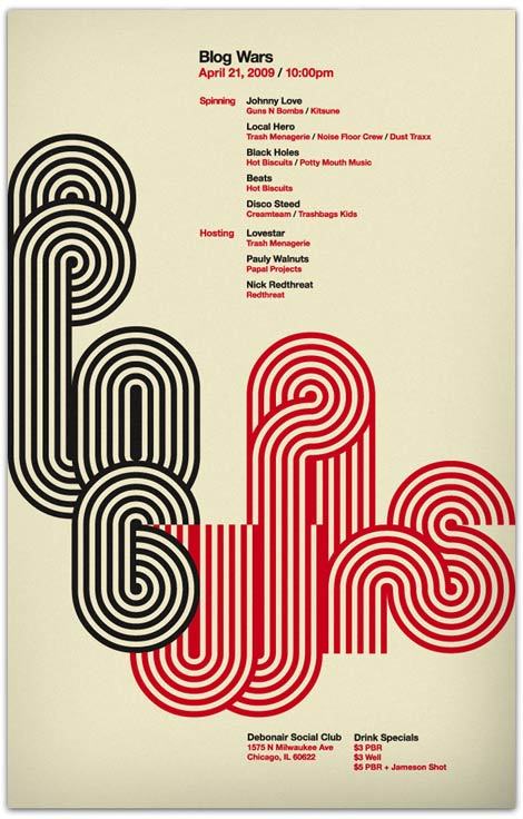
Postmodernist Graphic Design

Source For Image
"Post-modernism should be regarded at best as a critical evaluation of the issues of Modernism" - as written by Massimo Vignelli, 'Long Live Modernism'. Barbara Kruger is a very well known Graphic Designer in the Postmodernist period. All of her work is extremely experimental, both with typography usage and the way the images and type often carry a collage characteristic, which differs extremely from work created in the Modernist era. This poster is typically post-modernistic, because the letterforms have been placed about in an almost sloppy manner, and there is no clear structure or guideline to the layout of the design. I think the composition is effective in the sense of the era's principle of there being absolutely no rules in Graphic Design work, and it is also extremely legible, however I'm not a huge fan of Kruger's work, as to me, they seem quite amateurishly produced and I like work that shows particular attention to detail and composure.

Source For Image
The arrangement of David Carson's work is highly influenced by the Postmodernism Movement and you can notice this through the way in which he scatters his letters and information quite frantically across the page with no consistency or obvious use of structure. He often describes his work as "happy accidents', which ultimately shows that Carson enjoys to experiment a lot with his image and letter-forms, and his style of working proves his ability to play around and try new methods to create his final pieces. In the extras of the DVD of the Helvetica film, I recall Carson taking images that he found boring and randomly adding pieces of masking tape or acetate onto them to really push the boundaries of legibility, which I think in a way is extremely effective and makes him stand out from other designers quite dramatically. I actually quite like work produced by Carson, because it displays how 'gutsy' the designer is and that he really isn't afraid to mess about, which I think influences me a lot in the way that I work, as I take pleasure into trying out new methods and medias before creating my final pieces.

Source For Image
I think this design example is a piece of postmodern design, because the designer has messed around with the letters and tried making it look as though the word is part of the metropolis scenery. The legibility is really clear like in modernist work, however you can tell that the designer wanted to make a poster that was aesthetically pleasing to the eye and grabs your attention from afar, rather than just conveying some information in a clear and coherent manner. I reckon this poster is a really effective example of postmodernist work as it is memorable but not too vibrant and in your face, and I really like the fact that the designer chose to stick to the recognisable colours of Bauhaus and propaganda poster designs.

Source For Image
I really love the work ethic that Craig Ward follows and all of his designs show clear experimentation with typography and the way in which words are read and recognised. This poster is a really interesting example of Postmodernist design, because it's not overcrowded and is actually really well thought out. The poster follows structure and invisible guidelines and the attention to detail is significantly better than some other postmodern pieces. I think what makes this poster Postmodern, is the fact that Ward has played with the legibility of the words and given the reader a whole new way of thinking how designs could work by overlapping different sentences to create new thought provoking images. I love the way Ward has made the sentences visually representable by making "Good typography is invisible" actually seem invisible by blending it into the background with the use of similar colours, which makes "Bad typography is everywhere" really stand out as a sentence.

Source For Image
I think that this is a really bold example of Postmodernist art, as it clearly doesn't really follow any structural guidelines unlike the Bauhaus posters, and the writing isn't really that legible. The letter-forms have been stretched and distorted throughout the image so that they fill the entire page, which shows that the designer was designing something to look nice rather than getting the viewer to completely understand the image. I have absolutely no idea what this poster is about, however it is interesting to look at and the colours really drew my attention to it when I was researching. The design looks like it has been collaged before messed around with on the computer and the letters could have possibly been hand-rendered before they were vectored, however it is hard to tell. I think the design is effective if the designer was creating it in a postmodernist way, however it doesn't convey the message correctly and is hard to follow. I don't like this design, however the complimentary colours are quite intriguing.
- Leave your comment • Category: ModernismandPostmodernism, OUGD401, task4
- Share on Twitter, Facebook, Delicious, Digg, Reddit