Find 5x examples of modernist work and 5x examples of postmodernist work - why does it fall under that category? is it successful/unsuccessful and why? what's your opinion on the examples, and justify.
Modernist Graphic Design Work

Source For Image
This piece of design work falls under the Modernist category, because of the obvious structure that follows rules created by the Bauhaus and Modernism Movement. "Modernism was a commitment against greed, commercialization, exploitation, vulgarization, cheapness" - Massimo Vingelli. You can see that the entire image has been designed to line up to invisible guides, giving it a clean and easily legible structure. I think it's a really successful example of Modernist Graphic Design work, especially for the period, as you can easily follow and understand the image created by the designer and it has been created with function in mind before form. I really like the poster design, because of how well it has stuck to the design rules set in the period of time, and in my opinion the aesthetics of the piece compliment the function.

Source For Image
This poster design is quite obviously an example of Modernist Design work. Firstly, it quite obviously follows the principle proclaimed by Adolf Loos "Form Follows Function', because of the lines that have been added into the design to prove the use of guides and rulers - the weight of the lines are the same as the typeface weight, so they line up really nicely with the letter U in FUTURA, which makes it legible. I think that this poster is extremely successful as it is really easy to read and understand. I'm not quite sure what the random geometric shapes are used for, however they compliment the design and make it more aesthetically pleasing to the eye. I like this poster, however I don't really like how the A seems to have fallen onto it's side, as I think this might have been a bit too experimental for the design era.

Source For Image
I would say that this poster design suits the modernist period, mainly because of the simple and legible type used for the information in the poster. The large decorative design itself isn't very legible, and I wouldn't associate this with Modernism straight off, however after looking at the poster for quite some time, you can see particular similarities between this and the work of the Bauhaus. For instance, the constantly joined typeface looks like it has derived from the curved Bauhaus font and the colours are all quite recognisable and similar to that of the poster at the top of my research. I think that it's a really successful poster design and attracts the audience's attention with the decorative, bold colours on the cream background.

Source For Image
This design by Josef Muller-Brockmann is quite obviously a modernist example of design work. due to the simplicity of the layout and colours within the design, as well as the use of sans serif typeface. I like how the poster has been stripped down so much that it is literally just a small bit of important information to read and the title of the exhibition, yet Muller-Brockmann has decided to play with legibility of the the title Der Film so that you can still fully understand the poster, yet it is still attractive to the eye and not just simply some type on a blank canvas. The design differs from the other designs above a lot - the use of the colours are the same, but have been used to make the colour black more prominent than the cream, red or green unlike the Bauhaus design at the top where the background is cream.

Source For Image
This poster is quite an experimental example of Modernist Graphic Design as the designer (Mike Kus) has created the poster mainly focused on the function and legibility of the design, but because of the experimentation of the orientation of the letters, it pulls the design away from modernism and slightly into postmodernism design rules. The designer has also combined serif fonts with sans serif fonts on the poster which is completely against the design rules of the era, which I think could be due to the fact the poster was created during the Postmodern period, but based on the designs from Modernist times. I quite like the combination of the two rules and the simplicity of the overall design structure, however it is hard to analyse this poster well when it has been created which such experimentation.
Postmodernist Graphic Design

Source For Image
"Post-modernism should be regarded at best as a critical evaluation of the issues of Modernism" - as written by Massimo Vignelli, 'Long Live Modernism'. Barbara Kruger is a very well known Graphic Designer in the Postmodernist period. All of her work is extremely experimental, both with typography usage and the way the images and type often carry a collage characteristic, which differs extremely from work created in the Modernist era. This poster is typically post-modernistic, because the letterforms have been placed about in an almost sloppy manner, and there is no clear structure or guideline to the layout of the design. I think the composition is effective in the sense of the era's principle of there being absolutely no rules in Graphic Design work, and it is also extremely legible, however I'm not a huge fan of Kruger's work, as to me, they seem quite amateurishly produced and I like work that shows particular attention to detail and composure.

Source For Image
The arrangement of David Carson's work is highly influenced by the Postmodernism Movement and you can notice this through the way in which he scatters his letters and information quite frantically across the page with no consistency or obvious use of structure. He often describes his work as "happy accidents', which ultimately shows that Carson enjoys to experiment a lot with his image and letter-forms, and his style of working proves his ability to play around and try new methods to create his final pieces. In the extras of the DVD of the Helvetica film, I recall Carson taking images that he found boring and randomly adding pieces of masking tape or acetate onto them to really push the boundaries of legibility, which I think in a way is extremely effective and makes him stand out from other designers quite dramatically. I actually quite like work produced by Carson, because it displays how 'gutsy' the designer is and that he really isn't afraid to mess about, which I think influences me a lot in the way that I work, as I take pleasure into trying out new methods and medias before creating my final pieces.

Source For Image
I think this design example is a piece of postmodern design, because the designer has messed around with the letters and tried making it look as though the word is part of the metropolis scenery. The legibility is really clear like in modernist work, however you can tell that the designer wanted to make a poster that was aesthetically pleasing to the eye and grabs your attention from afar, rather than just conveying some information in a clear and coherent manner. I reckon this poster is a really effective example of postmodernist work as it is memorable but not too vibrant and in your face, and I really like the fact that the designer chose to stick to the recognisable colours of Bauhaus and propaganda poster designs.

Source For Image
I really love the work ethic that Craig Ward follows and all of his designs show clear experimentation with typography and the way in which words are read and recognised. This poster is a really interesting example of Postmodernist design, because it's not overcrowded and is actually really well thought out. The poster follows structure and invisible guidelines and the attention to detail is significantly better than some other postmodern pieces. I think what makes this poster Postmodern, is the fact that Ward has played with the legibility of the words and given the reader a whole new way of thinking how designs could work by overlapping different sentences to create new thought provoking images. I love the way Ward has made the sentences visually representable by making "Good typography is invisible" actually seem invisible by blending it into the background with the use of similar colours, which makes "Bad typography is everywhere" really stand out as a sentence.

Source For Image
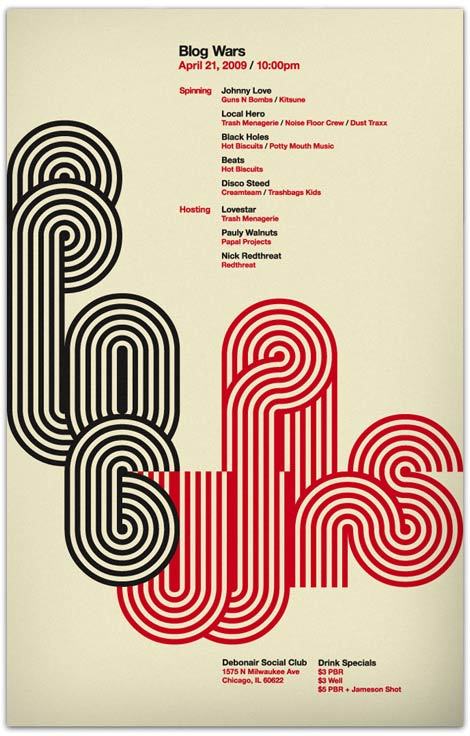
I think that this is a really bold example of Postmodernist art, as it clearly doesn't really follow any structural guidelines unlike the Bauhaus posters, and the writing isn't really that legible. The letter-forms have been stretched and distorted throughout the image so that they fill the entire page, which shows that the designer was designing something to look nice rather than getting the viewer to completely understand the image. I have absolutely no idea what this poster is about, however it is interesting to look at and the colours really drew my attention to it when I was researching. The design looks like it has been collaged before messed around with on the computer and the letters could have possibly been hand-rendered before they were vectored, however it is hard to tell. I think the design is effective if the designer was creating it in a postmodernist way, however it doesn't convey the message correctly and is hard to follow. I don't like this design, however the complimentary colours are quite intriguing.
- Leave your comment • Category: ModernismandPostmodernism, OUGD401, task4
- Share on Twitter, Facebook, Delicious, Digg, Reddit