My 3 Rules of Aesthetics are:
- The resolution of the image must be high quality, ie not pixelated/executed badly.
- The colour choice should complement the design choice.
- Typography must be appropriate to it's use.
RULE 1: RESOLUTION.

Fashion magazines tend to have extremely high quality resolution to their photographs, as it would completely defeat the point if they didn't. I find that I often favour the way Vogue front covers look over other fashion magazines, as, even though there is a lot going on, they still manage to keep their brand looking classy and chic.

Vector images are a really good example of high quality images/illustrations, as they hold their resolution no matter how big you blow them up (which is why illustrator is reliable software to use when creating logos or something of a similar nature). The image on this poster itself wouldn't work if it was low quality, as you wouldn't be able to see the fine detail within the man's beard or colourful hair, and I feel that this fine detail really makes the image stand out and work.

If the designer had photographed this piece of work using a polaroid or disposable camera, you really wouldn't achieve the same effect. The viewer wouldn't be able to see just how fine the detail is within the hand-crafted typography, and the texture in the metal itself would look flat and non-existent.
RULE 2: COLOUR.
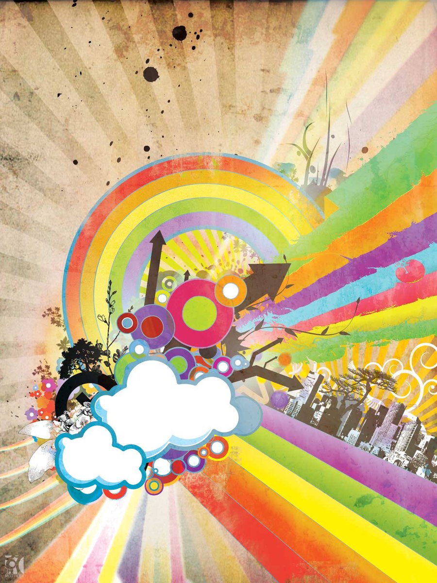
This is exactly the type of Graphic Design that I hate. The use of colour is vulgar - they have decided to use far too many colour is one overcrowded area, none of which are that complementary to one another. I think it's probably the design as a whole that I really hate, but the colour choice definitely helps me in this decision.

Whereas this choice of a variety of colours works for me, because the designer has chosen the colours wisely and accounted for the fact that there are a lot of colours by using the colour white as well, just to break it up a little bit. I think that this use of colour probably also works, because of the geometric feel to the designs.

This very particular choice of colour actually adds to the design in a clever and well thought out manner. The designer has obviously paid close attention to the colour of the macaroons that they will be selling within their food company, and chosen a colour scheme based on this, which I find both adorable, yet classy and elegant. I also like this use of colour as it is a pastel colour scheme - I often find that bright and bold colour schemes don't really tend to work for me.
RULE 3: TYPOGRAPHY.

The typography used for wayfinding and signage needs to be clear, concise and easily readable from a good distance so that it performs it's goal - informing you on where to go. If a script or extremely condensed font was used instead of something clear like the gothic font on the signage above, it would be hard to read quickly, therefore misleading and you could end up with some very confused drivers on the road, constantly getting lost and never finding their way home!
The Tiffany & Co logo is a good example of typography that is used appropriately, as the font that they used helps to give Tiffany a classy, elegant, expensive and professional look, just by the clarity and elegance of the typeface chosen to spell out their name. This really would not work if it were to be written in something more playful and messy like brush script.
The Chanel logo does exactly the same thing. With the original design of the logo and the usual typeface, you instantly recognise the brand and think of them as classy, womenly and slightly French. However, if you were to recreate the logo, let's say in Comic Sans (like the 2nd image), you really wouldn't get the same impression. The Comic Sans version gives off a less trustworthy brand, that is slightly tacky, and even the word Chanel reads more as Channel.
Examples of Non-Graphic Design Based Creative Practices That Follow Each Rule...
RULE 1: RESOLUTION.

This unique landscape photography could never be achieved, if it weren't for cameras and software that can create high resolution images of natural beauties around the world - creating an even more beautiful landscape than how you would see it with the naked eye.

This incredibly inventive drawing of a dog, possibly created on Microsoft Paint, is obviously not high resolution at all! The image becomes pixelated when enlarged (in fact the originally sourced image was pixelated itself...), which really doesn't do the drawing any justice. Okay, the drawing isn't that great itself, but the fact that the illustrator didn't even think about the final resolution makes it worse.


This extremely poor quality scene from Back To The Future (top image), in comparison to the better quality version (bottom image) shows just how much difference it will make to the viewer at home when watching the film. It makes it really hard to absorb yourself in the story line if the film is constantly dark and pixelated or the sound is muffled or crackly. Film footage is definitely better when viewed on a HD screen at the highest resolution possible, as it will make the experience more engaging.


The recreation of films in 3D, as well as films that have been created completely for the 3 dimensional experience, are a great example of high resolution filming. The films have to be created at such a high resolution, that it adds depth and you actually feel as though you're sitting in the film set when watching the movie. Obviously, it is a lot harder to experience the resolution of the 3D films through screenshots on a computer screen, however if you have seen one, you will understand where I am coming from.
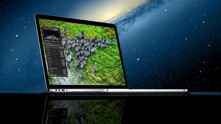
An obvious resolution outbreak within product design would be Retina Display featured in the latest Apple computers. People constantly want a higher resolution screen, and Apple constantly design their products to suit the needs of their customers (mainly consisting of designers and photographers, so it suits them perfectly).
RULE 2: COLOUR
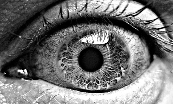
Limiting colour within photography can make a huge impact. Black and white photographs help to create drama and depth within the photographs. They can also create confusion, and the viewer will often admire photographs in high quality black and white, as it's up to you to decide the exact colours of the original object that is being photographed.

On the contrary to the previous colour decision, the ultimate use of colour can also absorb the viewer. Capturing the alluring purplish pink colour of this sunset is particularly beautiful and completes this image, as it really would not be quite so impactive if it were in black and white - as it wouldn't capture the beauty of the natural colours themselves.

Colourful architecture can often be quite interesting, as it is a very unique and unusual style of architecture to come across. Even though there are a lot of different colours used within this building, the use of creating said colours from lights shining through windows really adds to the design and makes the building stand out. Even though i tend to prefer less colour, I find this example of architecture quite beautiful to say the least.
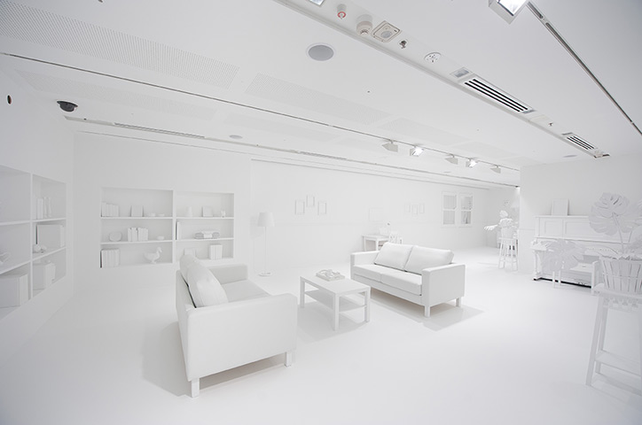
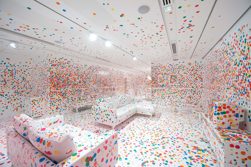
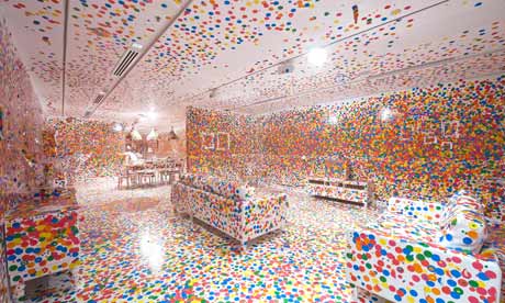
The idea of creating an installation with absolutely no colour in it at all (apart from white), and then asking the audience to add colour to the room with the use of many different coloured spots, like the above installation 'The Obliteration Room' by Yayoi Kusama is really bizarre. Not only does the room look extremely weird when just in white, when you add colour to it in such an unorganised and crazy manner, the room starts to become even harder to see and recognise. It's a lot harder to distinguish exactly what furniture has been placed in there, and removes the sense of depth.

With the 'Everything Under The Sun' installation by Olafur Eliason at the Tate, it is really important for the artist to use his choice of colour wisely as this particular installation definitely wouldn't work if the sun had been created from green or purple lights.
RULE 3: TYPOGRAPHY.


Barbara Kruger's typographic installations are a fine example of typography being used in an appropriate way, as it communicates a message without it having to be image based or painted etc. It's interesting to see a fine artist to choose type for an installation, as it is unusual and hardly ever produced, however I think it works really well and personally prefer it to a lot of other installations that I have viewed.

Anamorphic typography really interests me, as it looks like the words are floating infront of you when you look at it from the right angle, however as you walk towards the text you notice that really it has been painted onto walls and objects around the room in a particular way to create some typography that really stands out. I think that this is a really clever form of installation work that follows the rule adherently.

The large letters creating the Hollywood sign are used really well as they help give clear indication as to where you are, and you also gain that immediate recognition to fame and wealth when you see the sign as the large letters spelling out the name of the city make it seem of great importance and culturally significant. This would also be a good example of typography used well in a photograph.
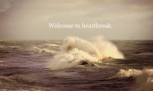

Typography that I never really find necessary, is that which is written over a beautiful photo. You see these types of images a lot - where a quote, saying or something completely irrelevant and stupid has been written in a pretty typeface, then plopped straight onto a photo to try and make it look edgy, like something you would find on Tumblr.


Signage photography can often create a huge impact, as it can draw the reader in with the beautiful images accompanied by the words that are actually there within the photographed scene. I also often find that there is some kind of 'deeper meaning' behind photographs that have had words taken amongst the rest of the photo, and being a fan of typography find this style of photography extremely intriguing.
- Leave your comment • Category: OUGD401, studiotask2
- Share on Twitter, Facebook, Delicious, Digg, Reddit