INTRODUCTION TO COLOUR PRINCIPLES.
- Colour theory started around 1700s through art practices and investigation of light in science.
- Colour adds towards legibility of type and can either increase the legibility or totally decrease it.
- We perceive colour at different wavelengths. The lower the wavelength, the closer to blue we see. The higher the wavelength, the closer to red we see.
- The eyes contain two kinds of receptors: rods and cones. While the rods convey shades of grey, the cones allow the brain to perceive colours. When a single cone is simulated, the brain perceives the corresponding colour. If both our green and red-orange cones are simulated, then we see the colour yellow. Our eyes naturally only perceive green and red.
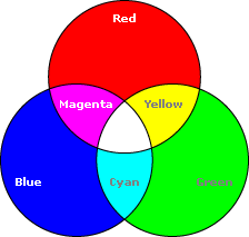
Primary colours: are colours that you cannot make from other colours.
Secondary colours: are equal mixtures of the primary colours.
Tertiary colours: are unequal mixtures of primary/secondary colours, eg a "reddy-purple" or a "lilac" etc.
- In terms of optical and on-screen colours, you work in terms of red, green and blue (as green is more true than yellow, due to that fact that you can't naturally perceive yellow).
- When looking at print based work, we use CMYK. The KEY colour is the use of tones and using the rods in your eyes.
- The eye cannot differentiate between spectral yellow and some combinations of red and green. The same effect accounts for our perception of other in-between spectral colours.
- The eyes can be "fooled" into optically mixing the full range of visible colours through the proportionate adjustment of just three colours: red, green and blue.
- The colour modes aren't distinct, they are interrelated.
SUBTRACTIVE COLOUR MODE: CMYK (ink)
You mix all the colours together and you get the colour black (KEY).

- Complimentary colours are the exact opposite of each other and they cancel each other out (contrasting colours). When you start to mix these colours together in an appropriate proportion, you end up with grey (neutral colours - absence of colour).
- They become grey because, in effect you're just mixing all 3 primaries together.
- For example: orange + blue = grey (red+ yellow (orange) + blue = grey).
Studio Session
In preparation for this session, we each brought in 15 items of a chosen colour. Using the tertiary colour wheel as a guide, we set up a giant colour wheel around the studio, ordering the colours in a gradient.
.jpeg)
.JPG)


