Submission Deadline: Wednesday 17th April 2013
Weeks until hand in: 7 weeks.
Submission Requirements:
- Blog with all workshop tasks completed
- Thumbnail layouts - strong collection
- Enlarged and scaled thumbnails with rough measurements
- Traditional mark-up with margins, guides, grids, sizes etc - hand-rendered
- Digital mark-up
- 10 Double page spreads or booklet format (content will be made up of '10 things someone should know about Graphic Design') - it is completely up to you on how to produce the book. You can just hand in 10 loose double page spreads, but that's the lazy option...
- Consider printing method, format, final outcome
- Time
- Design and Layout!!!
✿✿✿✿✿✿✿✿✿✿✿✿✿✿✿✿✿✿✿✿✿✿✿✿✿✿✿
Stuff to know & find out...
- What are grids, columns, gutters and margins?
- What are sub-heads, paragraphs, captions and ligatures?
- What is DPS and what does it do?
- What is golden section?
- Explain what rulers, boxes, folio numbers and drop caps are
- What are picas, points and pixels?
Design Research
Abram Games

Painter who works with grids and columns and shapes to make layouts. Uses objects to make images.
Neasden Control Centre (Steven Smith)


Based in London. Started off doing layouts and designs, and has branched out to do instillations and video etc 'the lot'. Extremely simple grids, but plays with type layout within the grids.
Newwork Magazine


Magazines printed onto newspaper. Really clean and clear layout, and well structured. Evident grid layout. Following all the rules of grid and layout, but produced elegantly.
NoZine


Follows a structured grid, but plays with typography to create a distinct style. A new colour for each zine, keeps a consistency in the theme.
Paul Rand


Also follows obvious grids, but will play around to make it look aesthetically pleasing and different.
Saul Bass


More jaunty and creative way of using grids and layout, rather than a clean and clear structure. Will still follow a clear structure, but doesn't make it distinct within the design.
Out of class research....
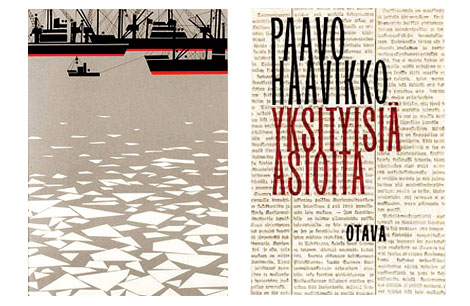
I quite like the way that the heading text is bold and overlaps the rest of the text. I also think that the constant use of extremely soviet colours helps to make the dps look like a Russian influenced design.

I quite like how simplistic and structured this dps has been designed. I think that the use of 3 columns of text is has been used quite creatively, in the way that they played with the amount of text used within each column. I also like the way that the Header sits upon 3 lines, rather than one standard Header line.
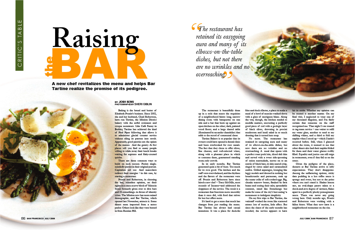
I think that this is a very basic and obvious dps design, however I think it stands out in the way that the designer was confident enough to play about with the layout of the type a little bit. I like the fact that the text overlaps the two images, to bring the images into the content rather than two bits of extra visual furniture. I also quite like the way that the g in 'raising' overlaps the r in 'bar' and the use of a little 'the' on the side of 'bar'.

I found this dps interesting, due to the large use of image on one side and the lack of text on the other side. I quite like the way that the block of text has been positioned in the bottom right of the verso, but in a way that it is slightly off rather than positioned fully to the right, which shows use of van de graaf.

I liked this design, because of the small amount of colour used within it. I like how the small use of the colour yellow helps to make the whole dps stand out, because if it was just in black and white, it would be quite a boring design.
I think that this design is very boring, and not very influential. I don't really like how most of the text is structured within the columns, except for the left hand column where the text merges around the photograph. I think this makes the page lack continuity.

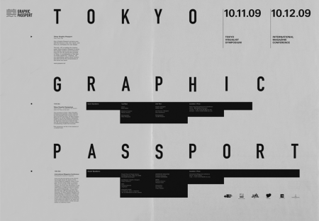
I like this dps surely because it shows how to use grids and layout well. I think that it was probably designed to show how to use columns etc in an interesting manner, however I still think that this is quite a unique idea and works well.

I thought that the use of the columns was quite interesting within this design, as they have been broken up so that they aren't just 3 constant white columns; you can see the background image behind them.

The reason why I found this dps aesthetically pleasing, is due to the fact that it follows a theme and is consistent within the design. I love how the whole design looks very scientific and almost like something that you would see in an old biology textbook. I think the choice of a serif font helps make the design look scientific. I think that the bodycopy has also been used to it's full potential, and it makes the text more legible.
I found this dps layout quite interesting, because of the large amount of image covering both of the pages and, once again, the small amount of body copy on the right hand side of the recto.

I don't really like the use of inanimate objects to form the typography for this dps, however I like the way the columns are quite small but wide. I also think that the use of a drop cap is interesting and makes the text stand out a bit more.
I found this design interesting, because of the use of a black image as the background, and rather than using white text on the black, the designer decided to give their text boxes a white background so that they could carry on using black text within some of the bodycopy.
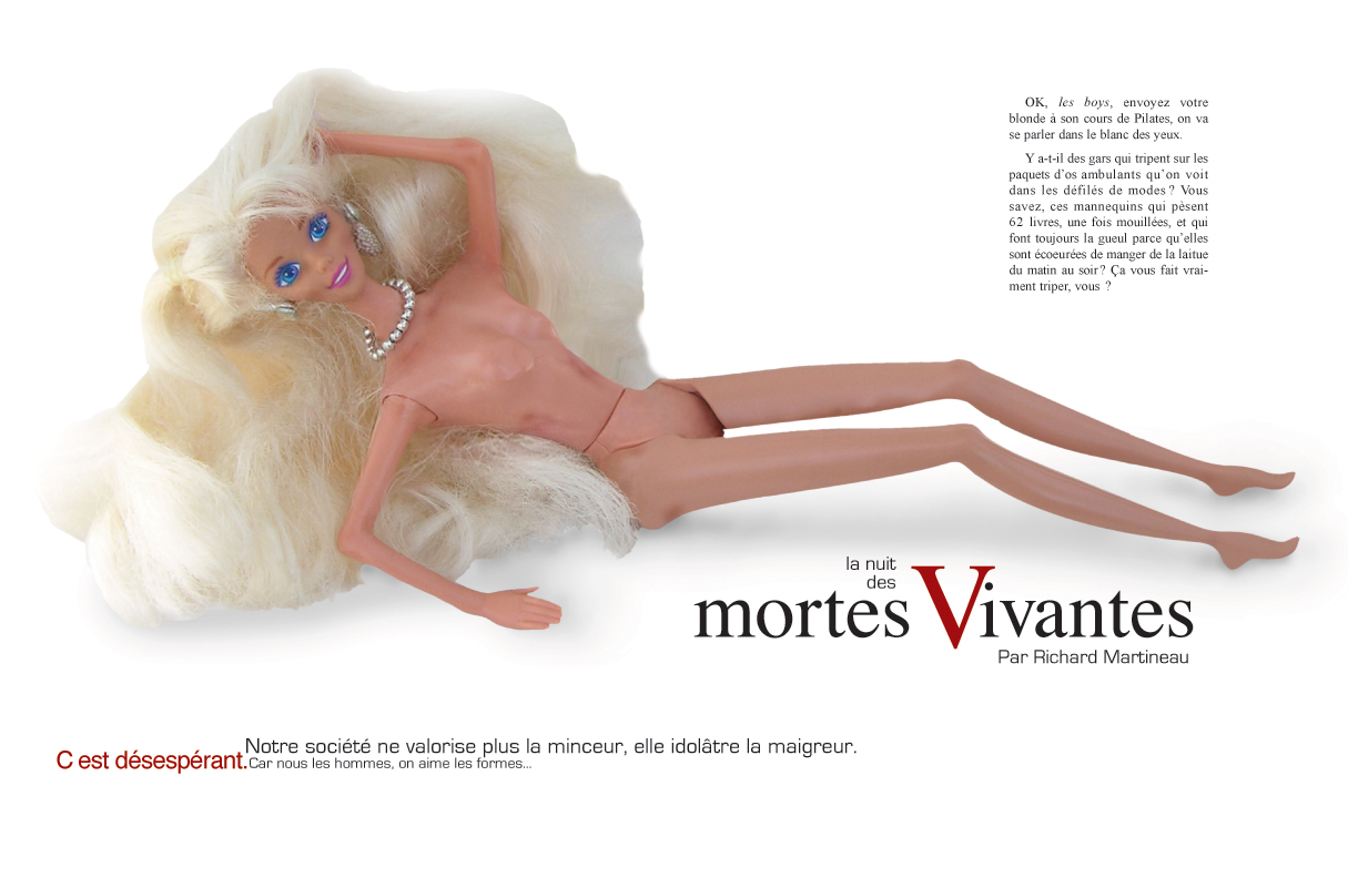
I have found that a lot of Russian design uses the colour red, which is why this design intrigued me as it still followed the revolutionary colour scheme. I loved the use of cyrillic letters within a plain sans serif typeface, as it's not that often to find. I also found the layout of the header interesting and aesthetically pleasing.

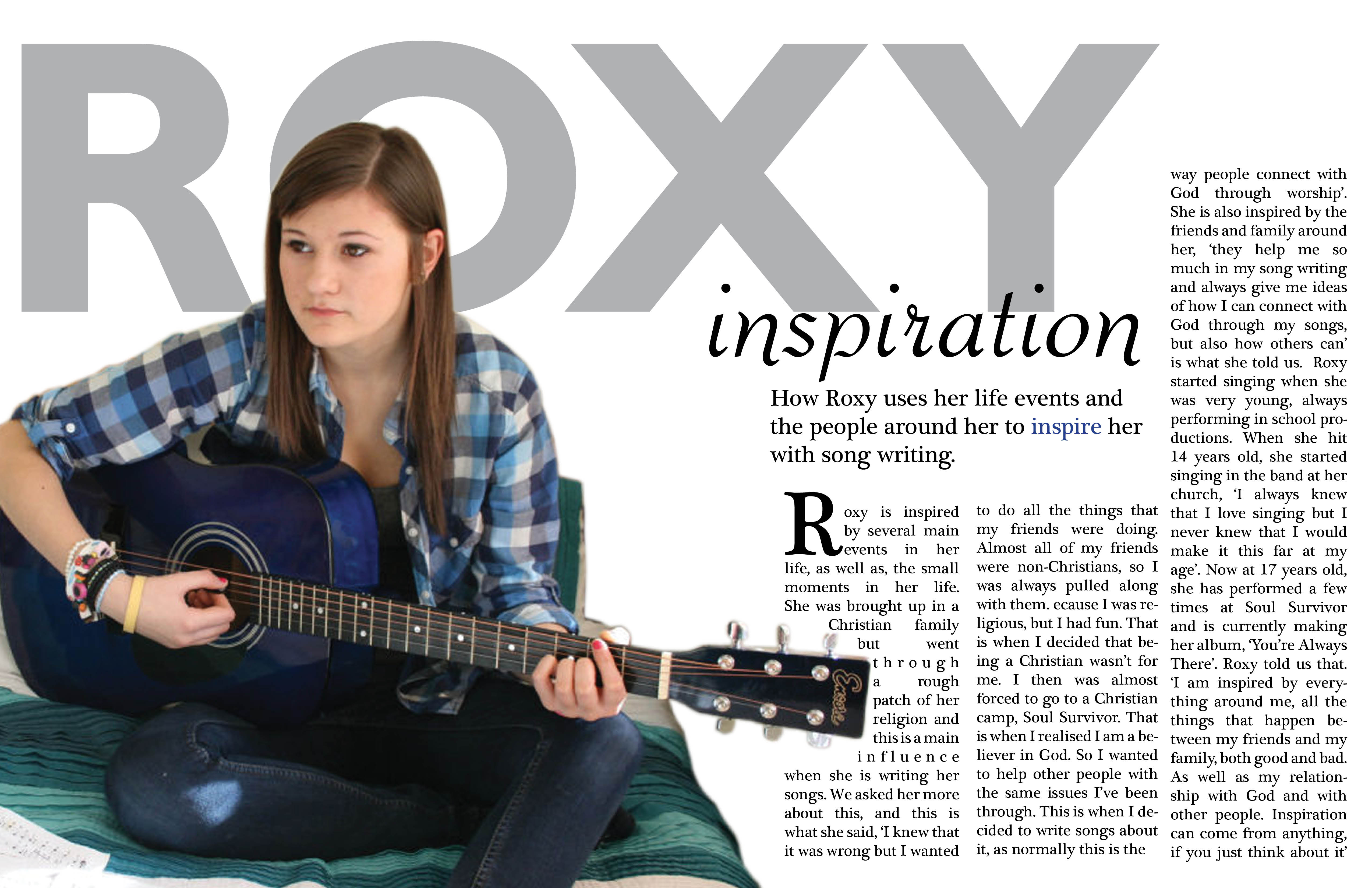
I think that this is a very 'bog-standard' way of laying out a dps, however the reason why it caught my eye was the overlapping of 'Florence & The Machine' over the picture of Florence singing. I thought that it looked nice over the image, and made the pages a little bit more exciting.

I really love the use of white space within this design, as you don't often find dps layouts consisting of so much white space. I think that it could look really nice printed onto an interesting type of stock.

I quite like this design, because of the strange layout of the bodycopy on the recto. I also think that the photograph complements the typography.

I don't really like this type of layout, however I felt like I needed to look at a few things that weren't so simplistic and obviously structured. The columns within this design are extremely structured, however the Headers look a bit strange in the way that they're overlapped.
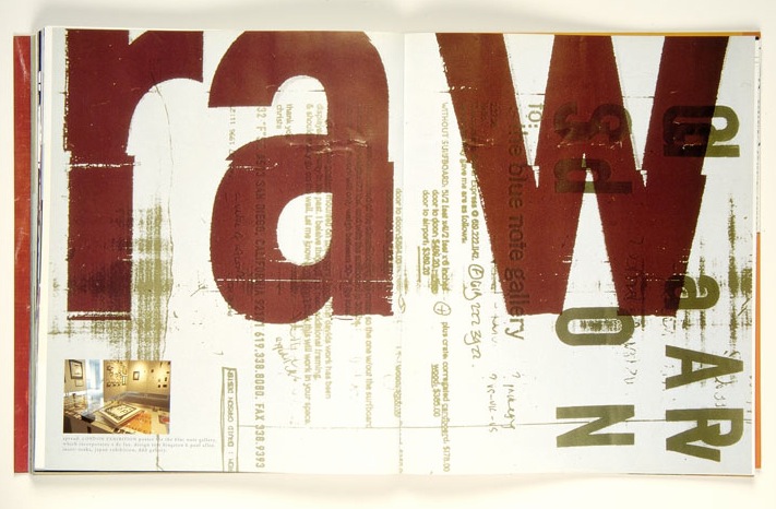
I thought that I'd put a bit of Carson's layout work within my research to create some contrast within my research, however I don't think that it will be very influential when it comes to my designing, as I don't really like how jumbled it seems, even though it does seem to follow a structure.

I don't really like the typeface chosen in 'oh my word' however, I found the use of the typography quite playful and thought that it was quite intriguing.

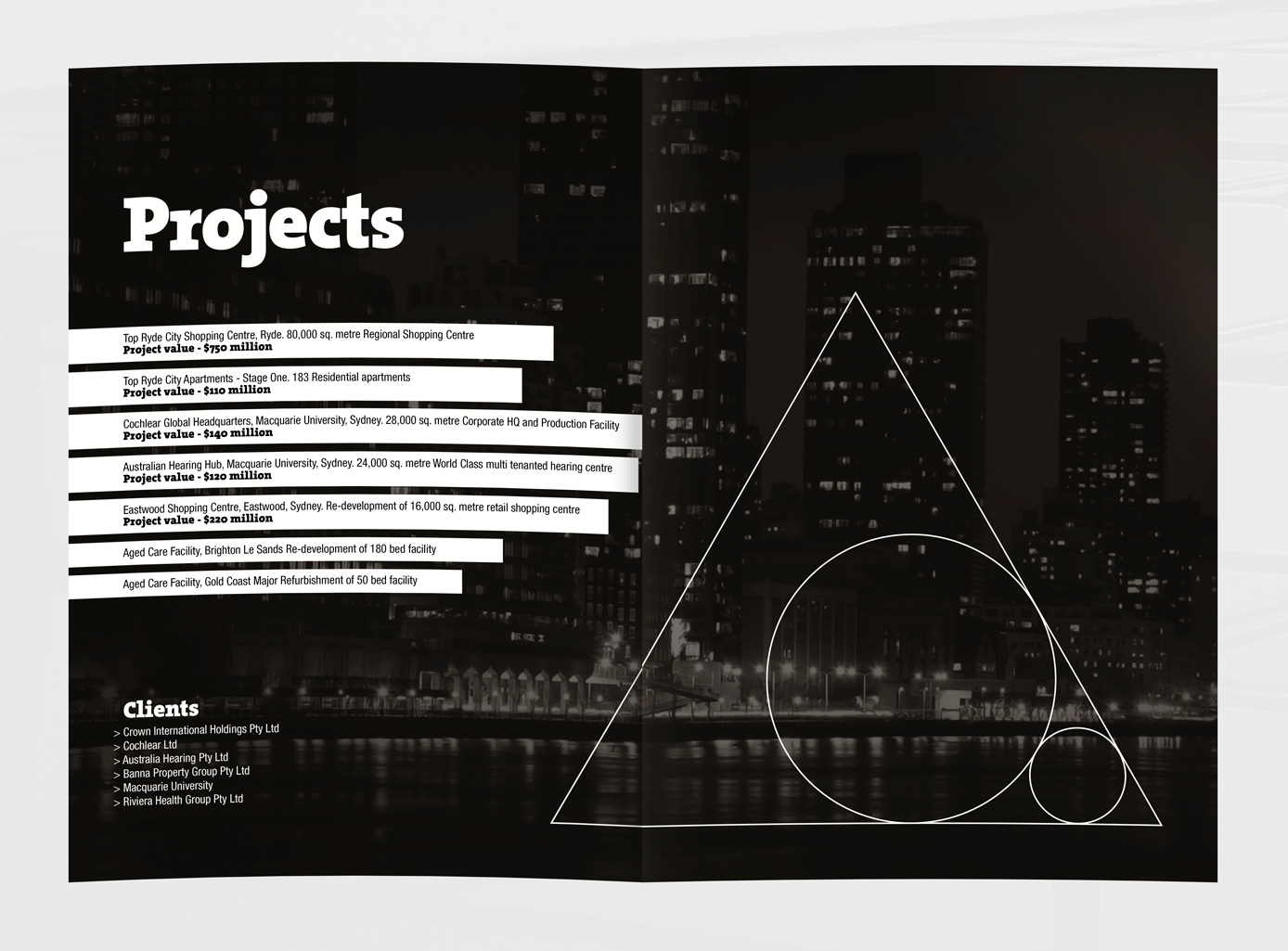
I really like the way that the designer has chosen to use strangely shaped columns within the design, rather than using your standard 3 rectangular shaped columns. I think that it's a clever idea, due to the fact that the columns follow the same shape as the red background shape in the image used on the verso.

I found this layout choice intriguing, because the header isn't fully visible, yet you can still fully understand what it says. I also think the idea of putting all the writing on an angle is different and playful.

I think that this dps is quite plain, but interesting at the same time due to the random positioning of the photographs. I also like the way the text is written on it's side for the header and subheader.

I found this layout choice interesting, because of the small paragraphs at the bottom of the page and teh large illustration taking up most of the layout space.

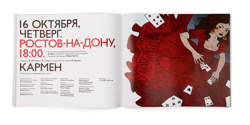
I like this layout, because it is really playful, yet extremely structured. I love the use of the colours and think that the typography is intriguing. I think the text on the recto at the top of the page is a bit messy and weird, however I like the use of the text within the red shapes of the design on the recto.
I liked this layout design, mainly because of the fact that the background is a different colour to usual. I think that the use of an extremely bold colour in such a vast quantity, is quite elaborate and unusual to find. I also quite like the qwerky typeface to go with it.

I like this design, because it reminds me of a black and white version of paintings in the De Stijl movement. I think that the use of the boxes helps to form interesting and unusual grids to work with. I also find the lack of colour interesting.

I found this layout design intriguing, because of how playful the designer has been with the body copy inhabiting the header. It makes a really boring font like Times New Roman seem quite aesthetically pleasing.
I thought that this dps design looked quite vintage, due to the stock and the font that has been used for the header. I quite like the broken and qwerky feel to the entire design, and think that it is consistent in theme.
You can find my final 10 things publication here...