Yardstick Coffee
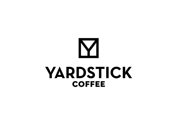
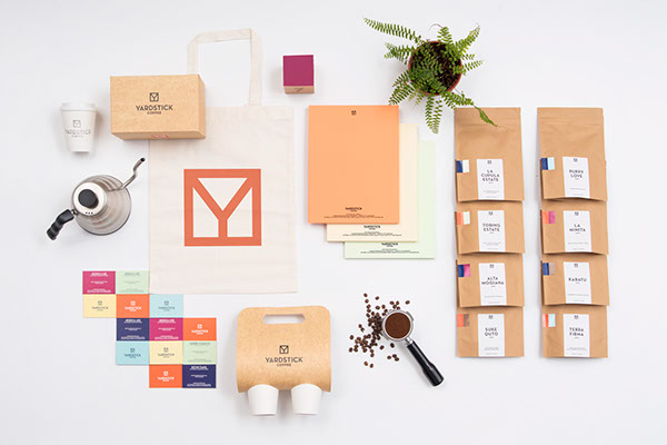
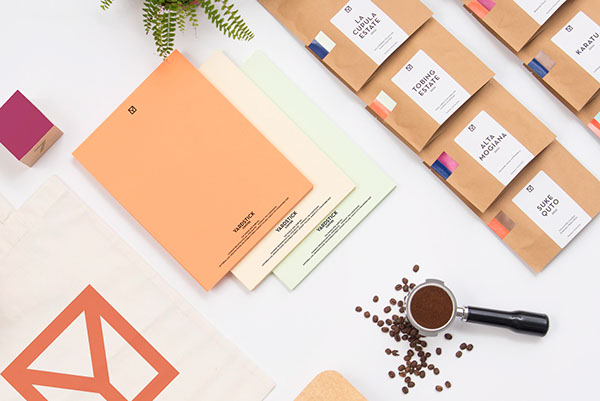
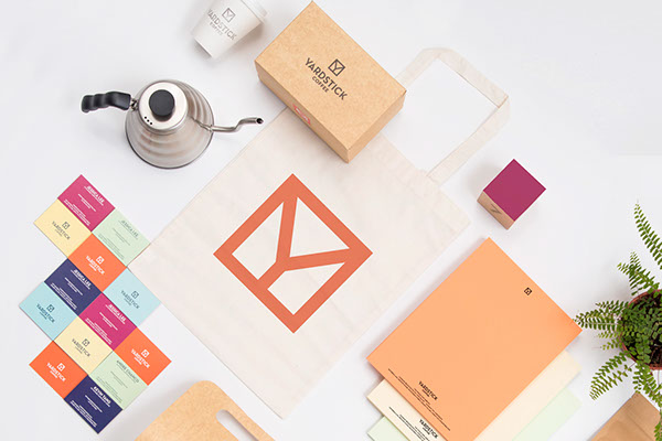
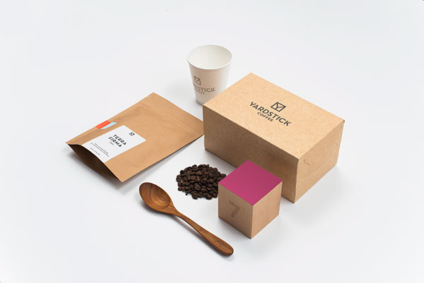
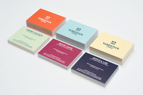
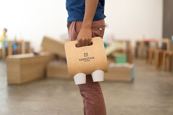
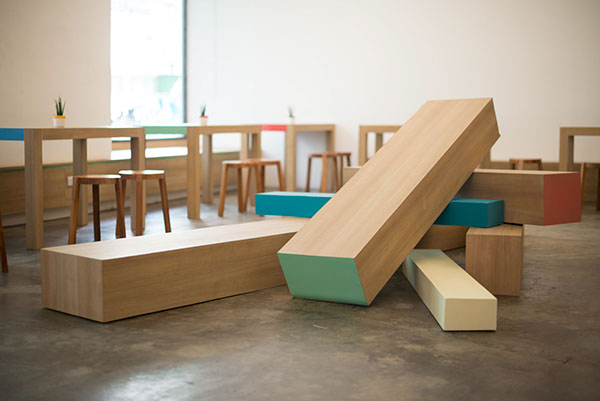
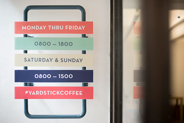
I think that the branding for Yardstick Coffee is extremely well thought out, across all areas of the coffee shop. The brand's identity is consistent - the use of pastel colours and a simplistic feel is seen across the board, which creates continuity. I really love how the designer has even thought about the interior of the coffee shop and considered how the tables and chairs will fit into the brand. I think that the products are photographed in a way that shows off the designs, and shows how all the products are interlinked.
Smutje - Fisch am Eck
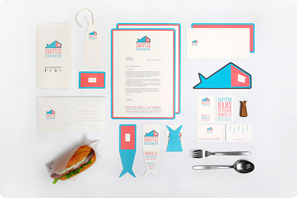
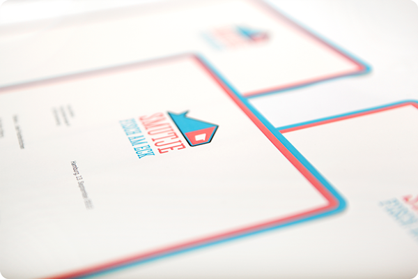
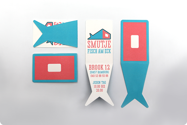
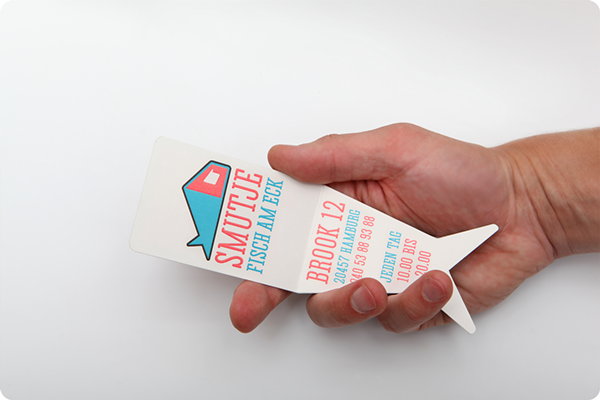
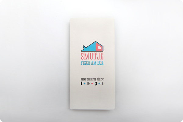
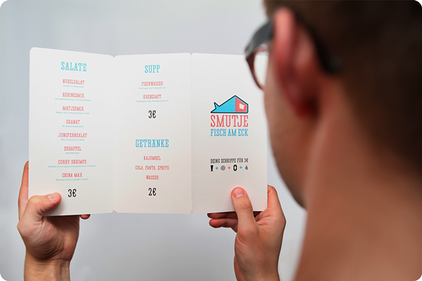
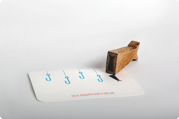
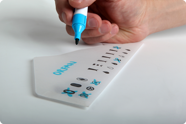
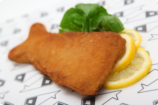
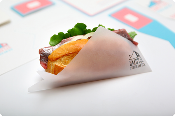
What I really liked about Smutje's brand was the way that they incorporated the fish shape across all sorts of products - from stamps to the food itself. They really considered how they could drill their brand into your head so that you remembered their logo and what they were about. The colour choices are a little bit strange for a fish sandwich shop, but the colour compliment one another so it works well across the range of products. The fish shaped business cards are interesting, as they've decided to break the normal shape of a business card and make it a bit quirky and memorable.
Hosh Mariam
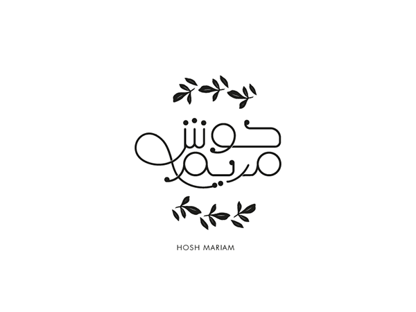


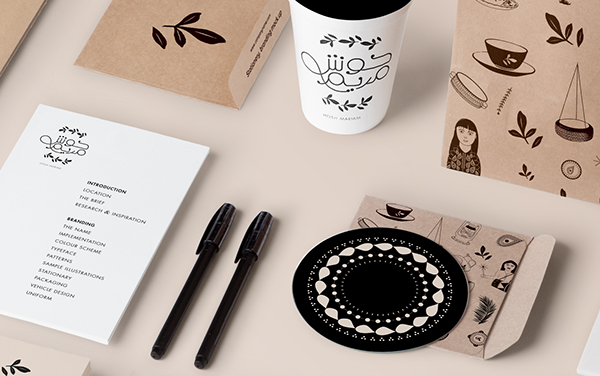


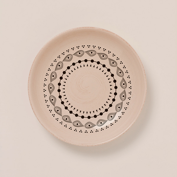

When viewing the Hosh Miriam branding, I noticed that the designer had thought about everything when it comes to a restaurant, even down to the patterns on the dishes, and the signage outside of the restaurant itself. I quite liked how the brand used limited colours, and concentrated on stock or surfaces that were a brown colour to add colour to their products and prints. The interior of the restaurant works really well with the organic-esque branding qualities.
Yakuza
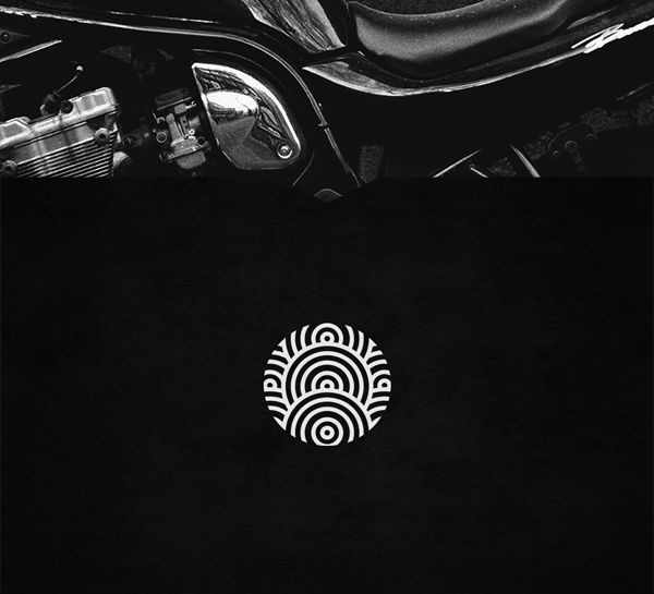

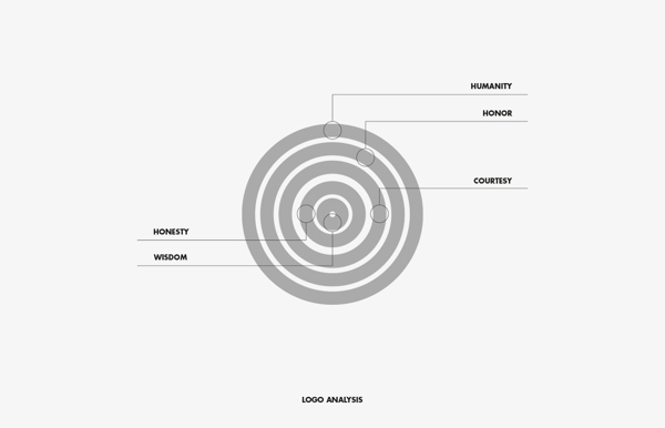
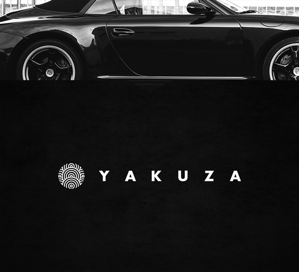
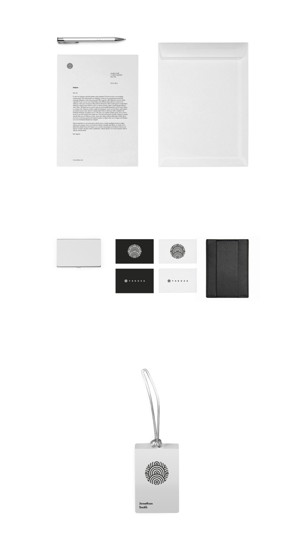
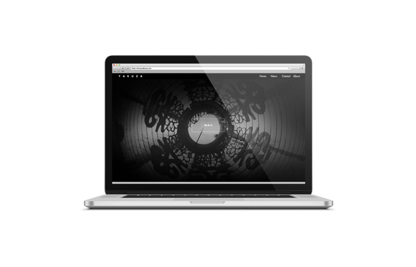
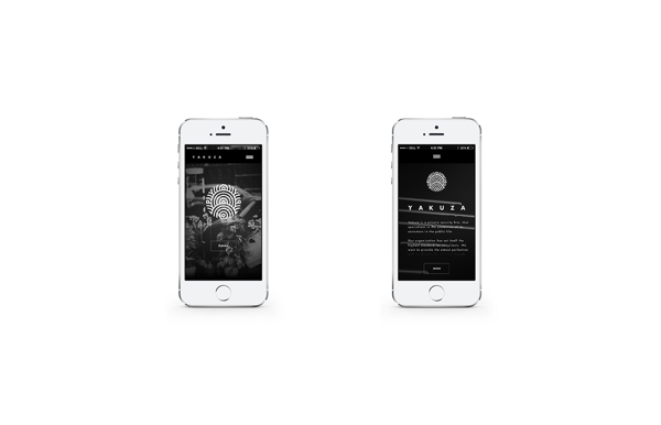
I thought that Yakuza was branded well, as they showcased various ways that they developed through their ideas to create their logo, and how it represents the company and their honour as a private security firm. It was also interesting to see how the brand worked online, through the use of macbook and iPhone mock-ups, showcasing their website and how it responds across different technology.
Vesuvio
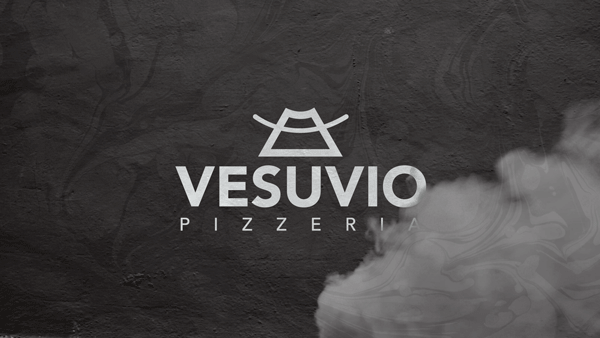
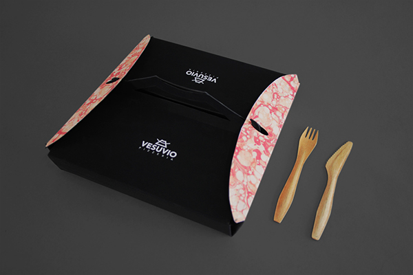
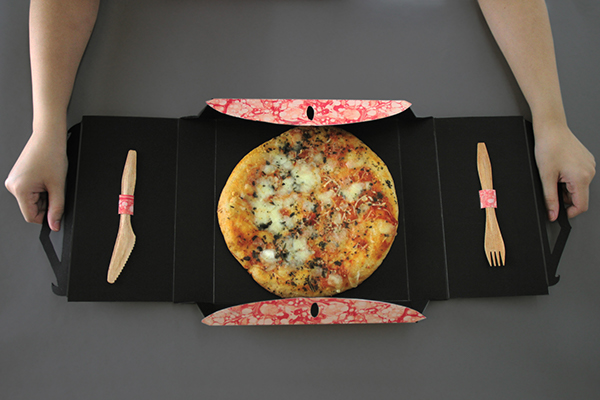
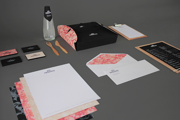
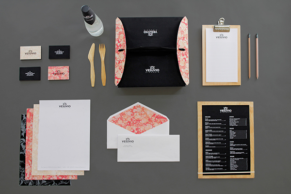
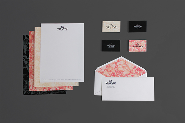
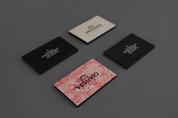
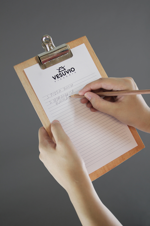
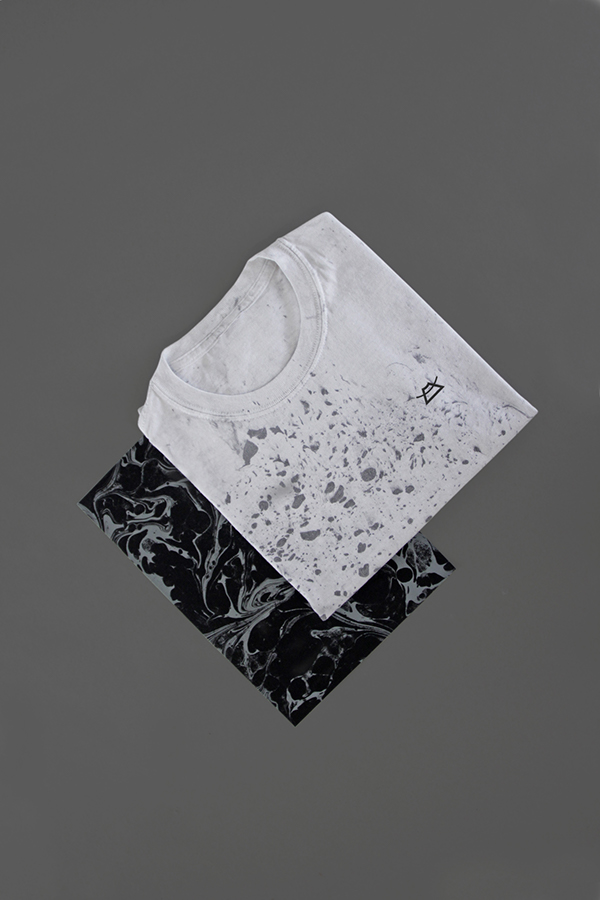
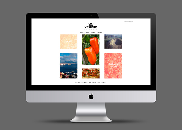
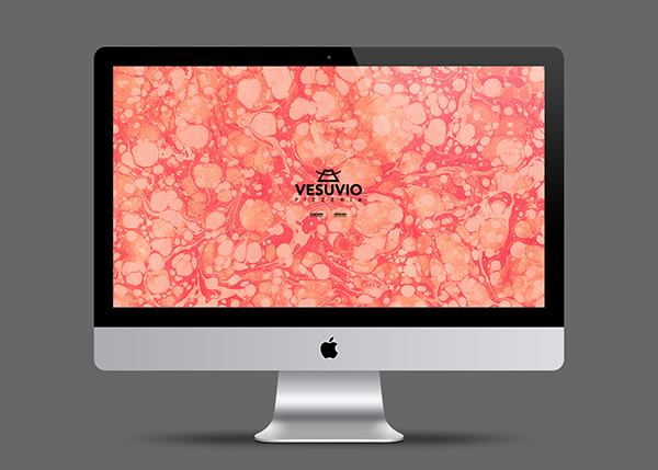
The brief was set as part of a university module, where they were asked to create packaging for a takeaway of their choice, but this student decided to take theirs further and create an entire brand, rather than just producing packaging. I really loved the marble effect that they created, as it looks like lava as well as pizza toppings, which relates to their concept behind the brand (great tasting tomatoes come from the soil of Mount Vesuvius, hence the name Vesuvio, hence the lava). I also love the idea of creating a GIF to showcase their logo with smoke moving in front of it, as if it was near the volcano. I think that they've really thought about products that this takeaway would need, even down to using a chalkboard menu, rather than your ordinary paper one.
Massproductions
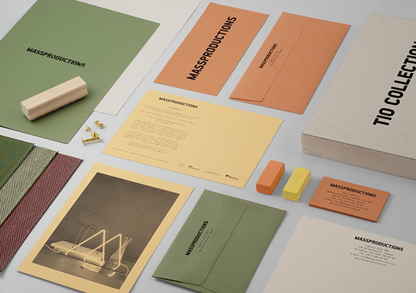
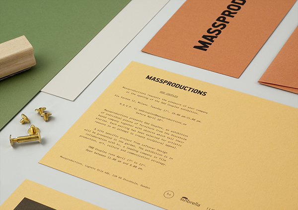
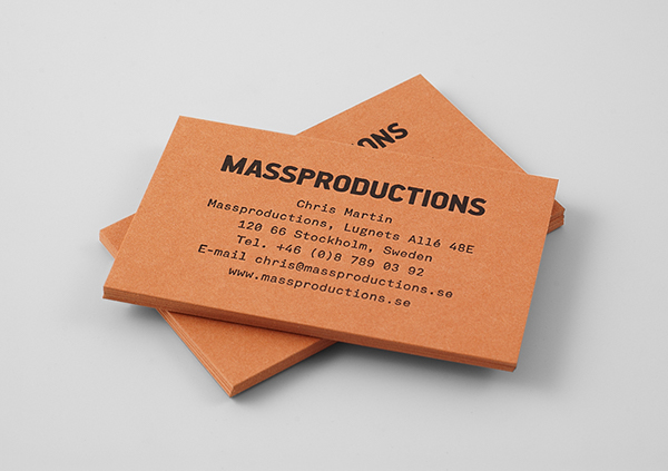
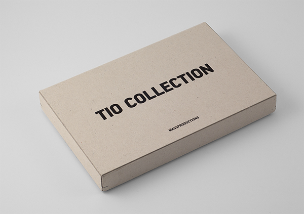
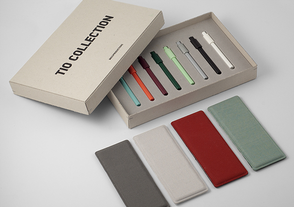

I quite like the overall simplicity of this brand, and how the colours used have derived from stocks and materials used for the products. I quite like the use of various dull colours, as it looks quite different to usual, and bring the designs together to create continuity. I think that the finish of the products has been well considered, and the use of embossing really adds to the tags.
Golden Leaf


Even though all of the designs are consistent, the designer has only really considered the stationery range, and how the brand will be reflected across these. However, I think that the use of double sided letterheads and business cards adds elegance, and the pattern choice creates a memorable design. I think that it could look nicer using gold foiling, to make the colours stand out on the page a bit more and add a sense of sophistication and expense.
Kocostar Nail & Foot Therapy
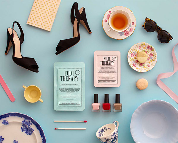
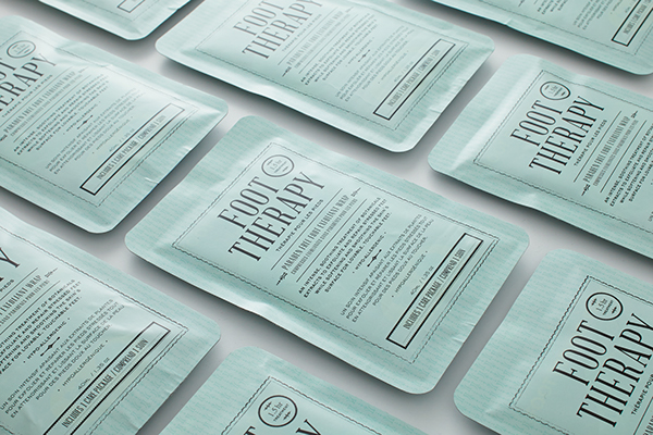
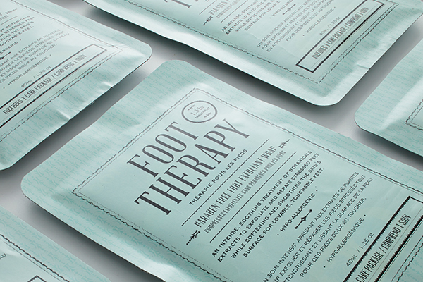
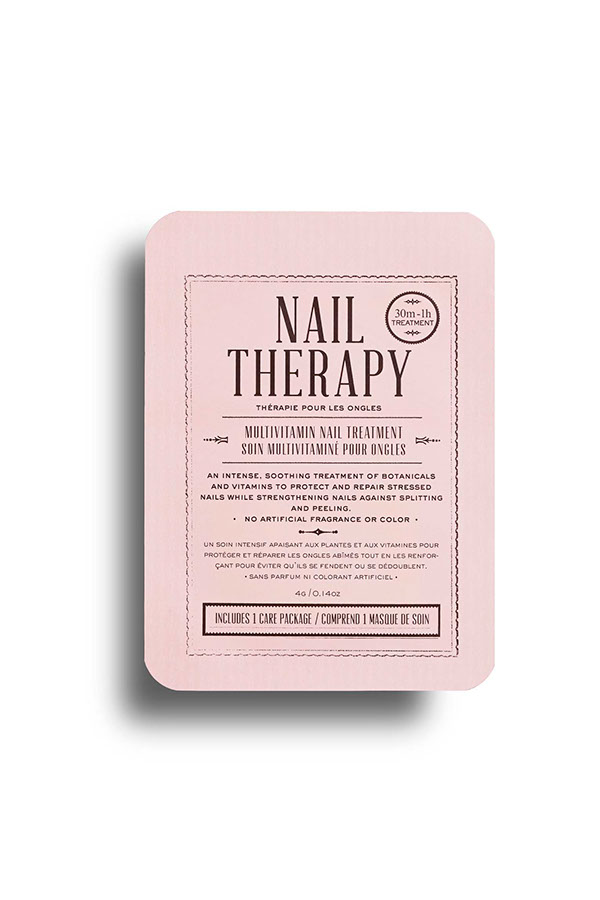
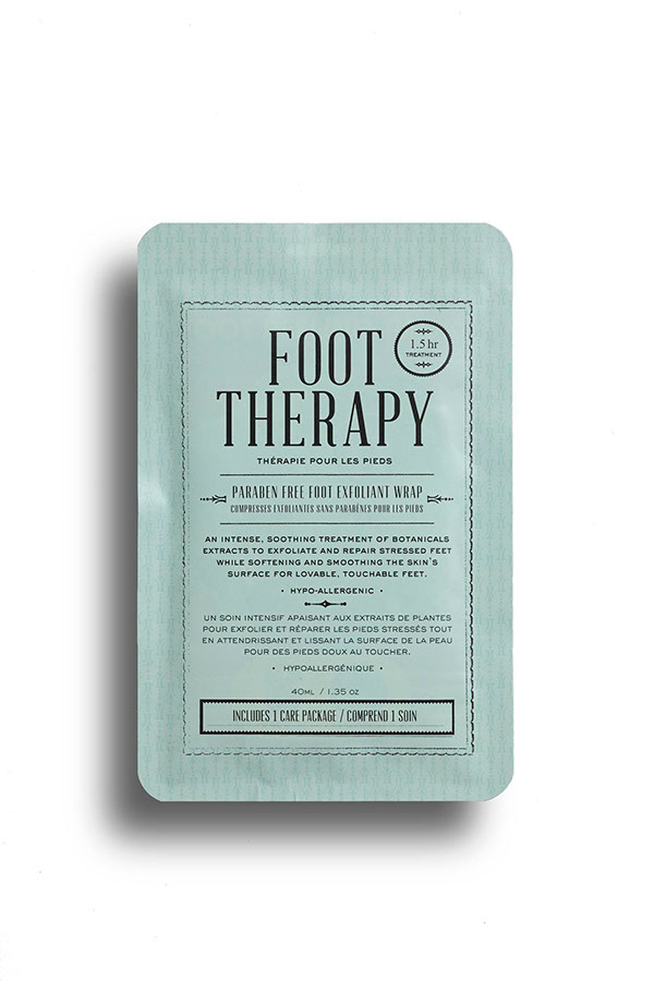

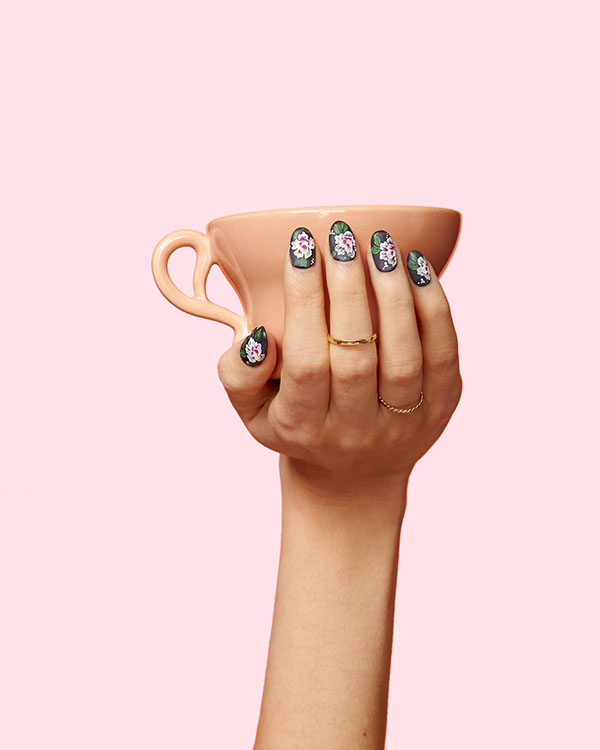
I really like the colour choice for this nail therapy brand. Although it doesn't really look like they've got much of a brand going on, I think that the use of photography works really well and adds some extra personality to the brand.
Avril


I think that this brand is very girly, but I think that the logo is really clever, as at first glance you wouldn't notice the A inside of the flower - a bit like the Fedex logo, with a hidden image within the logo. I quite like the colour scheme, and how everything incorporates their flowery pattern, bringing all the products together to create a whole feel of the brand. However, I feel that more products could have been explored.
Mylene Poisson Sommeliere
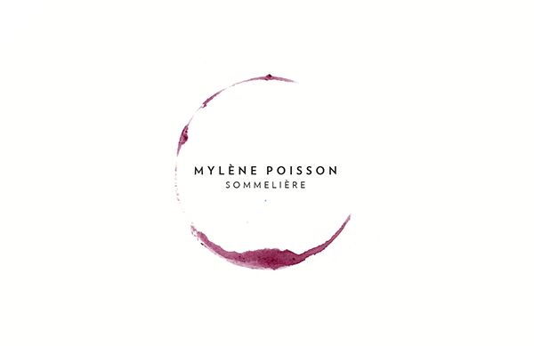
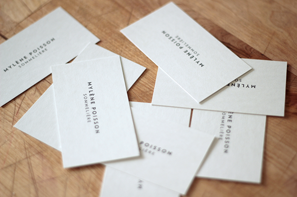
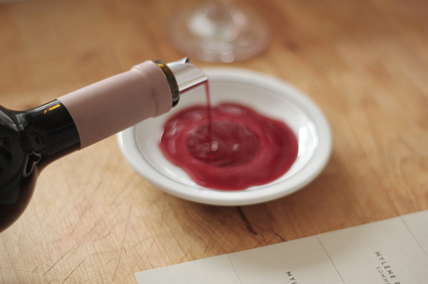
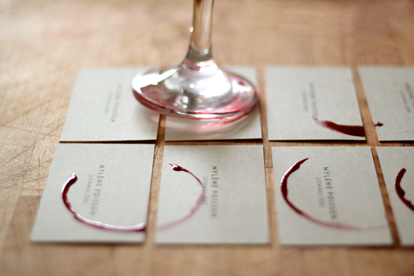
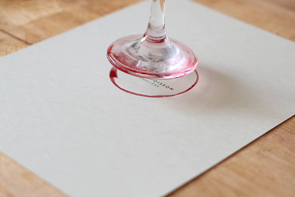
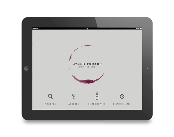
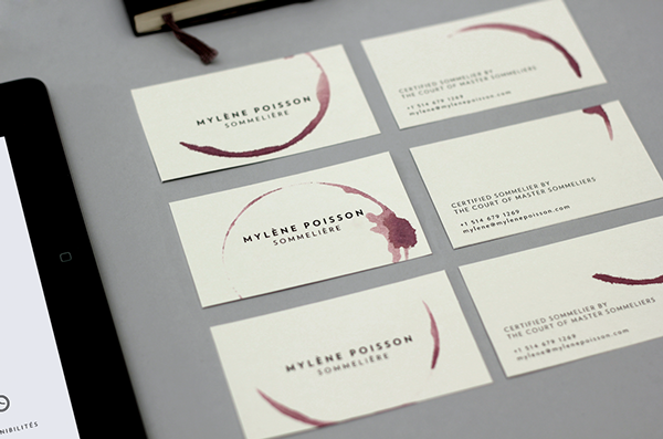
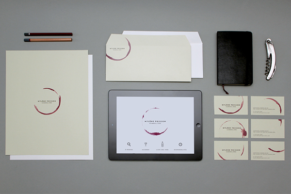
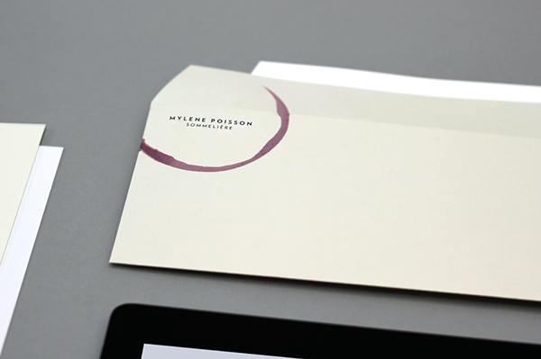
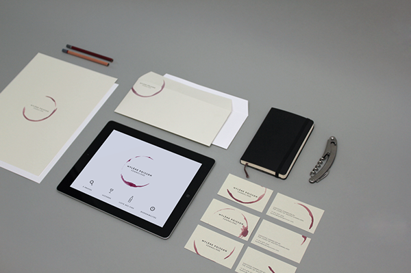
I really liked how the logo was created by hand using the bottom of a wine glass, so that it was authentic. This also meant that every time the logo was applied, it was different which added personality and individuality to the designs.
- Leave your comment • Category: brief 2 (505), OUGD505
- Share on Twitter, Facebook, Delicious, Digg, Reddit