1. The Pantone Colour System
The Pantone Colour System is important when designing, as you need to be careful with how colour will be printed when sent to the printers. You can save yourself hundreds of pounds when printing as long as you have chosen the right pantone colours. Once the Pantone codes are known by the designer, they can give this information to the printer so that the same colours are used throughout the process.
Wikipedia States:
Pantone Inc. is a corporation headquartered in Carlstadt, New Jersey. The company is best known for its Pantone Matching System (PMS), a proprietary color space used in a variety of industries, primarily printing, though sometimes in the manufacture of colored paint, fabric, and plastics.
The Pantone Color Matching System is largely a standardized color reproduction system. By standardizing the colors, different manufacturers in different locations can all refer to the Pantone system to make sure colors match without direct contact with one another.
One such use is standardizing colors in the CMYK process. The CMYK process is a method of printing color by using four inks — cyan, magenta, yellow, and black. A majority of the world's printed material is produced using the CMYK process, and there is a special subset of Pantone colors that can be reproduced using CMYK . Those that are possible to simulate through the CMYK process are labeled as such within the company's guides.
However, most of the Pantone system's 1,114 spot colors cannot be simulated with CMYK but with 13 base pigments (15 including white and black) mixed in specified amounts.
The Pantone system also allows for many special colors to be produced, such as metallics and fluorescents. While most of the Pantone system colors are beyond the printed CMYK gamut, it was only in 2001 that Pantone began providing translations of their existing system with screen-based colours. (Screen-based colors use the RGB color model — red, green, blue — system to create various colours.) The Goe system has RGB and LAB values with each colour.
Pantone colors are described by their allocated number (typically referred to as, for example, "PMS 130"). PMS colors are almost always used in branding and have even found their way into government legislation and military standards (to describe the colors of flags and seals). In January 2003, theScottish Parliament debated a petition (reference PE512) to refer to the blue in the Scottish flag (saltire) as "Pantone 300". Countries such as Canada and South Korea and organizations such as the FIA have also chosen to refer to specific Pantone colors to use when producing flags. U.S. states including Texas have set legislated PMS colors of their flags. It has also been used in an art project by the Brazilian photographer Angelica Dass which applies Pantone to the human skin color spectrum.
2. Hierarchy Within Design
Hierarchy within design is important, as you can control how the reader's eyes move around the page. This can also create interesting and balanced design that will attract the eye to the page, rather than just having a bulk of text.
Graphic Design Basics States:
Hierarchy is the order of importance within a social group (such as the regiments of an army) or in a body of text (such as the sections and subsections of a book). Hierarchical order exists in nearly everything we know, including the family unit, the workplace, politics, and religion. Indeed, the ranking of order defines who we
are as a culture.
Hierarchy is expressed through naming systems: general, colonel, corporal, private, and so on. Hierarchy is also conveyed visually, through variations in scale, value, color, spacing, placemet, and other signals.Like fashion, graphic design cycles through periods of structure and chaos, ornament and austerity. A designer's approach to visual hierarchy reflects his or her personal style, methodology, and training as well as the zeitgeist of the period. Hierarchy can be simple or complex, rigorous or loose, flat or highly articulated.
Regardless of approach, hierarchy employs clear marks of separation to signal a change from one level to another. As in music, the ability to articulate variation in tone, pitch, and melody in design requires careful delineation.
In interaction design, menus,texts, and images can be given visual order through placement and consistent styling, but the user often controls the order in which information is accessed. Unlike a linear book, interactive spaces feature multiple links and navigation options. Cascading Style Sheets (CSS) articulate the
structure of a document separately from its presentation so that information can be automatically reconfigured for different output devices, from desktop computer screens to mobile phones, PDAs, kiosks, and more. A different visual hierarchy might be used in each instance.
The average computer desktop supports a complex hierarchy of icons, applications, folders, menus, images, and palettes–empowering users, as never before, to arrange, access, edit, and order vast amounts of information–all managed through a flexible hierarchy controlled and customized by the user. As technology allows ever greater access to information, the ability of the designer to distill and make sense of the data glut gains increasing value.
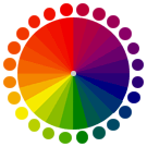
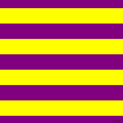
3. Complementary Colours
When working with complementary colours within design, you should always consider the usage thoroughly. Some complementary colours, when used next to one another, can be hard for the eye to look at and can cause stress on the rods and cones. This makes the reader's eyes hurt, and can also cause the colours to shake, as the eyes are stressed.
An example of poor use of complementary colours would be:
Colour Matters States:
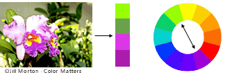
Complementary colours are any two colours which are directly opposite each other, such as red and green and red-purple and yellow-green. In the illustration above, there are several variations of yellow-green in the leaves and several variations of red-purple in the orchid. These opposing colours create maximum contrast and maximum stability.
4. Picas, Points and Pixels
Picas, points and pixels are all units of measurements within design. Picas measure points (sizes of typography, for example 72pt or 12pt). You can get pica rulers to measure typography with, so that you can find out the point size without being on a computer!
A point is the smallest measurement of typography.
Pixels are roughly the same size as a point, but are used to measure dots onscreen, for example 72ppi would be 71 pixels per inch used on a TV screen or a computer screen.
Picas & Points:
Example of Pixels:
Doug Vanderweide States:
A common question on Yahoo! Answers revolves around the relationships between inches, pixels, points, dots and picas.
The short answer is, a pixel — the basic dot in a TV screen — is the same thing as a point, the printer’s smallest measure. That one fact dictates all the relationships in online design, from why it is online images are always set to 72 dpi (dots per inch) to how to convert back and forth between inches and pixels.
A pixel is a dot is a point. Remember that and everything else falls into place: Points, pixels and dots are all the same thing.
How many pixels in an inch?
In printers’ measures, there are 12 points to a pica and 6 picas in an inch. So, 12 x 6 = 72; there are 72 points in an inch. And since points and pixels are the same thing, there are 72 pixels in an inch, too.
So, if you want something on screen to be 4 inches wide: 4 x 72 = 288. An element you want to have take up 4 inches horizontally on the screen should be made 288 pixels wide.
5. The Anatomy of a Typeface
Typeface Anatomy describes the graphic elements that make up printed letters in a typeface.
Wikipedia States:
The strokes of a letter are the lines that make it up. Strokes may be straight, as in k l v w x z, or rounded, as in c o s. If straight, they may be horizontal, vertical, or diagonal; if rounded, open or closed. Typographers also speak of an instroke, where one starts writing the letter, as at the top of a c f, and an outstroke, where the pen leaves off, as at the bottom of c e j k t y.
A main vertical stroke is called a stem. The letter m has three, the left, middle, and right stems. The central stroke of an s is called the spine. A stroke, usually a stem, which rises above the height of an x (called the x height) is called an ascender; letters with ascenders are b d f h k l. A stroke which drops below the baseline is a descender. Letters with descenders are g j p q y. An arching stroke is called a shoulder or sometimes just an arch, as in h n m. A closed rounded stroke is called a bowl in b d o p q D O P Q R; B has two bowls. A trailing outstroke, as in j k y J K Q R is called a tail. A short horizontal stroke, as in the center of e f t A and the middle stroke of E F, is called a bar. A longer horizontal stroke at the top or bottom, as in E F L T, is called an arm. The bottom of the loop-tailed g is called a loop; the very short stroke at the top is called the ear. i j each have a dot or tittle. Angles of strokes are called apices if at the top and vertices if at the bottom. w has one apex and two vertices; v has one vertex.
The terminals (ends) of instrokes and outstrokes often end in serifs in a serif font. A serifed or unserifed terminal may be described as a wedge, bulbous, teardrop, etc., depending on the design of the type. Some designs also have spurs, which are smaller than serifs and appear on angles rather than at a terminal, as on e or G.
Areas of negative space (white space) formed by straight or rounded strokes are called counters. Closed counters are found in a b d e g o p q A B D O P Q R, and open counters in a c e f h m n r s t u. Angles of white space, as in w, are corners (w has three corners); the term is not used for angles of strokes. The small corner formed by a serif, whether rounded or angular, is called the serif bracket.
6. RGB and CMYK Colour Models
Graphad States:
Differences between RGB and CMYK
- RGB is based on projecting. Red light plus Green light plus Blue light all projected together create white. Black is encoded as the absence of any color.
- CMYK is based on ink. Superimpose Cyan ink plus Magenta ink plus Yellow ink, and you get black, although this format also encodes Black (K) directly. White is encoded by the absence of any color.
- Computers use RGB internally. Exporting in RGB will give you results very close to what you see on screen.
- Even though it uses one more number to encode a color, the CMYK scheme encodes a smaller "color space" than does RGB.
- When a color is converted from RGB to CMYK, the appearance may change. Most noticeably, bright colors in RGB will look duller and darker in CMYK as shown below.
Recommendation
Use CMYK when designing for something to be printed, as the colours will be processed correctly and should print the same as what you see on screen. Only use RGB when designing something that will be seen on screen, for example a website.
7. Subtractive and Additive Colour Modes
Worqx states:
Available color systems are dependent on the medium with which a designer is working. When painting, an artist has a variety of paints to choose from, and mixed colors are achieved through the subtractive color method. When a designer is utilizing the computer to generate digital media, colors are achieved with the additive color method.
SUBTRACTIVE COLOR.
When we mix colors using paint, or through the printing process, we are using the subtractive color method. Subtractive color mixing means that one begins with white and ends with black; as one adds color, the result gets darker and tends to black.

The CMYK color system is the color system used for printing.
Those colors used in painting—an example of the subtractive color method.
ADDITIVE COLOR.
If we are working on a computer, the colors we see on the screen are created with light using the additive color method. Additive color mixing begins with black and ends with white; as more color is added, the result is lighter and tends to white.

The RGB colors are light primaries and colors are created with light.
Percentages of red, green, & blue light are used to generate color on a computer screen.
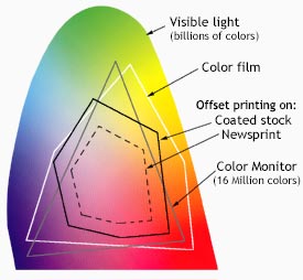
WORKING WITH SYSTEMS
The Visible spectrum consists of billions of colors, a monitor can display millions, a high quality printer is only capable of producing thousands, and older computer systems may be limited to 216 cross-platform colors.
Reproducing color can be problematic with regard to printed, digital media, because what we see is not what is possible to get. Although a monitor may be able to display 'true color' (16,000,000 colors), millions of these colors are outside of the spectrum available to printers. Since digital designs are generated using the RGB color system, colors used in those designs must be part of the CMYK spectrum or they will not be reproduced with proper color rendering. Working within the CMYK color system, or choosing colors from Pantone© palettes insures proper color rendering.
8. Tracking and Kerning
Tracking is the spacing between characters in a line of text.
Kerning increases or decreases the spaces between certain pairs of letters like AV, which often look better if they are positioned closer together.
9. Fonts and Typefaces
What is a typeface?
Think of a typeface as the 'design' of the design of the alphabet, the shape of the letters that make up the typestyle. The letters, numbers and symbols that make up a design of type. So when you say "Arial" or "Garamond", you're talking about a set of letters in a specific style, a 'typeface'.
What is a font?
Think of a font as the digital file that contains/describes the typeface. Think of the font as a little piece of software that tells the computer and printer how to display and print the typeface.
10. Applying Typography To Grids
A typographic grid is a two-dimensional structure made up of a series of intersecting vertical and horizontal axes used to structure content. The grid serves as an armature on which a designer can organise text and images in a rational, easy to absorb manner.


