Construction of Grids
Before you can apply a grid you must understand the requirement of the grid for the work to be produced. Typeface, text & illustrations, print method and paper quality must be confirmed beforehand.
Always start with small sketches. Thumbnail sketches will make your job of final layouts easier and productive. Thumbnail sizes should be proportionate to the final format to make your job of final layouts easier and productive.
Before drawing your sketches, consider the number of columns needed. For example:
- 1 column only for text and illustrations gives little freedom of layout. Restriction of making illustrations small, medium or large.
- 2 columns, logically, gives you more scope (1 column for text and 1 for image) and they can be mixed together.
- 2 column division can be subdivided to create a 4 column page.
- 3 columns gives opportunities for arranging and accommodating text and illustration in numerous sizes. You could also subdivide the three column grid into a 6 column grid arrangement.
Disadvantage of 6 column systems are:
Lines of text will be narrow.
Small typeface will have to be used.
But this solely rests on the function that is to be performed.
For statistics, figures, graphs and trend line publications:
Use 4 columns per page.
Remember 4 columns can be subdivided into 8, 16 + columns, convenient for representing stats.
The width of a column dictates the size of a typeface used.
The Rule:
"The narrower a column is, the smaller the typeface."
In A Nutshell....
Make a variety of thumbnails of layouts/designs.
Do not rely n just one set of thumbnails.
Enlarge a small selection of appropriate thumbnails by 1:1.
Compare them and select and repeat process until you are confident with the design.
Apply Type To Columns
The first line must fit flush to the top limit of the column grid. The last line must stand on the bottom limit. Keep calm, it is difficult to find the final solution the first time around. It could mean that your grid field is too high or too low.
For example:
10pt type, column length 15cm, roughly means use 15 point leading. At this length there must be 10 lines per field, meaning 30 lines per every 15cm. The depth of my fields ascertains how many 10pt type lines I have.
Font Heights
The Caption Text should be a proportion of the Header & Footer Text. For Example:
Caption Text - 4 point type, 6 point leading
Header & Footer Text - 7 point type, 10 point leading
Body Text - 10 point type, 13 point leading
Subheading - 20 point type
Heading - 40 point type
Type & Picture on an 8/20 field grid
A4 format, 8 & 20 field grids.
8 grid fields are used frequently for advertising material and brochures. If using 8 field grids, you can subdivide into 16 grid fields. 8 and 16 grid fields give you a range of possibilities.
8 grid fields allow various sizes of illustrations to be portrayed. You can use with or without text. You need to have a good perception of composition.
"The grid is only an instrument in which you, a designer, can make interesting and balanced design."
20 field grid has quite a large scope for possibilities. Calculated at 42 layout possibilities.
It is up to you to use the teachings to create and develop your design response.
...Are grids an aesthetic choice?
Making Grids on InDesign:
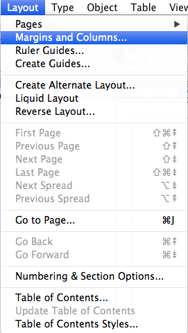
Make a new document at whatever size you wish to work at and then go to: Layout - Margins and Columns...


It should result in something along the lines of this...

Making Grids on InDesign:
Make a new document at whatever size you wish to work at and then go to: Layout - Margins and Columns...
Then click on the link button to unlock the margins, so that you can alter each margin to a different size. Then you can change the margin sizes according to how you want your layout to look like and click okay. If you have the preview box ticked, then you can see how the page layout looks as you change the margin sizes.


To make grids alongside the guides, go to: Layout - Create Guides...

Then you can alter the amount of rows and columns that you want on the page, and the gutter size works best at 5mm.


Another way of creating columns and grids would be by using the Rectangle Frame Tool.
By creating the square that you want, and holding down the mouse click whilst pressing the up arrow on your keyboard, you can create grids to work with. You can also press the right arrow to create more grids.

An easy way of making guides on the page and finding the centre point:
Grab the little square shape on the top left hand corner of the ruler of the page and drag it out till it is in line with the edge of your page layout...

Then drag and drop guides from the ruler to the top and bottom of the InDesign page...

If you drop another guide on top of the bottom guide, and change the location of the guide by using the values on the top left of the page, you can find the centre point.
Type /2 next to the unit of measurement on the Y height..

You now have the centre line represented by another guide. You can repeat this step along the page to find more and more centre lines between guides.

Another way of making guides would be by using the scripts enabled into the software. To find these, go to: Window - Utilities - Scripts...

You can then look in the Application and Samples folders to find the scripts to use.

Add a box, using the Rectangular Frame Tool and select it.

Then double-click on "AddGuides.applescript". Then click OK.

Then if you look through the different scripts again and click on "MakeGrid
Then you can alter the amount of rows, columns and gutter sizes to how you feel and press OK...

It should result in something along the lines of this...

You can then use this as a set of guides to follow when designing.