

Words That Best Describe Yourself:
Neat Freak, Sometimes Loud, 'A Thinker', Observant, I complain a lot!
Which living designer do you most admire, and why?
David Foldvari - Really like the freedom in his brushstroke of his work, along with him being able to illustrate controversial issues in a non-bias manner

Source For Image
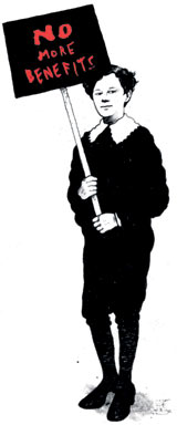
Looking at Foldvari's work, I really like the way he illustrates and the style he works in. It reminds me quite a bit of work by Banksy, especially the full illustrations of the people in solid black and white. I think this kind of technique of lots of little black strokes, whether painted or drawn, could look really good in a typeface.


Source For Image
Source For Image
Who is your favourite musician?
Florence & The Machine

I think that the style of the typeface for the name of the band could work quite well representing Anisha, because it's quite girly and you straight away think of Florence when you see it.

I also think that the typeface that has been created to write the album name 'CEREMONIALS' is really interesting and something similar to this could work quite well, as it relates to the fine lined brushstrokes of Foldvari's work.
Favourite Colour: Maroon
Which piece of graphic design do you wish you had created?
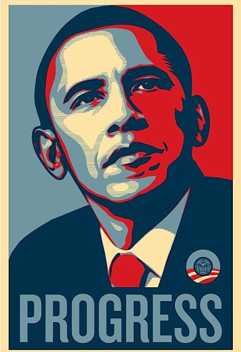
Shepard Fairey - Obama Posters

I think that the colours used in Fairey's posters are interesting to work with, however we have been limited to black and white.. Could the typeface consist of this style of design? Could try creating some type using black white and grey, rather than blue red and cream, and make something of similar aesthetics?
Favourite Typeface:
Arial

I think that Arial could be a good typeface to work from, because Anisha describes herself as a 'neat freak' and Arial is an extremely tidy typeface. It's a bit plain, but that adds to the neatness. If I can find an interesting way of using Arial, but changing it to incorporate Anisha's personality and likes&dislikes etc, it could look really nice!
 Source For Image
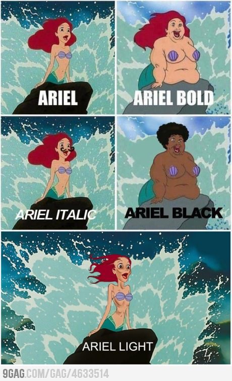
I thought about maybe manipulating the Arial typeface, to incorporate the character Ariel from the Disney film 'The Little Mermaid'. I found this take on changing the actual character to suit the description of the different typefaces, which I found extremely amusing.

I really like the typeface used for the title of The Little Mermaid, and there have been many takes on it
Source For Image
I really like the M used on this version of the title, because it looks like a wave going over the rest of the letters.

I really like the idea of using a well known font and incorporating the pattern into it to give it a zebra feel. I also like the use of lines to create the pattern.
Ideas For Typeface
 I thought about tracing over parts of the Arial typeface and then filling in the rest with lines. I really like this idea, because it is aesthetically pleasing. It's an effective idea as it conveys the 'neat freak', Arial loving side of Anisha. I have also created it in the style of Foldvari, as he uses a lot of fine lined strokes in his work, and also when he incorporates type into his illustrations, the letters are quite bold and blocky. I think if this idea was hand rendered, then I can make it look even more like Foldvari's work, by using different materials and processes, other than just straight, neat lines on illustrator.
I really like filling in the previously white parts of the typeface, as it emphasizes the letters more and helps to make them stand out. This also makes the areas which are made up of fine lines less in your face and they look like they're actually part of the letter.

Andrei Robu

I found a typeface quite similar to what I'm trying to create, which I really like. I think it's really smart and nice to look at, and quite inspiring for my own work.

I decided to go back to the Foldvari research from before, and chose this illustration. I really like it, because he has used typography to help create the image. I like all the fonts that Foldvari creates in his images, as they're very stencil-like and bold, which once again reminds me of street art.
Matthew Gray Gubler
One of the people Anisha said she'd like to have at her dinner party was Matthew Gray Gubler. I did a little bit of research into him and found that not only is he a famous actor, he also loves to draw and paint.

Favourite Food: Fish

Source For Image
I think this idea for a font is really cleverly thought out and well executed. I really like the idea of using silhouettes of sea animals to create the different letterforms. I think the letters used on their own wouldn't work so well, but when used in a sequence or in a word, it would be legible and could look really cool.

I think this is a really fun and witty way of creating a typeface to do with fish. I like the idea of using actual photographs of fish to create the letterforms with, and think it works quite surprisingly well, as the fish aren't exactly that easy to work with (especially when creating the glyphs).

I think fish scales are really interesting to look at close up and form a nice shape. Letters made out of scales could look quite interesting.. Or maybe find a way of incorporating just a few scales into the letters.

Close-up Photograph of the skeleton of a fish.
I really love this photo, it's really interesting to see the skeleton of a fish, especially when it looks so translucent. I think it's really intriguing how straight all the bones are and how it just looks like a big pattern of straight lines. I think the idea of the fish bones could work quite well with the previous idea of using lines in my typeface (see above).

Source For Image
Looking through some more of Foldvari's work, I noticed that he likes to make it look like the ink has dripped off of the characters that he's illustrated. It makes the images look more eary and weird.
- Leave your comment • Category: alphabetsoup, OUGD403
- Share on Twitter, Facebook, Delicious, Digg, Reddit