Find an article in a newspaper from Tuesday 23rd October, and research into related subjects and visual concepts..

Chosen Article: Women of War: A Different Side of Afghan Mission
"A new photographic exhibition provides a rare insight into the lives of women soldiers serving on the front line in Afghanistan. A photojournalist, Alison Baskerville, was embedded with British Forces and granted unparalleled access to the Female Engagement Officers. The engagement officers work to build relationships with Afghan women in some of the most dangerous parts of Helmand. Ms Baskerville said her photographs highlight how women respond to the often austere conditions in which they find themselves and how they maintain their morale and individuality in the face of demanding circumstances. Capt Alice Homer, below, is an officer with the Royal Electrical and Mechanical Engineers. The exhibition runs from Thursday until Nov 11 at Oxo Gallery, Oxo Tower Wharf, on London's South Bank." - The Daily Telegraph, Tues 23rd October 2012.


The role of women in the war has changed quite dramatically since WWI, as women were nurses rather than actually in the front line. I think it's really interesting to see how women take part nowadays, and how their roles are still quite feminine, for example gaining the trust of the Afghan women.

Researching into the roles of the women in the war, I came across this website which informed me a lot about what women used to do in WWI and it made me realise how much society has barely changed today and the fact that women's roles have improved, however they still don't take part as much as the men do.

I think that propaganda posters are really effective designs to encourage women to do something during the war. The poster has been made to make the woman look like a strong figure of importance, showing off her muscles and preparing herself for work. The slogan "we can do it" immediately brings the sense of positivity to the poster and the colours are bold and vibrant which also suggests positivity and strength.

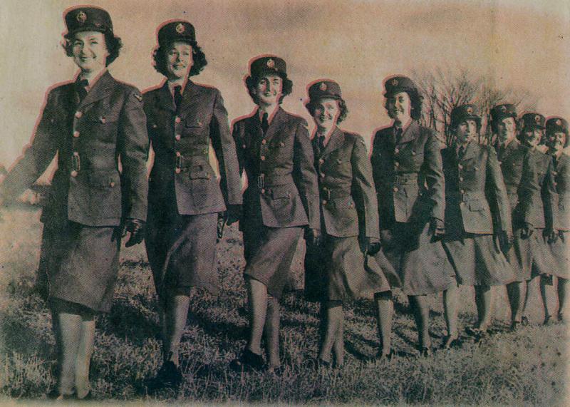
I found that women had a set uniform during the war that was pretty similar to that of the military, but had great femininity about it, what with the tight fitting blazers and knee length skirts. I think the fact every single woman in the photograph is walking the same, has the same hair and are wearing the same clothes shows that there wasn't really any thought of individuality when working for the service.

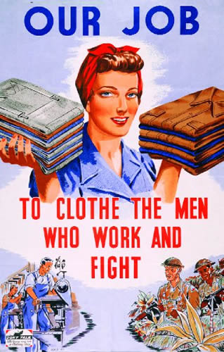
I think that this poster is very sexist and portrays a stereotypical housewife. Rather than encouraging women to take part in the war first hand, they're being told that clothing the men who work and fight in the war is their job and that they should abide by this idea. The poster makes women seem fragile and weak in comparison to the illustrations of the working and fighting men.

I really like this photograph, because even though none of the women are looking down the camera, you still feel like you can relate to the photo and it seems really personal and easy to engage with. The women look content with their officering job and their role in the war.

I think that this example of info-graphics is interesting, because it relates more to how women are perceived and how they don't have as much choice as men do. The poster relates more to women's rights than it does to women taking part in the war, but I really like the general aesthetics of the design and the simplicity and clarity.

This example of info-graphics is similar to the example shown above, just set out in a different manner. I think it's a lot more cluttered than the other one and wouldn't really say that the colour choices work for the design.

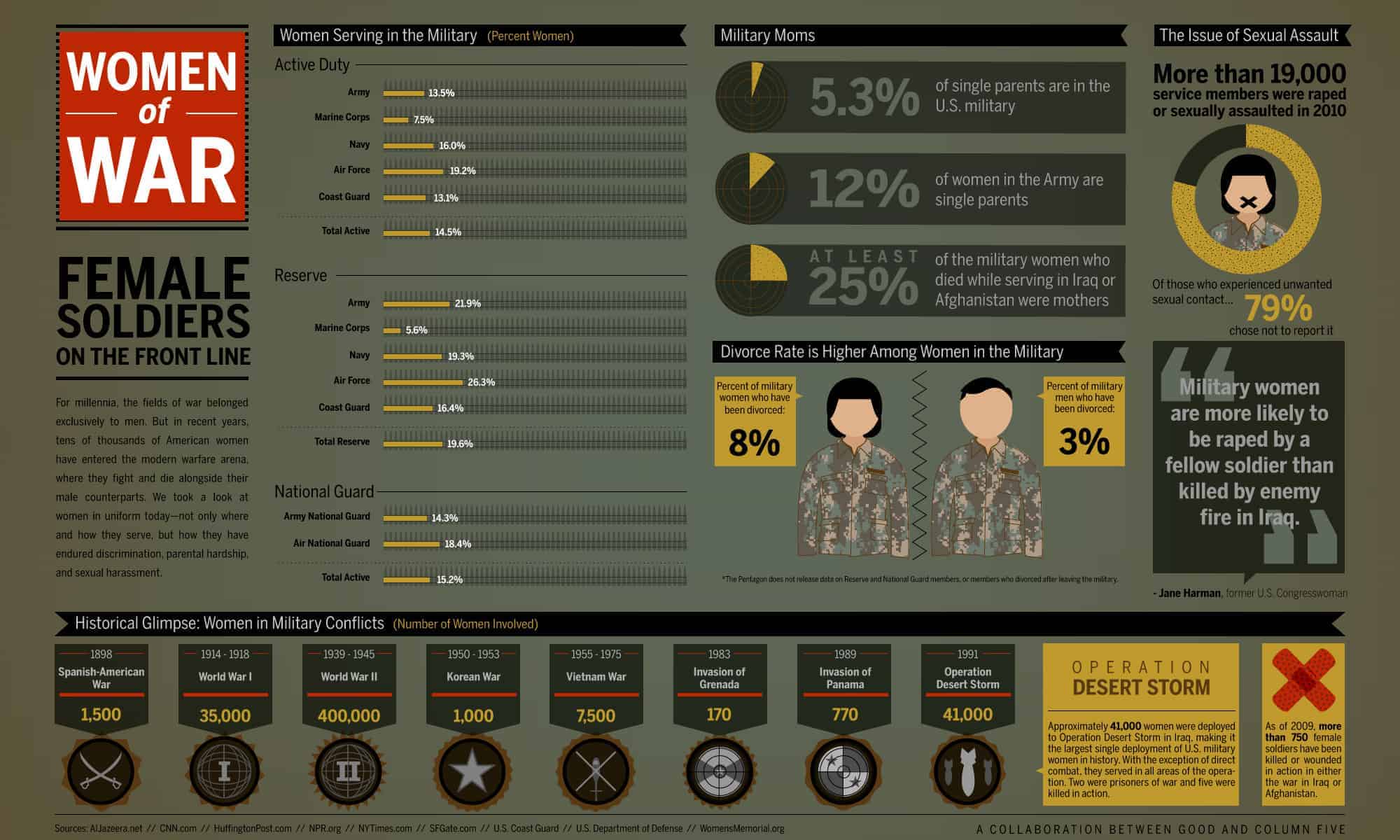
I really love this info-graphic about women of the war, because it is factual and informative, yet simple and to the point. The poster has lots of information spread across a small amount of space, yet it is extremely legible and easy to engage with as the designer hasn't just slapped a big block of type across some paper. I think the colours work really well as they're colours that you would usually associate with warfare and the army.

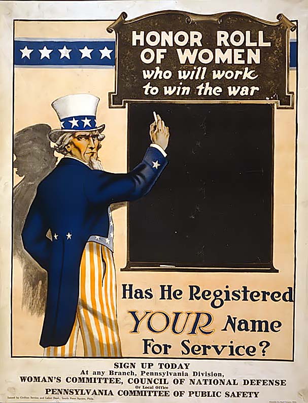
I think this propaganda poster design is really clever, because it directs the message straight at the reader by asking "has he registered YOUR name for service?". This makes the design more personal to the audience as they read the poster, and will make them question themselves and feel guilty for now registering their name.

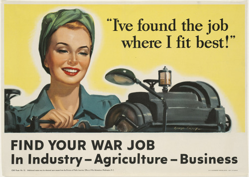
I think that this poster concept aimed at women works well, because it has been created to make the industry, agriculture and business job sides of the war seem really appealing and positive. The designer has done this by using positive and bright colours alongside an illustration of a happy woman working with the slogan "i've found the job where I fit best". This combination of generally happy outcomes makes the whole design undeniably cheerful.

I love this idea that's being illustrated, and the way it has been executed. At first it is a bit confusing to understand, but once you read the key the diagrams become extremely clear. I like the way the entire image looks hand-rendered and the colours chosen really compliment each other nicely. I also think it's good how concise and seemingly accurate the diagrams are.