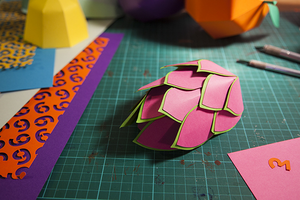
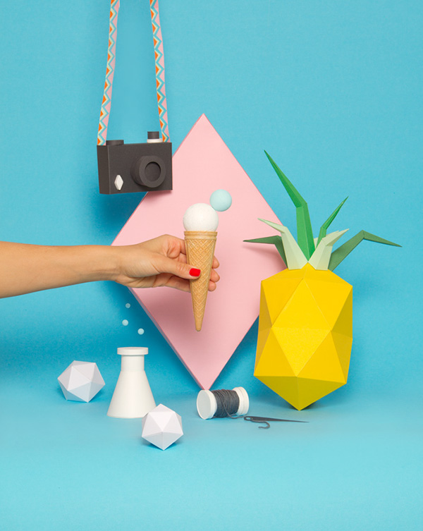
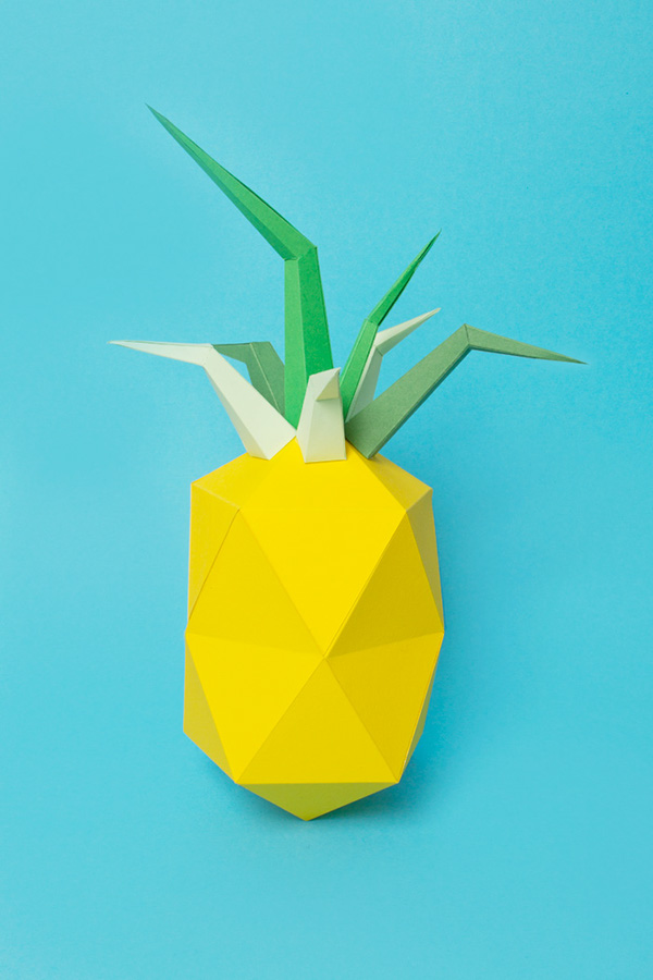
I really love these paper structures and how they're photographed - they almost look real in the final poster designs, and sometimes it's hard to believe that someone has made them out of paper! This could work really well with Body Shop products, as we could try making 3D paper constructions of ingredients used within Body Butter or lipsticks..
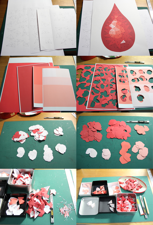
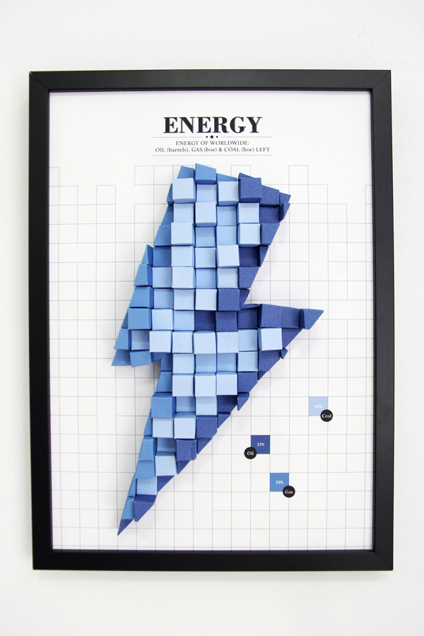
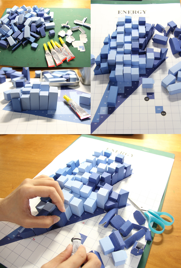
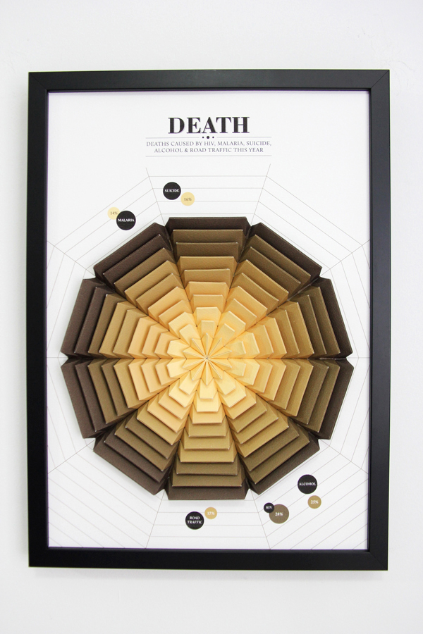
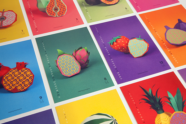
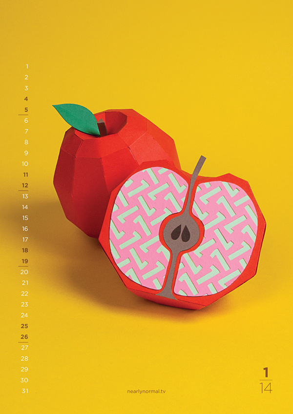
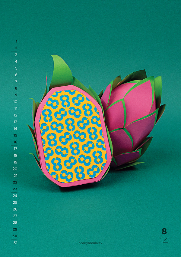
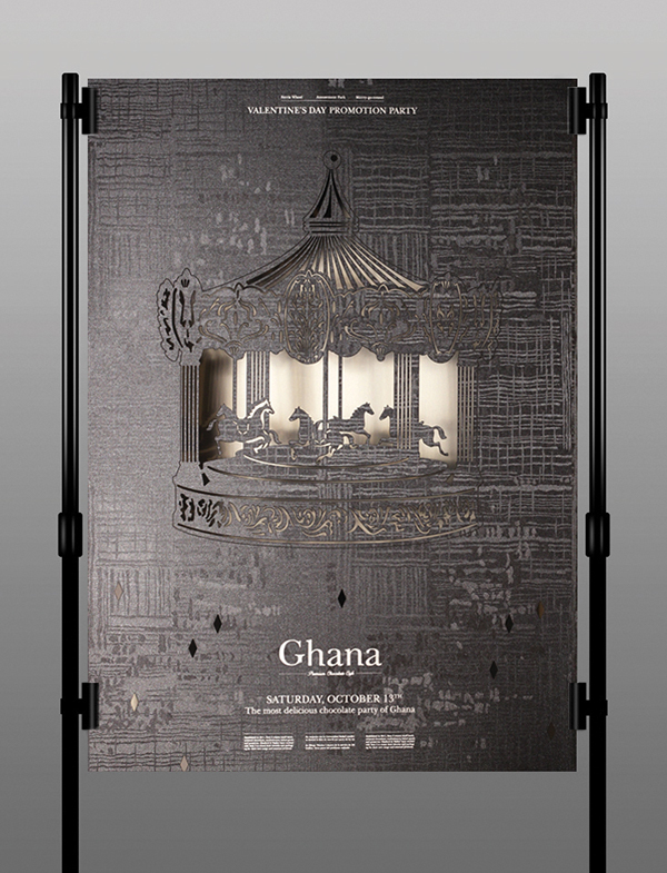
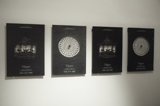
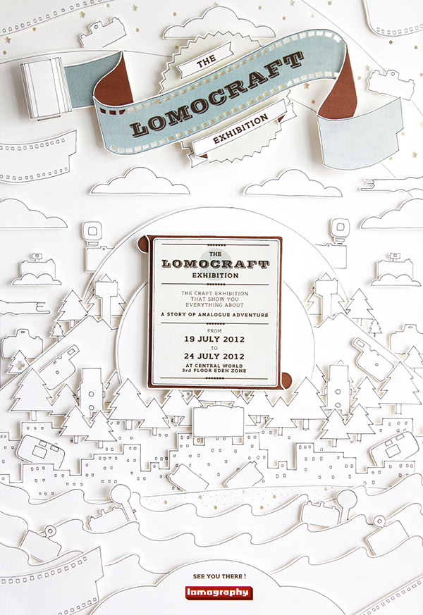
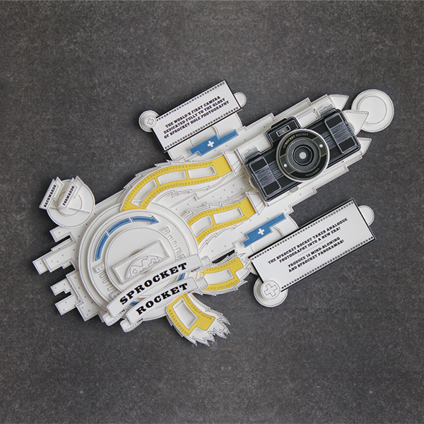
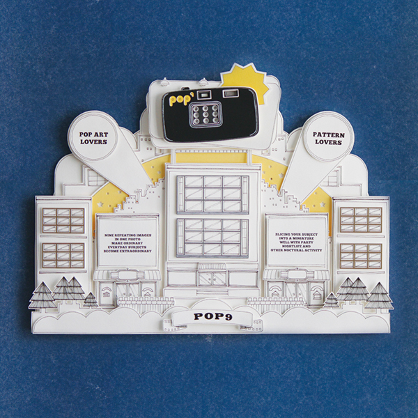
I really loved how these 3 poster designs were constructed. It was interesting to see exactly how the designer went about creating the final pieces and they work so well as final products! The sense of a 3D element really brings the posters to life.
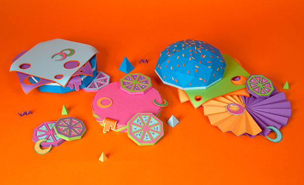
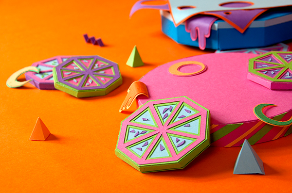
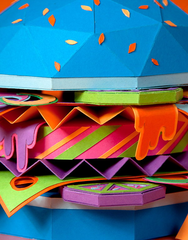
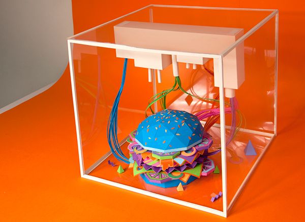
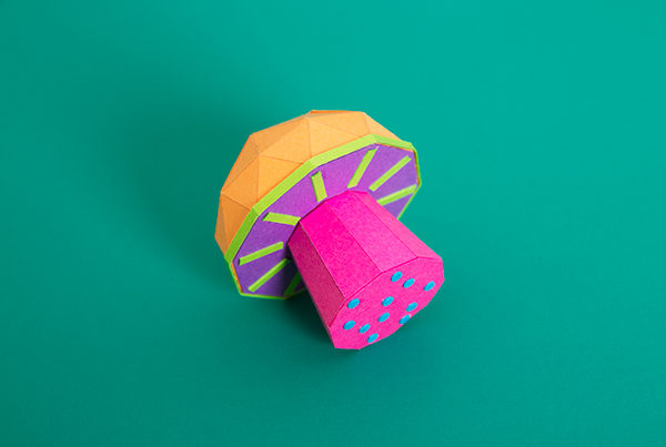
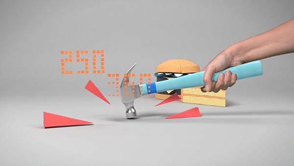
I thought that it was interesting to see all the different paper elements of the burger - so many different structures produced to create the final burger structure! The colours are a bit bold and 'in your face', but it works well together.
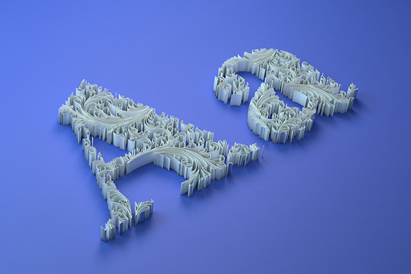
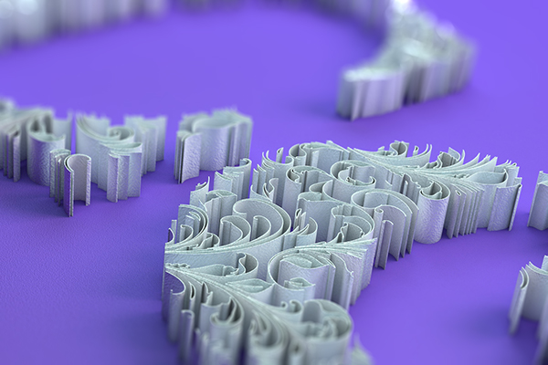
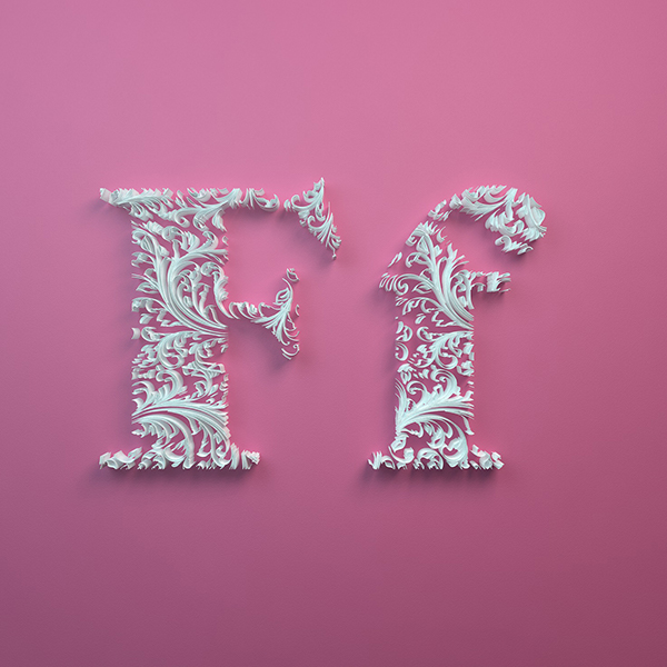
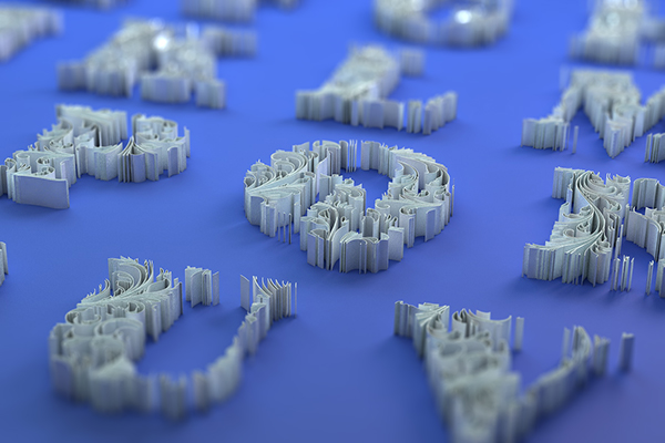
I think that this alphabet made from quilling looks absolutely beautiful. I love how simplistic yet elegant it looks, and how they have really complimented the typeface used.


I found this poster interesting, because you could see how the word ART was made out of several 3D shapes. It was also interesting to see how the designer didn't stop there and even made the 'TRUC TROC' out of paper cut-outs.
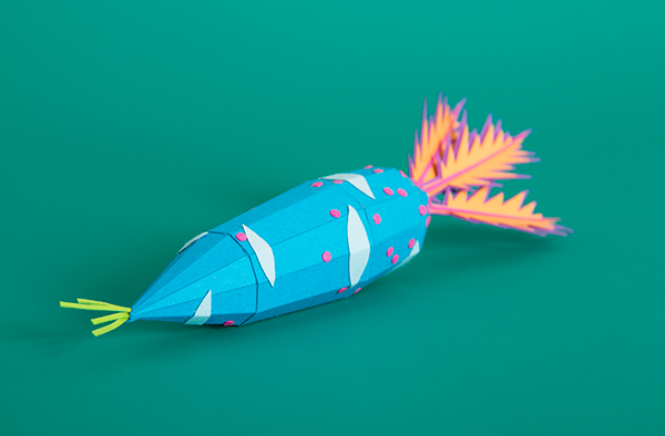
Once again some really weird colours have been used to make every day vegetables out of paper, however I think it looks really interesting and almost dream-like.
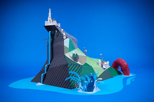
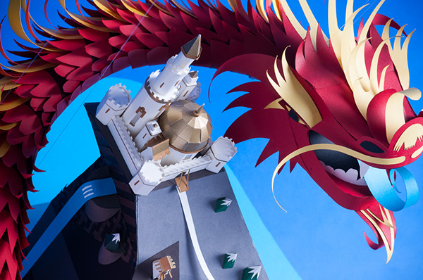
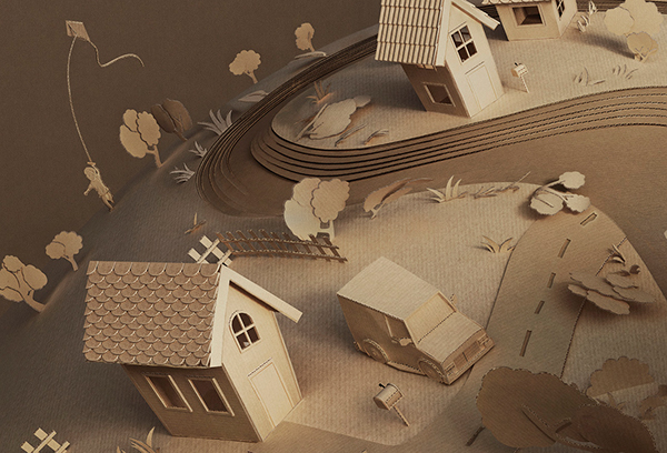
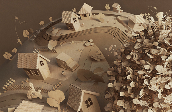
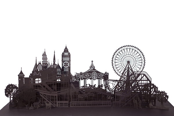
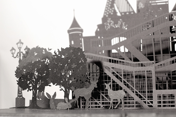
The immense construction for this particular paper structure was outstanding! Every little detail has been thought about, from the dragon scales down to the little trees of the island. I think it looks amazing!
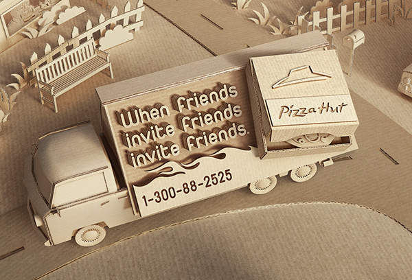
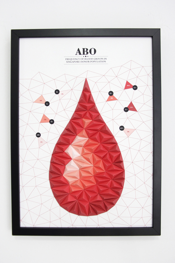
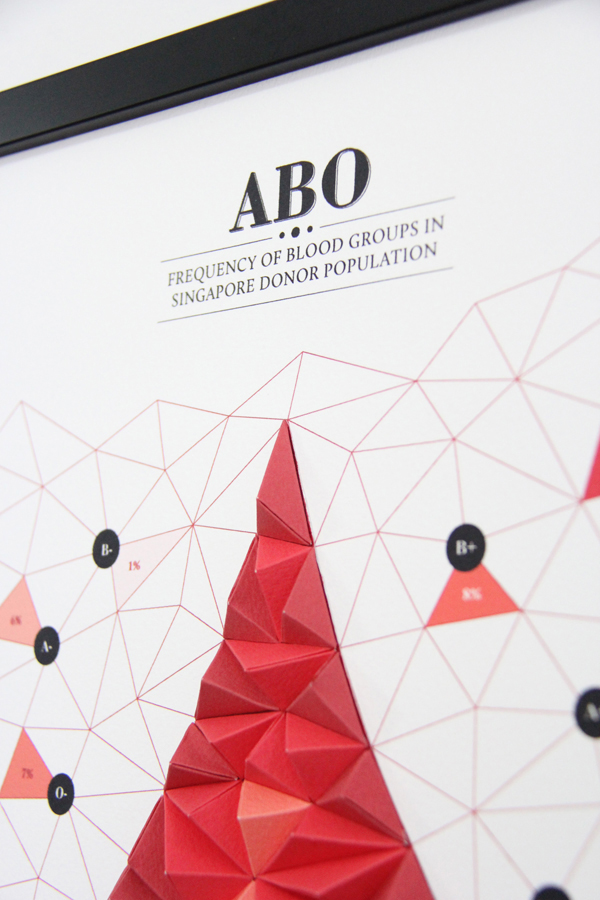
I found this paper piece interesting, because the designer chose to work with one particular stock. This made everything seem quite bland, yet the detail within the structure is crazy!
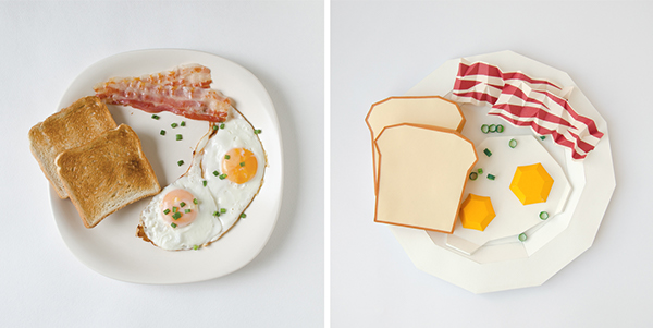
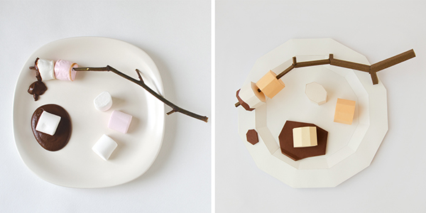
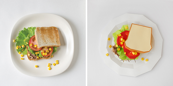
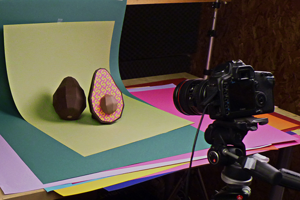
I found these photos humorous - the images on the right were made from paper and look just like the original food photos. I think that the choice of stock and printing quality helped to produce the textures of different food.


These poster ideas for Amnesty International were pretty interesting. The use of blank white paper took any identity away from the characters in the posters, and helped you realise that these kind of things could happen to anybody!
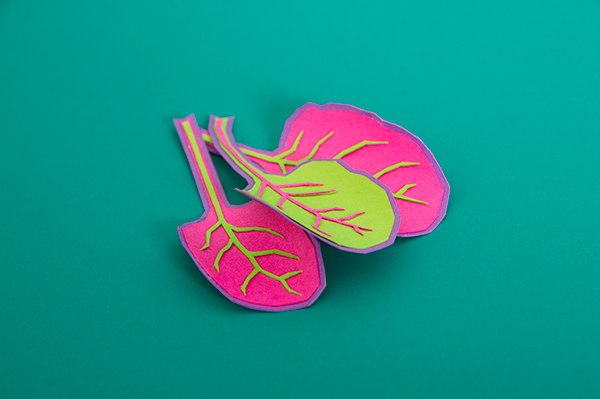
I really loved these paper crafts due to the sheer detail and thought put into each object created. You can really experience the skill and craftsmanship that the designer obtains.

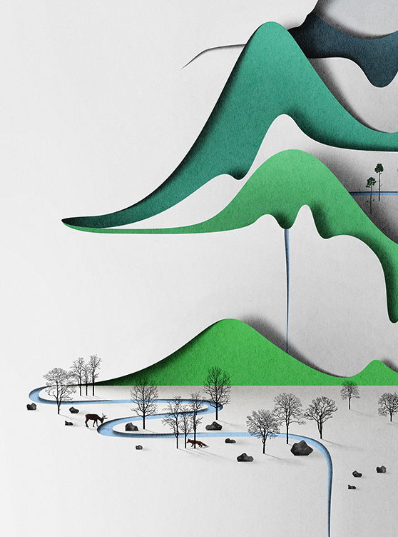
This poster took my interest because of the simplicity. The idea of the different layers of paper is so simple yet so incredibly elegant! It works so well as a whole and the closer you look at the poster, the more details you start to notice - like the branches of the trees or the fox walking between the woods.
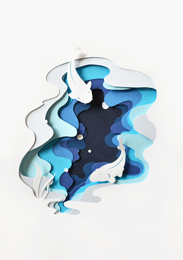
I liked this design, because of the layering of different shades of paper to add a sense of depth. Incredibly simple, yet incredibly brilliant.
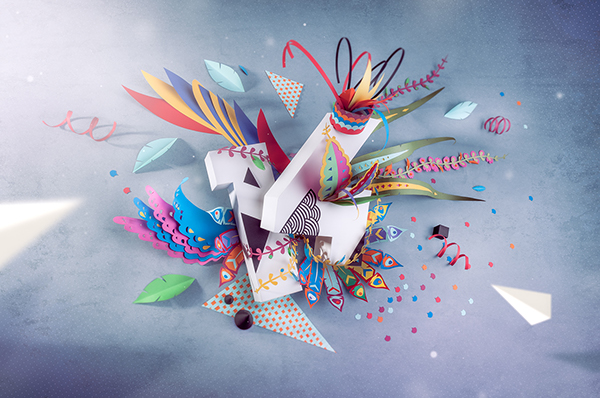
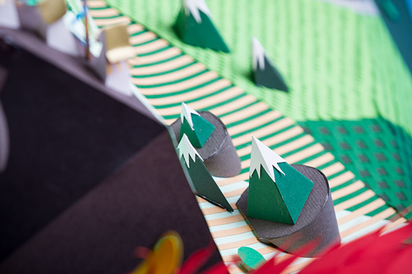
I thought that this was interesting, because it was so crazy and out there! I didn't really know what was going on, but it attracted my attention completely and I was fascinated by all the little details and bits here and there.
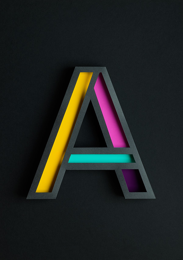
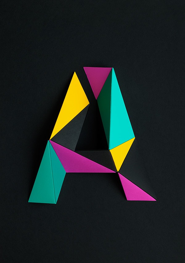
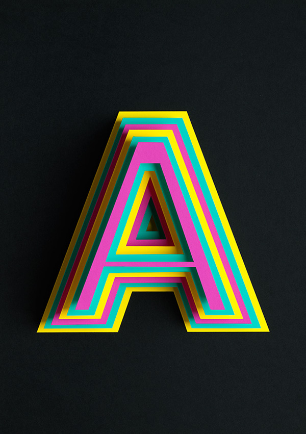
I really loved these letterforms constructed from paper. The 3 ideas are completely different, yet they work ridiculously well with the colours chosen and you can tell that the same person created each one. I also love how the way that they have been photographed helps to show that they're real 3D objects that the designer created.
I looked at this piece, because I was really impressed by the intricate detail.
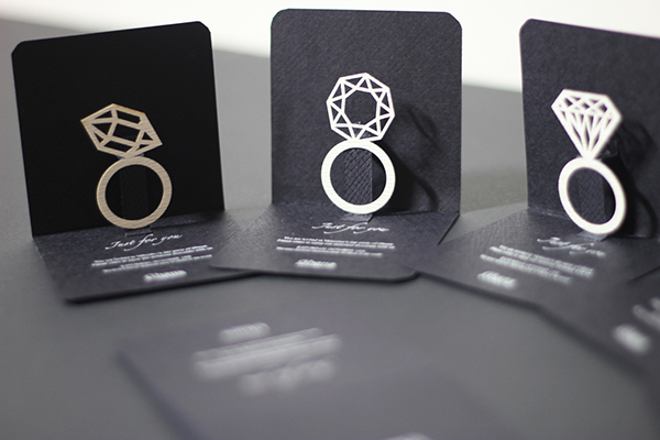
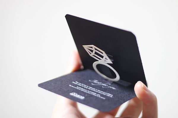
The same person created these little ring booklets, as well as the 3 intricate posters below..
That skill!
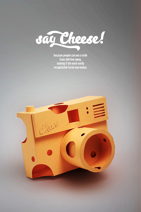
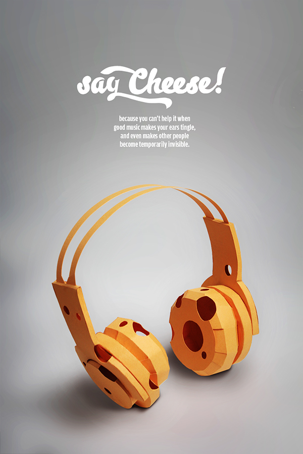
I thought that these posters were quite humorous. At first, I couldn't even work out if they were made from paper or 3D rendered, but after a lot of staring at them I noticed that they were, in fact, made out of yellow paper. They have been constructed beautifully well, and they even compliment the typefaces used.
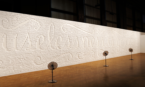
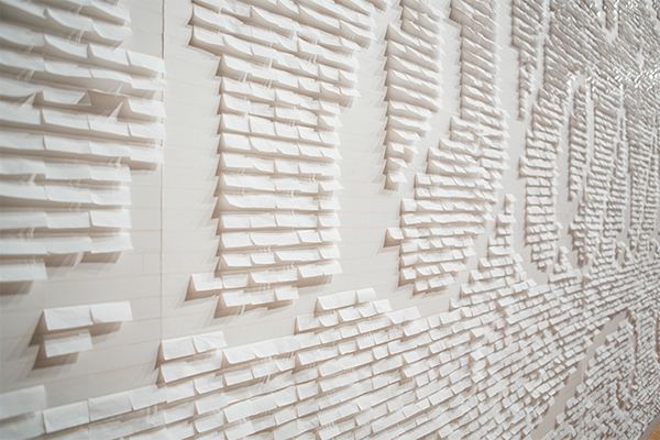
The sentence "uselessness is gorgeous" was made out of thousands of sticky notes, which really did impress me! The attention to detail can't be faulted, considering how the sentence has been produced.
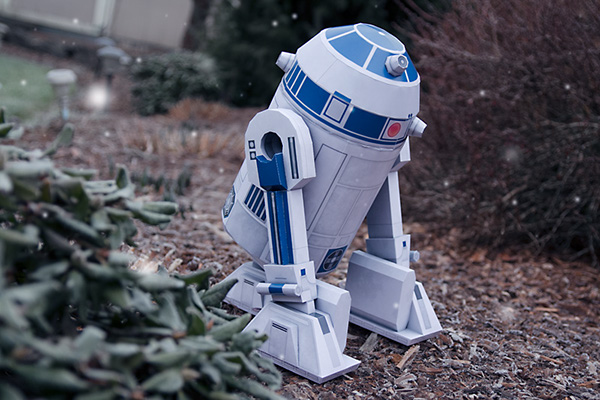
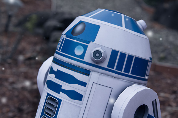
I looked at these R2D2 creations simply for the fact that they looked so realistic!
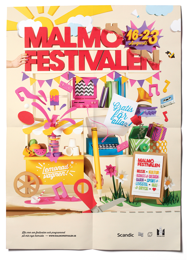
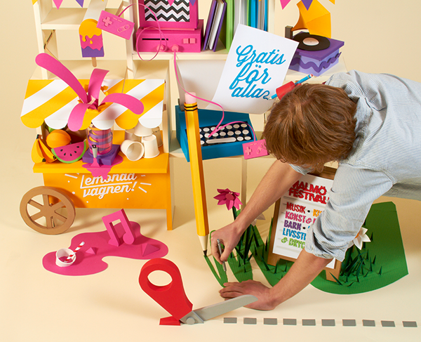
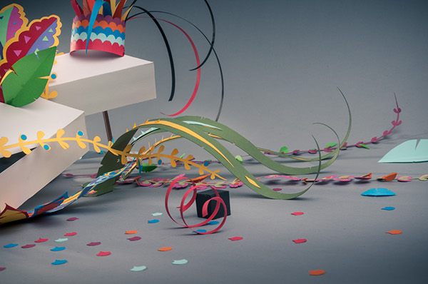
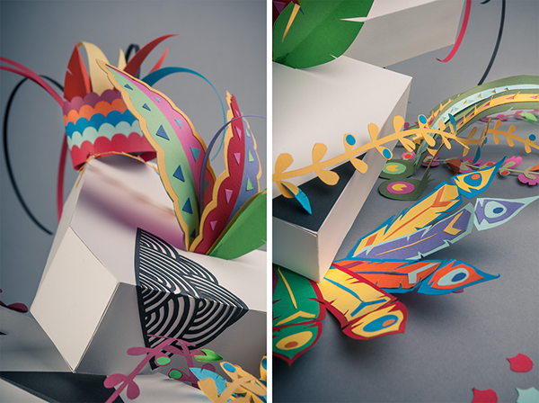
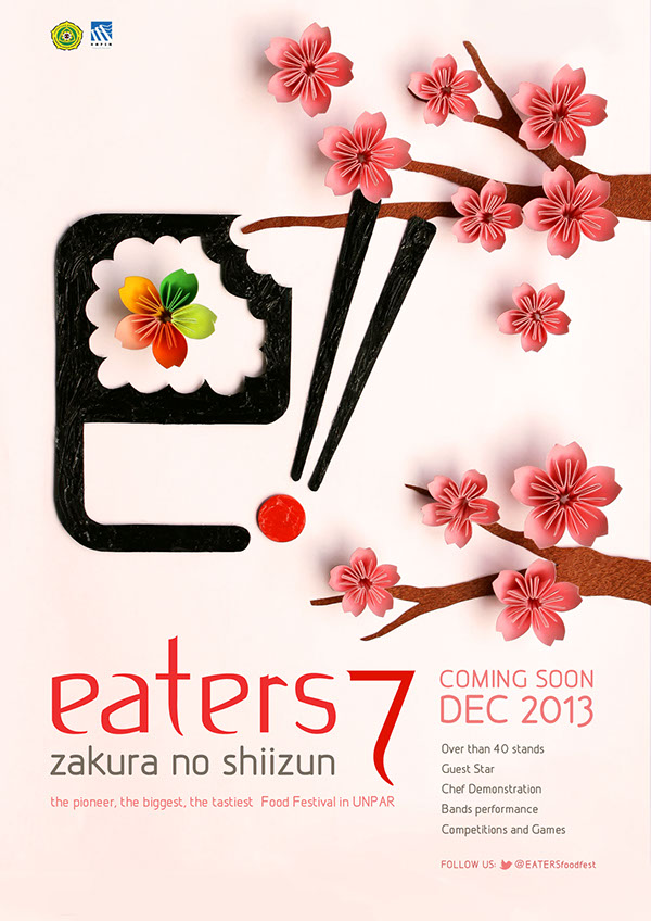
I absolutely love this poster design. I think it works really well as a whole and when photographed as a poster you can't even tell that someone created every single object within it by hand until you look at the design more closely. The colour scheme is really complimentary, and the idea itself works really well to show what the Malmo Festival is going to be like. It's also interesting to see someone making finishing touches on the objects within the poster.


I thought that this was interesting to look at, simply to see how 3D triangular prisms could be used to create an image. Although it does look rather 'arty-farty'.
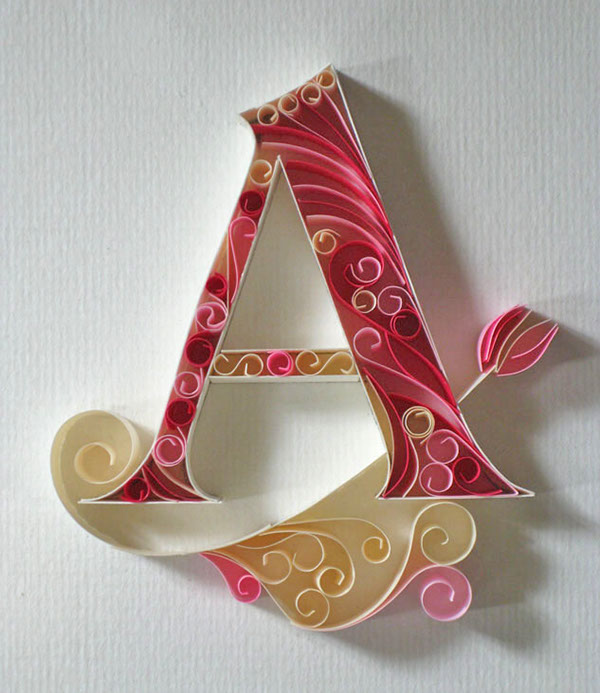
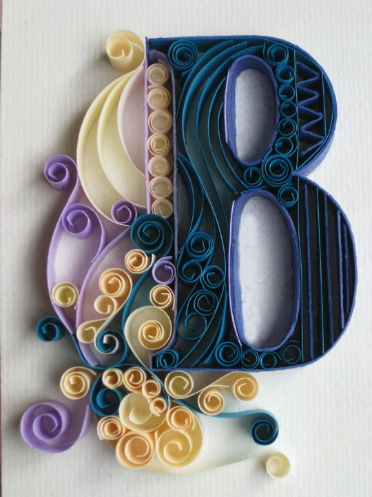
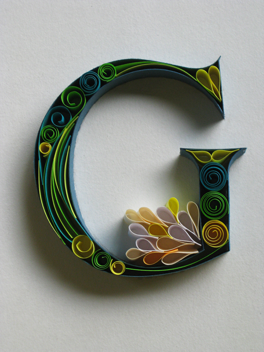
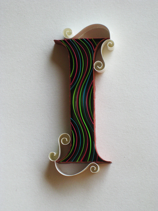
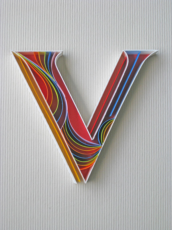
I absolutely love quilling. I think that it works extremely well, especially with typography! I also think that Body Shop could use quilling in posters for their products, as you can change the colour schemes accordingly for different products, yet they'll all still interlink with how they're produced. I think this is definitely something James and I should consider!


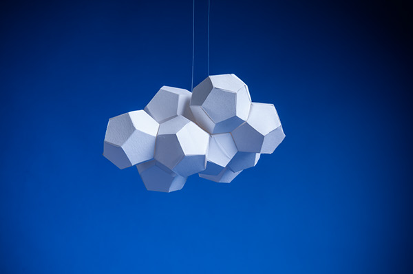
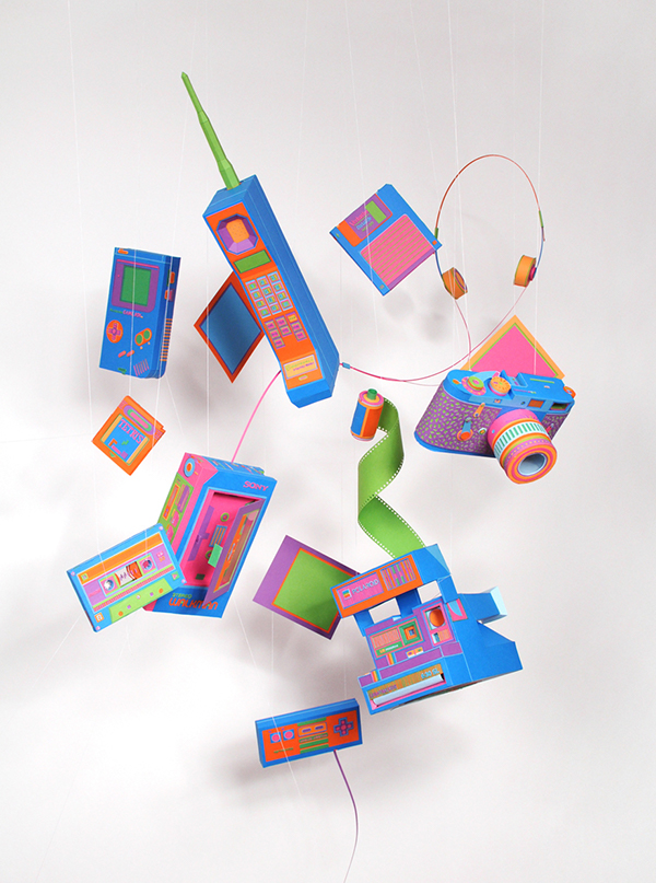
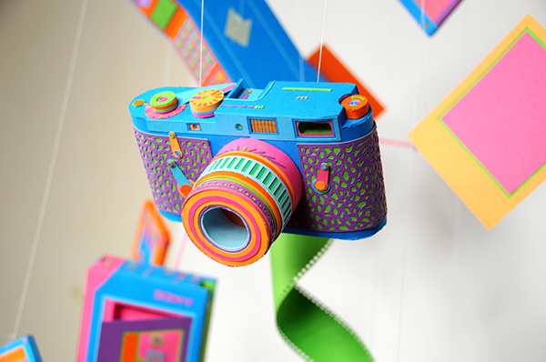
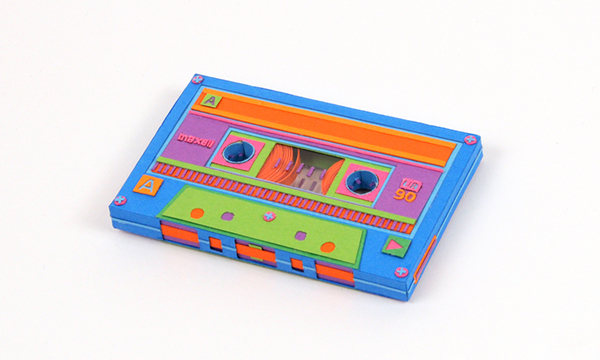
I liked these images, because the shapes have been suspended in the air using fishing wire before photographing, making them look like installations - they also look a lot bigger than they actually are!
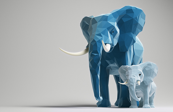
I thought that these 3D paper craft elephants were cute, and it was interesting to see how paper could be used to it's full potential (if you have origami skills).
I found these posters quite interesting, because of the idea of layering several pieces of paper designs on top of one another to create landscapes, cityscapes and a sense of depth.
I loved these posters, because they looked like animation stills. They were also really well finished and produced - everything looked real, rather than made from paper!
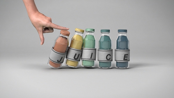
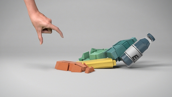
I love the work produced in these posters. I think that the colour schemes work really well and they compliment one another. I also think the use of a hand in the photograph helps show the viewer that what they're seeing in the poster are all 3D structures.
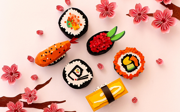
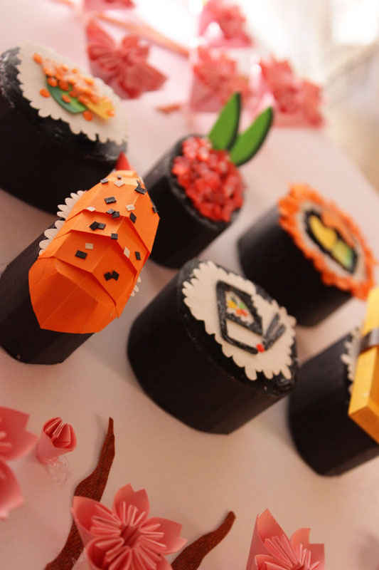
I thought that these sushi creations were excellent! Nothing could be faulted within them, they looked spot on! I also love how they've created the flowers in a Japanese style.


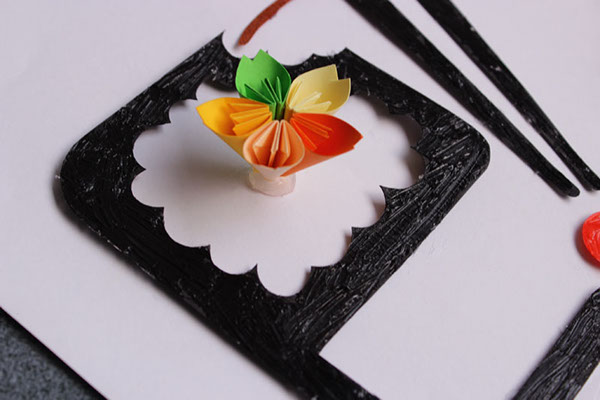
These flowers were interesting, because they have been made out of several cut-out pieces of layered paper. Rather than making them like origami, they were simply stuck on top of one another to create the sense of depth and '3Dness'.
- Leave your comment • Category: collaborative brief, OUGD503, responsive, studio brief 2
- Share on Twitter, Facebook, Delicious, Digg, Reddit