Campaign Posters


I thought that these campaign ideas were interesting, and definitely worked really well. Body Shop seem to be really good at bringing a message across in a simple way, without using horrific imagery to scare you into doing something! Instead they try to make you think about your actions. Using black and white photos for this particular campaign also helped take away any idea of who these people actually were.

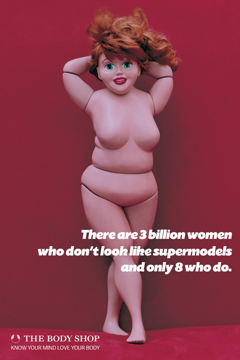

I thought that these campaign posters were really clever, and actually quite humorous even though the topic is serious! The Body Shop are all about encouraging Self Esteem and being beautiful. I thought it was funny to see naked Barbie dolls being created to look voluptuous and curvy, yet still beautiful. Rather than slim and covered in makeup with perky bottoms.


These poster campaigns were similar to the fat Barbie dolls, but this time they were questioning the reader why they don't look like a Barbie doll. I found these interesting as they were touching on a subject that a lot of people seem to forget about - the idea of how females are portrayed in the media. How men think we should look, and how we respond to that.


The HIV campaign posters were interesting, because they reminded me of work by Barbara Kruger. I also really love how simple and essentially typographic the posters are, as well as the idea that they've put the campaign designs on the packaging for their products.
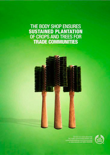


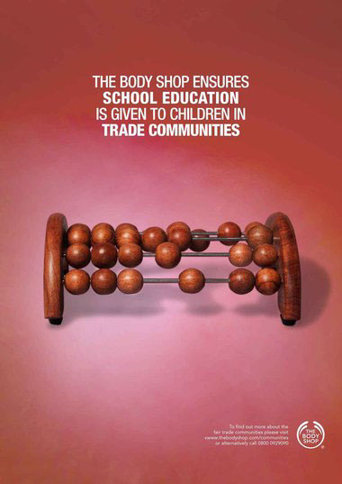
I thought that these posters were quite clever, as they took every day objects and photographed them in a way that looked like what they were talking about in the poster, for example using washing up brushes that look like trees.

I really hate the design of this poster, but I thought that the quote "Green is not a colour, it's a state of mind" was an interesting one. It also reflects The Body Shop and their outlook on the world and society.


I didn't really like the design for the campaign for endangered animals. It looked really cheap and quickly put together - they could have made people feel really sorry for the endangered animals!


Product Posters

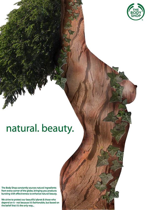
All of the Body Shop product posters seem to reflect the idea that The Body Shop use natural ingredients and fair trade resources to create their products. This is emphasised with the use of organic imagery.
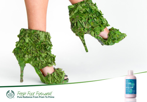
Creating shoes out of leaves underlines the natural and organic ingredients used with Body Shop products. You know exactly how your feet are going to feel, and what exactly you're putting on your feet!


I thought that this poster really emphasises the use of natural ingredients within their products.

I think that this product poster advertisement works really well, as they have really emphasised the fact that their ingredients are natural and real (by pouring the coconut milk directly into the bottle of coconut shower cream). Keeping the poster simple helps to highlight this, keeping it clear and concise.


I quite liked these posters, as they told you about what they use within their products through the use of simple imagery intertwined with typography.


Even though this poster is essentially image based, the colour schemes work really well to represent the peach scent of the body butter. Also, using soft peach colours helps reflect the moisturising effect of body butter and how it makes your skin feel.
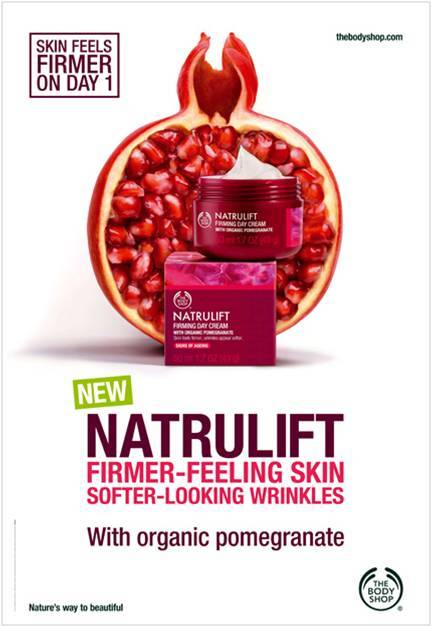
The image used in this poster helps to signify the use of natural ingredients within the Body Shop product that they are advertising. It also shows you exactly what ingredient they have used (pomegranate). The colour scheme has been chosen accordingly, complimenting the warm pink colours of the pomegranate fruit.

I love these posters for Body Shop, as they're bright and bold, and 'scream' the use of natural ingredients within their products. I think that the colour schemes work really well together, complimenting the typography and imagery.
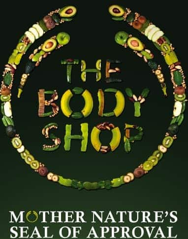
I thought that this was really clever, as the designer decided to create the logo out of all of the natural ingredients that they use to produce their beauty products - this emphasises their outlook and motto.
✿✿✿✿✿✿✿✿✿✿✿✿✿✿✿✿✿✿✿
After looking at existing product advertisements by Body Shop, I have noticed that they love to show just how natural, organic and real their ingredients are. They accentuate this idea through the use of organic imagery aligned with photos of their products. James and I will need to consider this when creating our posters, as Body Shop are all about "nature's seal of approval".
✿✿✿✿✿✿✿✿✿✿✿✿✿✿✿✿✿✿✿
Below are the products that Body Shop have asked for us to promote:
Body Butter

Product Description
If the changing seasons leave your skin dry or uncomfortable, look no further than The Body Shop's iconic range of Body Butters. Our range of deliciously scented Body Butters will help keep your skin feeling soft, smooth and hydrated for up to 24 hours. What's more, they're made with community fair trade Shea Butter because we believe in beauty with heart.
Colour Crush

Product Description
This luscious lipstick gives a stunning pop of colour and rich moisture, infused with a subtle rose scent.
- High-impact colour
- Rich moisture
- Infused with a subtle rose scent
White Musk

Product Description
Our iconic White Musk(®) fragrance in a lasting eau de parfum. This sensual scent unites a heady mix of notes including musk, lily, iris, rose and vanilla.
- Lasting eau de parfum
- Contains cruelty-free synthetic musk
Colour Crush
Product Description
This luscious lipstick gives a stunning pop of colour and rich moisture, infused with a subtle rose scent.
- High-impact colour
- Rich moisture
- Infused with a subtle rose scent
White Musk
Product Description
Our iconic White Musk(®) fragrance in a lasting eau de parfum. This sensual scent unites a heady mix of notes including musk, lily, iris, rose and vanilla.
- Lasting eau de parfum
- Contains cruelty-free synthetic musk
Drops of Youth

Product Description
Our certified organic range has been created for the first signs of ageing. This innovative concentrate helps to enhance surface skin condition, leaving it looking smoother, fresher and healthier.
- Helps enhance surface skin condition
- Smoothes
- Instantly moisturising
- 99% of ingredients are of natural origin
- Leave your comment • Category: collaborative brief, OUGD503, responsive, studio brief 2
- Share on Twitter, Facebook, Delicious, Digg, Reddit