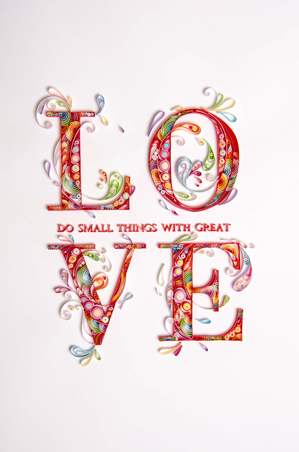
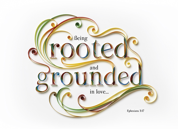
I really love this quilling design. The attention to detail is impeccable! I think that the quote works really well with the layout of the quilled paper, and the colour scheme is really effective. I also love the layout of the typography, as it's different to usual, yet easy to read and understand.
What I really like about these designs is the simplicity of the quilling - the designer hasn't gone completely crazy with the idea of quilling and has used it for decorating such a simple typeface. The addition of the decorative quilling has helped complete the design, and added dimension and interest.
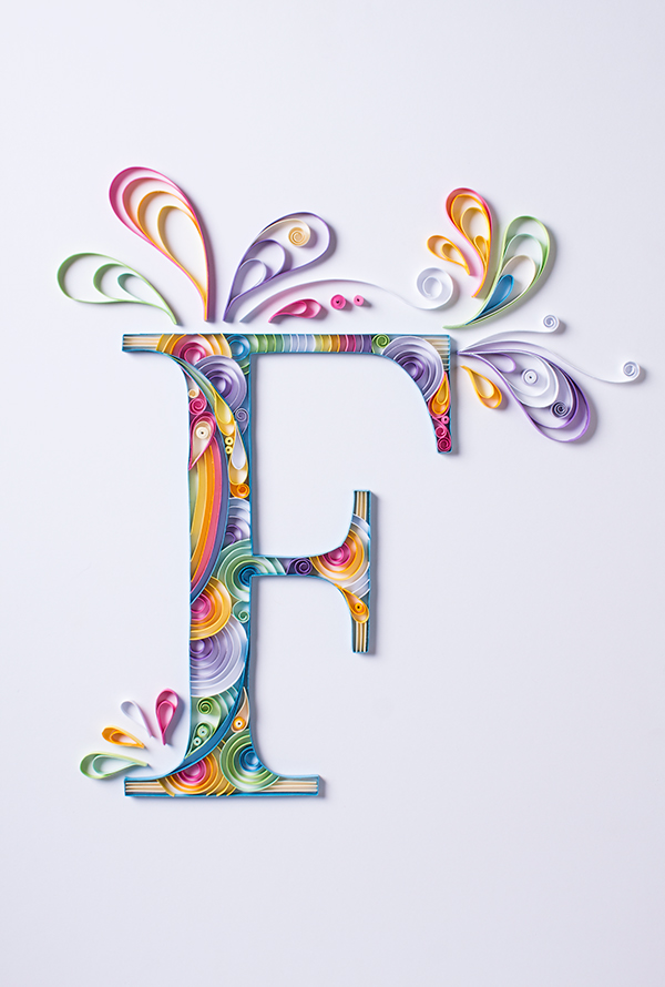

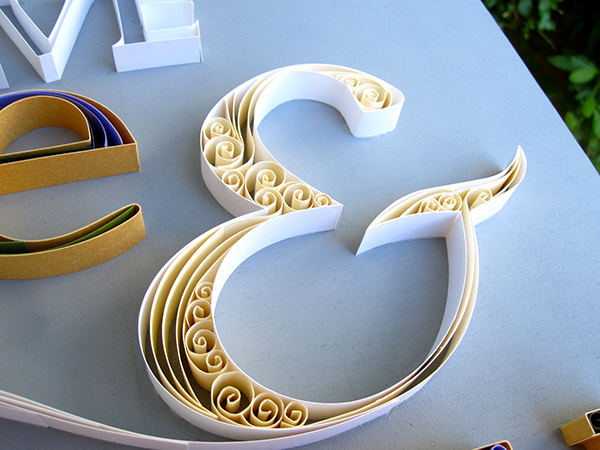
I think that this letterform has worked really well with the quilling! It's really decorative and has made the simply sans serif typeface so much more interesting and exciting to look at!
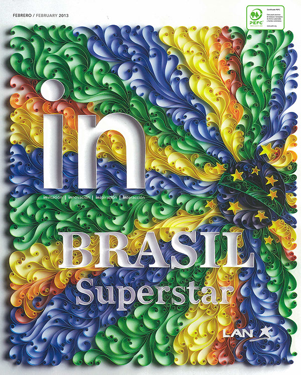
What I love about this quilling is the designer has used the quilling to fill the background, rather than the typeface. I think that this works really well, as it makes the typography clearer to read, and it stands out against all the bright quilled colours.

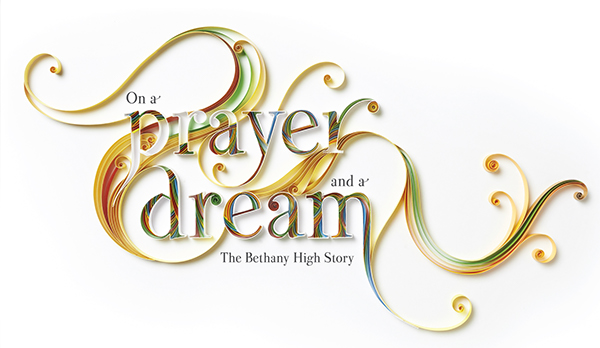
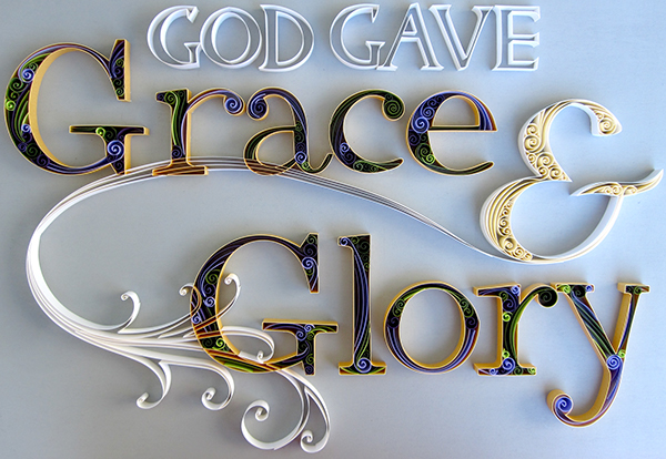
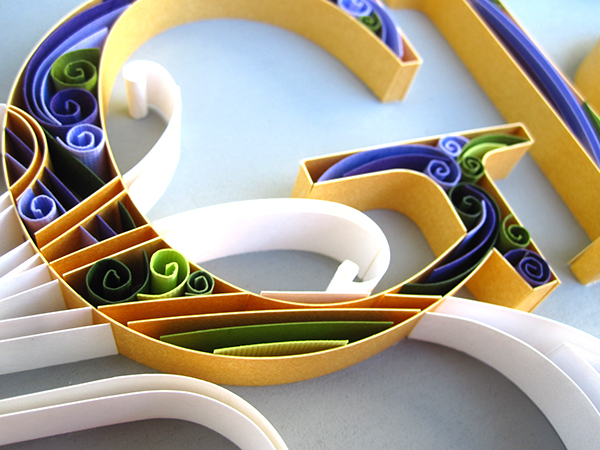
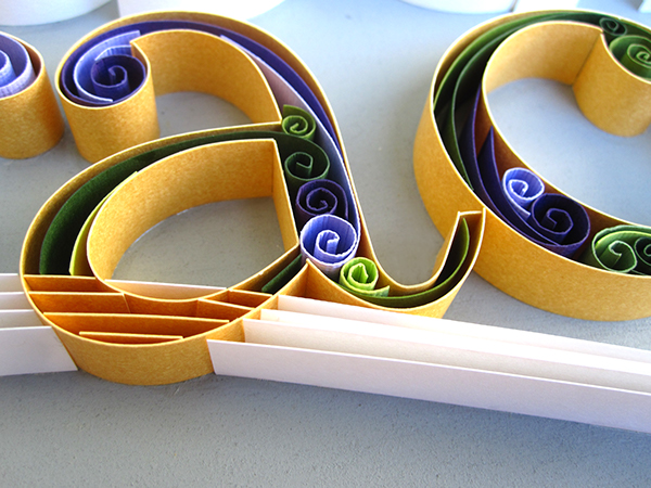
I think that these two designs work well, as the typefaces chosen reflect the ornate feel to the quilling technique, which compliments the process. I really like the way that the designer has produced the figures - they look almost 3D and the colour schemes are extremely complimentary.


I found this design interesting, because you can only just see the word written in the middle of the design - it looks almost transparent. I also think that the quilling has been produced in such a way that helps to make the typography blend into the background. The colour scheme works well, and it looks really elegant.
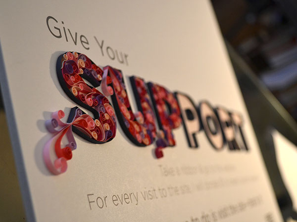
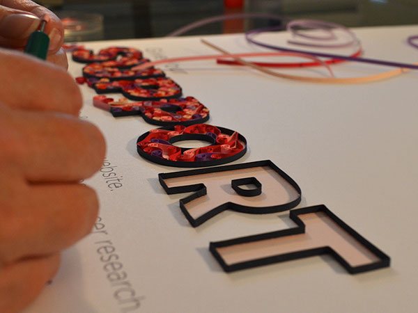

I found that using black paper as an outline for the quilling fill works really well - it helps with readability and makes the letters stand out against the sheer white background.
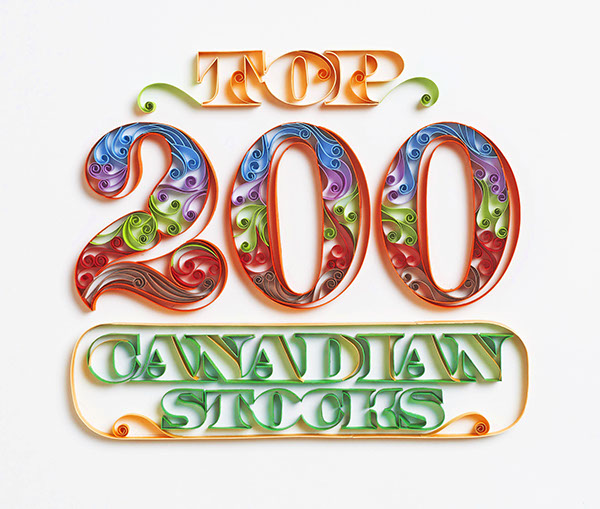
I really like how the paper looks as though it is going through some of the letters on this design, for example where it passes through the G and the A. I think this helps to bring the design together, and link the quilling into the typographic forms.
Quilling Techniques


I think that when it comes to our posters, we'll use simple quilling techniques, as they seem to be a lot more effective, and don't look so messy! I also really like when previous designs have used a piece of curled paper alone, rather than trying to wrap it into smaller, different shapes.
We're going to have to experiment with different techniques and see what works best for our designs!
- One comment • Category: collaborative brief, OUGD503, responsive, studio brief 2
- Share on Twitter, Facebook, Delicious, Digg, Reddit
One comment
Please credit the images you pulled from my website or remove them. They are copyrighted. www.littlecircles.net Thank you!
by ErinP.C. on 16 August 2015 at 14:26. #